Dia design research
A measured teardown of diabrowser.com, the marketing site for Dia, the AI browser from The Browser Company of New York. Captured 2026-11-21 at 1440×900 (desktop) and 390 wide (mobile) with agent-browser. Every number here comes from getComputedStyle, document.fonts, the site's stylesheets, or pixel samples of the screenshots. Values marked ≈ are estimates read off a screenshot.
The site in one paragraph
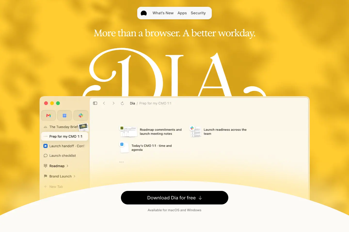
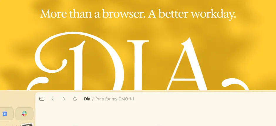
Dia sells a calm, warm, editorial browser for work. The page is a cream sheet (#FBFAF6), not white. Display type is a soft high-contrast serif, Exposure by 205TF, drawn at weight 500–550 with a variable "EXPO" axis. Everything else is ABC Oracle (a sans from Dinamo), with ABC Favorit Mono for footer and micro labels. Colour comes from photography and painting, not from UI chrome: a sunlit yellow hero with leaf shadows, oil-painting headers on release notes, and full-colour product screenshots. The chrome itself is black, white and five alpha greys. Motion is short (200–420 ms), eased, and mostly scroll-linked: the hero window rises 140 px as you scroll, a sticky "Download" pill docks into the top-right, and sections fade up 5 px.
How to read this
| Doc |
What it covers |
| Public pages |
Every public URL on the domain (147), grouped |
| 01 Design principles |
The 8 decisions that explain the rest |
| 02 Color system |
Every measured colour, alpha ink scale, gradients, WCAG ratios |
| 03 Typography |
7 families, where to license them, free substitutes, the full scale |
| 04 Layout, grid and spacing |
10-column 100 px grid, 1180 px content, section rhythm |
| 05 Heroes |
All 9 hero patterns |
| 06 Section types |
Scrollytelling, 6/4 bento, chip marquee, postcards, FAQ… |
| 07 Copywriting and voice |
Headline formulas, labels, microcopy |
| 08 Components |
Nav pill, CTA pills, cards, chips, accordions, footer |
| 09 Art direction |
Photography, painting, product shots, icons, the wordmark |
| 10 Brand assets and graphics |
Inventory of every graphic type, how it is made, how to rebuild it |
| 11 Motion and interaction |
Every measured transition, keyframe, scroll effect and hover |
| 12 Glossary |
The words you need to brief or build this |
| 13 Build recipe |
CSS tokens and component CSS to rebuild the look |
Page reviews (section by section, with measured values and the reason behind each choice):
What was captured
- 22 desktop full-page screenshots in
images/full/. The two changelog indexes are 78–87 k px tall (every entry renders on one page); their screenshots are cut to the first 6000 px.
- 3 mobile screenshots (390 wide): home, plans, for-work in
images/responsive/.
- 14 motion frames in
images/motion/ (load at t=0/1/3 s, 8 scroll positions, CTA rest vs hover).
- 27 asset crops and swatch sheets in
images/assets/.
- Per-section crops in
images/<page>/, indexed in images/sections.json.
- Raw measurements in
data/: <page>.json (all headings, text styles, colours, buttons), <page>.probe.json (fonts, @font-face, keyframes, hover rules, transitions, radii, shadows, media), home.measure.json, home.bento.json, changelog.lite.json, extra-measures.json, and public-pages.json.
Stack (observed)
- Next.js (
/_next/static/ assets, next/image URLs).
- Sanity CMS for page content and images (
cdn.sanity.io/images/e5fj2khm/production/...).
- Tailwind with a custom px scale (
text-28, rounded-20, px-24, 800: breakpoint prefix at 800 px).
- Framer-Motion-style inline styles (
style="opacity:0;transform:translateY(5px)") for reveals.
- One WebGL2
<canvas> (1440×900) in the home hero, over leaf-shadows-tinted.webp.
- Self-hosted WOFF2 fonts in
/fonts/.
Gaps
- JS-driven reveal durations (Framer-style) do not appear in computed
transition; the docs give the start state and say the duration is not measurable from CSS.
- The WebGL hero canvas's shader was not read; its visible effect is described from frames.
/privacy-policy is in the sitemap but serves the 404 template; noted in public pages.- Help center content lives on a third-party widget;
/help is only a shell.
Public pages · every public URL on diabrowser.com
Total: 147 URLs. On-site URLs come from /sitemap.xml (134 entries, checked 2026-11-21) plus the footer links the sitemap leaves out (/security, /privacy, /windows, /help, /termsofuse, /earlybirds). Off-site links are the ones the footer points to. robots.txt allows everything.
Notes:
- /release-notes and /release-notes/latest redirect (307) to the newest story, currently /release-notes/1-57-find-your-flow.
- /privacy-policy is in the sitemap but serves the Page Not Found template; the live policy is /privacy.
- /skills redirects (308) to /.
Marketing (7)
Apps (integrations) (7)
Help, legal and trust (5)
Release notes (versioned stories) (37)
Notes from the roadmap (9)
Changelog indexes (3)
Changelog: macOS (64)
Changelog: Windows (8)
Off-site (company, status, trust) (7)
01 · Design principles
Eight decisions explain almost everything on diabrowser.com. Each one names what Dia does, the measured evidence, and why it works for a product that wants to feel like "a better workday" rather than "an AI tool".
1. Warm paper, not white screen
What: The page background is #FBFAF6 (rgb 251 250 246), a cream with a yellow cast. Cards and nav sit on #F8F8F8 and #FFFFFF, so they read as slightly cooler sheets laid on paper.
Evidence: body background on 21 of 22 captured pages is rgb(251,250,246). Release notes switch to pure #FFFFFF so the oil-painting postcards look printed on white stock. Early Birds is the only dark page (#1B1B1B).
Why: A browser is the app you stare at all day. Cream lowers glare versus #FFF and makes the brand feel domestic and calm. It also lets the white product screenshots pop as objects rather than blend into the page.
2. A serif for feelings, a sans for facts
What: Headlines are Exposure (205TF), a high-contrast serif with soft, almost liquid joins. Body copy, buttons and UI are ABC Oracle, a quiet sans. Labels and the footer are ABC Favorit Mono in caps.
Evidence: Home section titles: Exposure 48/56, weight 500, letter-spacing -2.4px, font-variation-settings "EXPO" -25. Bento copy: ABC Oracle 20/30, weight 350. Footer headings: Favorit Mono 13/17, +1.3px tracking, uppercase.
Why: The serif makes promises ("A better workday", "Find your flow") sound like editorial, not like SaaS. The sans keeps features legible. The mono labels borrow the look of browser chrome and terminals, which quietly says "this is a tool".
3. Colour lives in pictures, not in UI
What: Interface chrome is black, white and an alpha ink scale (rgba(0,0,0,.85/.60/.45/.20)). Every saturated colour comes from imagery: the sunlit yellow hero (#FFCB30 sampled), oil paintings on release notes, full-colour app screenshots.
Evidence: Across home, plans, apps, figma and security, no button or link uses a hue except the legal link blue #5863EA. The brand hues (--red #FA3D1D, --blue #0358F7, --pink #FD02F5, --yellow #FFB005) appear only in the Students gradient.
Why: A neutral frame makes the product screenshots the hero. It also means one strong art piece per page carries the mood without a palette fight.
4. Show the product as a lived-in object
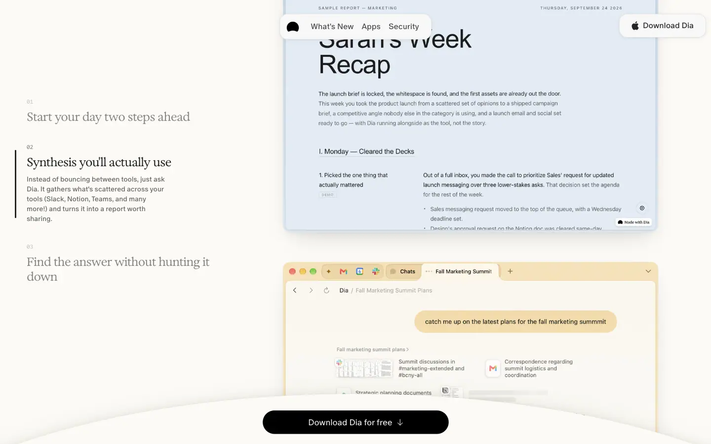
What: Product shots are real Dia windows with real-looking content ("The Tuesday Brief", "Sarah's Week Recap", "Prep for my CMO 1:1"), framed with macOS traffic lights and soft shadows, often on a painted or photographed backdrop.
Evidence: Home hero autoplays a muted, looping 1115×793 video with 16 px radius. "Dia reads between the tabs" uses three 760×562 stills. App pages place UI cards over painterly photo backgrounds (880×476 Sanity images).
Why: An AI browser is abstract. Showing a believable morning (calendar, brief, meeting prep) sells the outcome, which is what a work buyer cares about.
5. One pill, everywhere
What: Primary actions are fully rounded black pills; secondary actions are grey pills; navigation is a floating white pill. Corners are either 9999px or one of 12 / 16 / 20 / 36 px.
Evidence: Home radius count: 20px ×59, 9999px ×55, 12px ×14, 16px ×6. Hero CTA 443×56 black pill. Nav 307×52, radius 16, backdrop-filter: blur(12px).
Why: Pills echo Dia's own tab and chip shapes. A single repeated shape makes the site feel like part of the product.
6. Scroll is the storyteller
What: The hero window rises as you scroll (translateY to −140 px by 400 px of scroll), the CTA pill shrinks and docks, a sticky three-step list swaps screenshots, and the chip row in "Privacy first" scrolls as a marquee.
Evidence: Measured transform on the hero video wrapper: −52.5 px at scrollY 150, −122.5 px at 350, −140 px from 600 on (0.35 px per px of scroll, clamped). CTA: 443×56 at rest → 377×48 docked at scrollY 300 → a second 176×48 "Download Dia" pill appears top-right by scrollY 1100.
Why: The download CTA never leaves the viewport, but it gets smaller as interest grows. The page reads like a guided demo instead of a stack of blocks.
7. Restraint in motion
What: Hovers are 150–300 ms colour or opacity changes. The one "showy" hover is the hero CTA: scale 1.02 plus a deep shadow (220 ms transform, 420 ms shadow, cubic-bezier(.22,1,.36,1)).
Evidence: 118 elements on home share color, background-color, border-color, text-decoration-color 0.2s cubic-bezier(0.4,0,0.2,1). No infinite CSS animations run on home except marquees.
Why: Calm product, calm site. Motion only confirms that something is interactive or that the story moved.
8. Personality in the edges
What: Small human touches sit at the edges of a quiet system: handwritten "Shipped by Sébastien" signatures (Ammer Handwriting) on every changelog item, a round "The Browser Company of NY" seal in the footer, a magazine masthead ("Dia Weekly — UNFILTERED") on roadmap notes, pixel-art icons and hard-shadow cards on Students.
Why: These say "made by people" without breaking the calm grid. Each audience page (students, release notes) gets a different costume while keeping the same fonts and pills.
02 · Color system
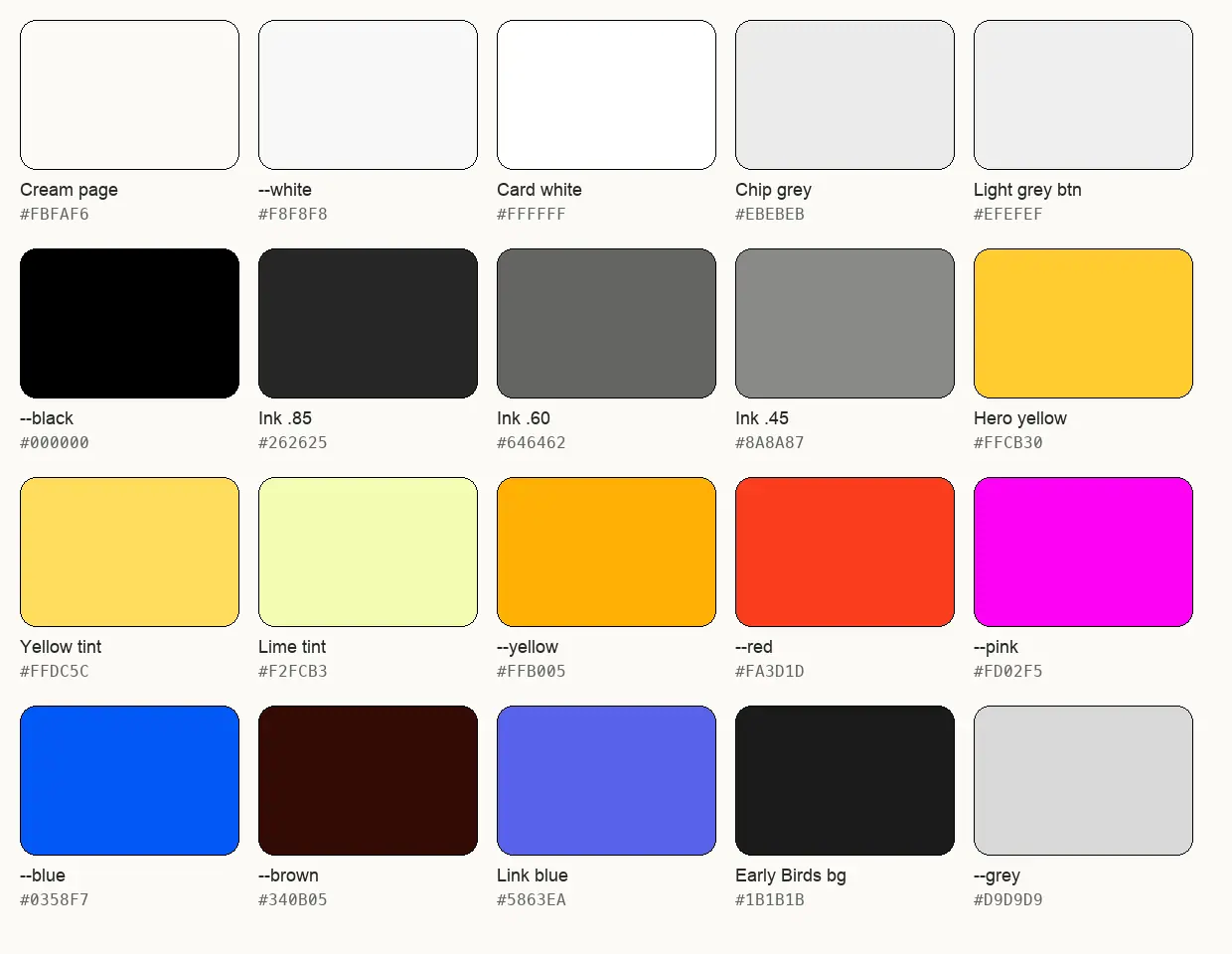
Dia's colour system has three layers: a paper layer (cream and near-whites), an ink layer (black at five alphas), and an image layer (photography, painting, product screenshots) that carries all saturated colour. A small set of brand hues is defined as CSS variables but used almost only on the Students page.
1. Surfaces (paper)
| Token / role |
Value |
Where measured |
| Page background |
#FBFAF6 rgb(251,250,246) |
body on 21 of 22 pages |
--white (UI white) |
#F8F8F8 |
nav pill bg, CTA text colour, theme-color meta |
--background / card white |
#FFFFFF |
bento label chips, plans popular card, release-note page body |
| Plans side card |
rgba(255,255,255,.75) |
/plans Better Browser / Better Days cards |
| Chip grey |
rgba(235,235,235,.7) ≈ #EDEDEB on cream |
home privacy toggle chips |
| Light-grey button |
#EFEFEF |
"Learn more about privacy in Dia" |
--fill-secondary |
rgba(0,0,0,.08) |
secondary pills (/plans "Download Dia for free" uses .05) |
--fill-secondary-hover |
rgba(0,0,0,.12) |
hover of secondary pills |
--fill-tertiary |
rgba(0,0,0,.04) |
app-tour prompt rows |
--header-background |
#dddddd77 |
defined; mobile header |
| Early Birds page |
#1B1B1B |
/earlybirds body |
| Release-note dark panels |
#0B0B0B rgb(11,11,11) |
20 elements on /release-notes/1-57-… |
Why cream + two whites: Cards in #FFF and #F8F8F8 read as separate sheets on #FBFAF6 without any border. The 3-point difference is enough on a calibrated display, which is why most cards add a 1 px alpha border as backup.
2. Ink (text and lines)
All text is black at an alpha, so it takes on a little of the warm paper underneath.
| Token |
Value |
Flattened on #FBFAF6 |
Contrast vs page |
WCAG |
--primary |
rgba(0,0,0,.85) |
#262625 |
14.5 : 1 |
AAA |
| bento body |
rgba(0,0,0,.70) |
#4B4B4A |
8.36 : 1 |
AAA |
| apps body |
rgba(0,0,0,.65) |
#585856 |
6.83 : 1 |
AA (AAA large) |
--secondary |
rgba(0,0,0,.60) |
#646462 |
5.68 : 1 |
AA |
| caps label |
rgba(0,0,0,.55) |
#71706F |
4.73 : 1 |
AA |
| plans muted |
rgba(0,0,0,.50) |
#7E7D7B |
3.94 : 1 |
AA large only |
--tertiary |
rgba(0,0,0,.45) |
#8A8A87 |
3.31 : 1 |
AA large only |
footer links (primary/50) |
rgba(0,0,0,.424) |
#91908E |
3.05 : 1 |
AA large only |
--quaternary |
rgba(0,0,0,.20) |
#C9C8C5 |
1.6 : 1 |
decorative only (step numbers "01", "02") |
Lines: --stroke-light rgba(0,0,0,.06), --stroke-medium rgba(0,0,0,.12), --black-8 rgba(0,0,0,.08) (nav border), rgba(0,0,0,.10) (plans cards, FAQ dividers), rgba(0,0,0,.15) (app cards), rgba(0,0,0,.30) (home bento cards, the darkest hairline).
Why alpha ink: One black, many opacities keeps type perfectly neutral on cream, white and grey surfaces without a separate grey per surface. It is also how macOS system text colours work (labelColor, secondaryLabelColor), which the app-tour mockups copy exactly: rgba(60,60,67,.78) is iOS/macOS secondaryLabel.
Weak spot: Footer links at 3.05 : 1 and step headings at .45 (3.31 : 1) fail AA for 13–16 px text.
3. Action colours
| Role |
Value |
Contrast |
| Primary CTA fill |
#000000 with #F8F8F8 text |
19.77 : 1 |
Primary hover (.button--primary) |
stays #000, adds inset 0 0 7.8px 2px rgba(255,255,255,.5) glow |
— |
| Generic hover fill |
rgb(66,66,66) |
— |
--get-dia-button-hover |
rgba(0,0,0,.90) |
— |
| Legal / FAQ link |
#5863EA rgb(88,99,234) |
4.58 : 1 on cream (AA) |
| Group-hover link |
rgba(88,99,234,1) |
same |
Why black CTAs: On a page full of yellow, painting and screenshots, black is the only colour guaranteed to win. It also matches Dia's app icon and wordmark.
4. Brand hues (defined on :root)
| Variable |
Hex |
Seen on |
--yellow |
#FFB005 |
Students gradient; close to the hero's photographic yellow |
--red |
#FA3D1D |
Students gradient |
--pink |
#FD02F5 |
Students gradient |
--blue |
#0358F7 |
Students gradient |
--brown |
#340B05 |
--midnight-gradient start |
--grey |
#D9D9D9 |
dividers |
Each comes with -50 (80 alpha) and -10 (1A alpha) variants, for example --red-10: #FA3D1D1A.
5. Image-layer colours (sampled)
| Sample |
Value |
| Home hero sunlight yellow |
#FFCB30 rgb(255,203,48) at (200,60) and (1300,300) |
| Hero leaf shadow |
#DAA61C rgb(218,166,28) at (720,130) |
| Home bento tints |
rgb(242,252,179) lime ×30, rgb(255,220,92) yellow ×20, rgb(255,228,140) (inside the hero video frames) |
| Students hard shadow |
#000 offset −3 3 and −6 6 |
The hero yellow is not a CSS fill. It is a photograph (leaf-shadows-tinted.webp, 1440×900, object-cover) under a WebGL canvas, so the colour shifts as leaves move.
6. Gradients
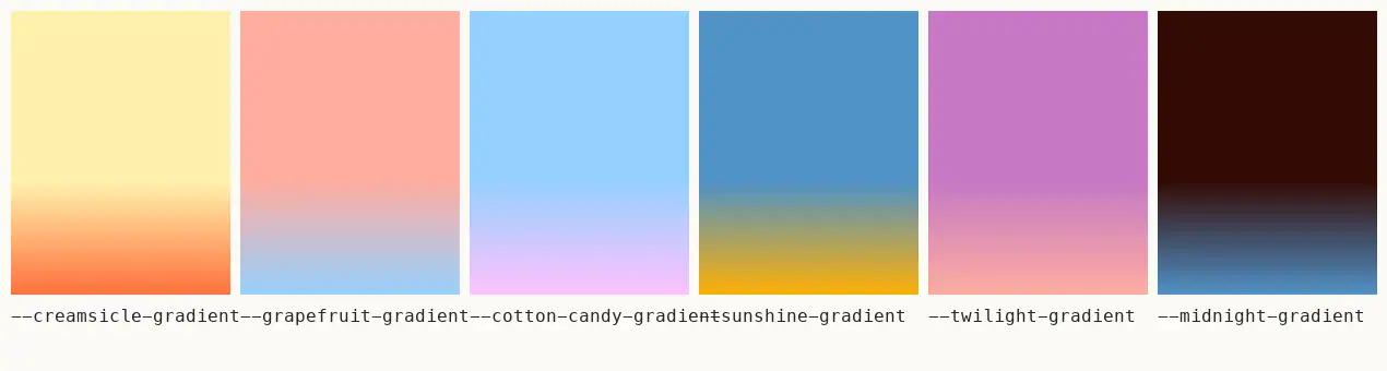
Six named vertical gradients are defined on :root. Each holds the first colour solid until 60 %, then blends to the second. Their names match Dia's profile/theme presets; none is painted on the captured marketing pages.
| Variable |
Value |
--creamsicle-gradient |
linear-gradient(180deg,#FFF1AC 60%,#FF6F3C) |
--grapefruit-gradient |
linear-gradient(180deg,#FFADA0 60%,#96D0FF) |
--cotton-candy-gradient |
linear-gradient(180deg,#96D0FF 60%,#FFC1FD) |
--sunshine-gradient |
linear-gradient(180deg,#5092C7 60%,#FFB005) |
--twilight-gradient |
linear-gradient(180deg,#C679C4 60%,#FFADA0) |
--midnight-gradient |
linear-gradient(180deg,#340B05 60%,#5092C7) |

--student-gradient: linear-gradient(180deg,#FD02F5 -10.07%,#FA3D1D 6.81%,#FFB005 35.18%,#E1E1FE 66.63%,#0358F7 95.78%). --student-marquee is the same stops at 270deg. These are the only loud colours in the system, and they belong to one audience page.
Home uses one subtle gradient: linear-gradient(0deg, rgba(91,63,8,.08), transparent), a warm brown shade at the bottom of the hero window to seat it on the "hill".
7. Contrast failures worth knowing
| Pair |
Ratio |
Verdict |
White hero H1 on sunlit yellow #FFCB30 |
1.52 : 1 |
Fails even large-text AA (3 : 1) |
White on darker leaf yellow #E6AA14 |
2.07 : 1 |
Fails |
Footer links rgba(0,0,0,.424) |
3.05 : 1 |
Fails AA for 13 px |
Black .85 on chip grey #EBEBEB |
13.18 : 1 |
Passes |
White .5 on #1B1B1B (Early Birds) |
5.19 : 1 |
Passes AA |
Why they accept the hero failure: The white H1 "More than a browser. A better workday." and the giant white "DIA" wordmark are mood, not information. The same message is in <title> and the CTA. For your own build, darken the photo under the text (a 20–30 % warm-brown overlay gets white to ≈3 : 1) or set the line in #262625.
8. Dark page (Early Birds)
/earlybirds uses #1B1B1B with a horizon image that fades blue → pink → black at the top. Text is #FFFFFF for the H1, rgba(255,255,255,.8) for the H3, rgba(255,255,255,.5) for footer links. Cards are rgba(170,170,170,.1). The CTA flips to a white pill with black text. This is the only "dark mode" on the marketing site; there is no prefers-color-scheme switch.
03 · Typography
Dia loads seven families from /fonts/ (all self-hosted WOFF2) but builds 95 % of the site from three: Exposure (serif display), ABC Oracle (sans text) and ABC Favorit Mono (mono labels). The other four are costume fonts for specific moments.
1. The families
| Family (CSS name) |
Role |
Weights loaded |
Foundry / where to license |
Free substitute |
Exposure ("Exposure VAR", "Exposure Variable") |
Display serif: H1, section titles, card titles, prices |
300–900 as 11 static cuts + 1 variable file (205TF-Exposure-ExposureVAR.woff2, weight range 1 999) |
205TF (Swiss), 205tf.com. Desktop/web licence per domain |
Fraunces (variable, has SOFT axis) or Newsreader; Instrument Serif for one-weight headlines |
| ABC Oracle |
Text sans: body, buttons, nav, legal H1s |
300 Light, 350 Book, 400 Regular, 500 Medium, 700 Bold |
Dinamo, abcdinamo.com (ABC = "A Better Company") |
Geist, Inter Tight, Hanken Grotesk |
| ABC Oracle Triple |
Semi-monospaced Oracle: toggle chips, changelog version tags, "SHIPPED BY", eyebrow |
400 |
Dinamo (Oracle family) |
DM Mono or Geist Mono |
| ABC Favorit Mono |
Mono caps: footer, step numbers, badges, plan FAQ group labels |
400, 500, 700 |
Dinamo |
JetBrains Mono, IBM Plex Mono |
| Quadrant Text Mono |
Dates on roadmap notes ("Nov 12, '26") |
400 |
Foundry not confirmed on site |
IBM Plex Mono |
| Ammer Handwriting |
Signatures "Shipped by Sébastien" |
400 (rendered as 350) |
Foundry not confirmed on site |
Caveat, Reenie Beanie |
SF Pro (SFProText-Regular.latin.woff2) |
Inside product mockups on Students |
400 |
Apple; licensed for Apple-platform UI mockups only |
Inter |
-apple-system |
Text inside app-tour mockups on /apps/* |
system |
system font |
system font |
How Exposure is wired
The static files are named by exposure value, not weight. The CSS maps them to weights:
font-weight |
File |
| 300 |
205TF-Exposure-[+40].woff2 |
| 350 |
[+30] |
| 400 |
[+20] |
| 450 |
[+10] |
| 500 |
[0] |
| 550 |
[-10] (+ [-10]-Italic) |
| 600 |
[-20] |
| 650 |
[-30] |
| 700 |
[-40] |
| 900 |
[-80] |
Exposure simulates photographic exposure: positive values thin the strokes (over-exposed), negative values thicken and soften them (under-exposed, ink spread). The home hero also sets font-variation-settings: "EXPO" -25 on the variable file for the section titles, a value between the 500 and 600 cuts.
Why Exposure: It is a serif with very high contrast and soft, slightly blurred joins. It feels like print and like light, which ties straight to the sunlit hero photo. At 48–100 px it is unmistakable; it carries the brand without a logo.
Why Oracle: A neutral grotesk with a little warmth. Weights 350 (Book) and 300 (Light) are used more than Regular for long copy, which keeps the page light next to the dark serif.
Why Favorit Mono caps: Mono uppercase with +1.3px tracking reads like browser chrome, file paths and system labels. It signals "utility" in the footer and in small metadata.
2. The measured scale (desktop 1440)
Sorted by size. "n" is how many text nodes used the style across the 22 captured pages.
Display (Exposure)
| Use |
Size / line-height |
Weight |
Tracking |
Example |
| Release-note H1 |
101.664 / 110.814 (clamp, --lately-title-size: clamp(48px,7.06vw,118px)) |
550 |
−5.08 px (−0.05 em) |
"Find your flow" |
| Apps H1 |
96 / 100 |
550 |
−3.84 px (−0.04 em) |
"All your apps, working together." |
| App page H1 |
82 / 82 |
550 |
−1.64 px (−0.02 em) |
"Figma, meet Dia" |
| Release-note H2 |
70 / 84 |
550 |
−2.8 px (−0.04 em) |
"Nest your tab groups" |
| Students H1 |
56 / 62 |
650 |
−2.8 px (−0.05 em) |
"You don't have to do it all alone." |
| Roadmap H1 |
50 / 60 |
600 |
−2 px |
"Notes from the roadmap" |
| Home section title |
48 / 56 |
500 (EXPO -25) |
−2.4 px (−0.05 em) |
"Dia reads between the tabs", "Privacy first" |
| Changelog entry H1/H2 |
44 / 49.72 |
550 |
−2.2 px |
"Faster starts, tidier tabs" |
| Plans FAQ title |
40 / 43.2 |
600 |
−2 px |
"Frequently asked questions" |
| Home hero H1 (over photo) |
38.793 / 42.67 (fluid) |
500 |
−1.55 px (−0.04 em) |
"More than a browser. A better workday." |
| Price |
38 |
400 (Exposure Variable, tabular-nums) |
−0.1 px |
"$10" |
| App page H2 |
34 / 38.08 |
550 |
−0.51 px |
"Stay on brand without opening Figma" |
| Apps card title |
24 / 30 |
550 |
−0.48 px |
"Slack" |
| Home step title |
24 / 30 |
500 |
−0.72 px |
"Start your day two steps ahead" |
| App page kicker |
19 / 31.35 |
550 |
+0.19 px, colour .40 |
"A quick tour" |
Pattern: Exposure is always tracked tight, about −0.04 to −0.05 em at display sizes and −0.02 em at 24–34 px. Line-height is 1.0–1.17 for headlines. Weight sits at 500–550; only Students goes to 650 for a louder, poster-like voice.
Text (ABC Oracle)
| Use |
Size / line-height |
Weight |
Tracking |
Colour |
| Legal / utility H1 |
72 / 84 (72/72 on privacy, security) |
300 |
−2.88 px (−0.04 em) |
.85 |
| Legal H2 |
54 / 60 |
300 |
−2.16 px |
.85 |
| Past-issue card title |
39 / 45.63 |
400 |
−1.17 px |
#000 |
| Legal H3 |
34 / 37 |
300 |
−0.68 px |
.85 |
| Release-note "what else" H3 |
25 / 34 |
350 |
−0.75 px |
#0B0B0B |
| Lead paragraph |
22 / 30 |
350–400 |
0 |
.60–.65 |
| Release-note body |
20 / 28.8 (22.5/30.8 for the intro) |
350 |
−0.2 px |
#0B0B0B |
| Bento card copy |
20 / 30 |
350 |
−0.4 px |
.70 |
| Hero CTA label |
20 |
350 |
0 |
#F8F8F8 |
| Changelog item title |
18 / 23 |
400 |
−0.36 px |
#000 |
| Body default |
16 / 20–24 |
400 |
0 |
.60 body, .85 emphasis |
| Changelog item body |
16 / 23 |
350 |
−0.16 px |
rgba(0,0,0,.4) |
| Plans list |
15 / 23.25 |
400 |
0 |
.60 |
| Small |
14 / 20 |
400 |
0 |
.60 |
| Caption |
12 / 14.4 |
400 |
0 |
.50 |
Labels (mono)
| Use |
Family |
Size / lh |
Tracking |
Case |
Colour |
| Footer heading |
Favorit Mono |
13 / 17 |
+1.3 px (+0.1 em) |
upper |
.85 |
| Footer link |
Favorit Mono |
13 / 16 |
+1.3 px |
upper |
.424 → .85 on hover |
| Bento card label |
ABC Oracle |
12 / 30 |
+0.72 px (+0.06 em) |
upper |
.55 on a white 30 px pill |
| FAQ group label |
Favorit Mono |
11 / 16 |
+0.44 px |
upper |
.50, weight 300 |
| Badge "MOST POPULAR" |
Favorit Mono |
10 |
— |
upper |
.85 |
| Step number "01" |
Favorit Mono |
11 / 14 |
0 |
— |
.20 |
| Eyebrow "THE DIA LATELY • NOVEMBER 12TH • 2026" |
Oracle Triple |
14 / 18 |
+0.42 px |
upper |
transparent text filled with grain |
| Toggle chip "Block trackers On" |
Oracle Triple |
16 / 35 |
0 |
— |
.85 |
| Masthead "UNFILTERED" |
Favorit Mono |
17 / 18.7 |
+2.72 px (+0.16 em) |
upper |
white on black |
| Signature |
Ammer Handwriting |
36 / 24 |
−0.16 px |
— |
#000 |
3. Heading hierarchy in practice
- Section titles are visual paragraphs, not
<h2>s. On home, the real <h2> is sr-only (ABC Oracle 54/60 300), while the visible lines are two <p> elements in Exposure 48/56. This lets the design split "Privacy first" and "with you in control" around a chip marquee while screen readers get one clean heading.
- Two display voices: product/marketing pages use the Exposure serif; legal, security, download, windows, for-work and 404 use ABC Oracle Light 72/84. The serif is reserved for persuasion; the sans is for information.
- Subheads are grey, not smaller-bold. Under each H1 sits a 20–22 px Oracle paragraph in
.60–.65 alpha. Weight never goes up for subheads; colour goes down.
- Kickers are italic serif or mono caps. "A quick tour" (Exposure 19/31 italic,
.40), "THE DIA LATELY • …" (Oracle Triple caps).
4. Responsive type (390 wide)
| Element |
Desktop |
Mobile |
| Home hero H1 |
38.79 / 42.67 |
28 / 30.8, −1.12 px |
| Home section title |
48 / 56 |
32 / 38, −1.6 px |
| Home step title |
24 / 30 |
24 / 30 (unchanged) |
| Home "Built for…" (sans) |
54 / 60 |
36 / 41 |
| Bento copy |
20 / 30 |
16 / 24 |
| For-work H1 |
72 / 84 |
48 / 52 |
| Plans H1 |
36 |
30 |
| Plans FAQ title |
40 / 43.2 |
34 / 36.72 |
Mobile drops display sizes by about ⅓ and keeps line-height ratios. Tracking scales with size (still ≈ −0.04 em).
5. Rules to copy
- One serif for headlines, one sans for everything else, one mono for labels. Add a costume font only for a single named moment (signatures, masthead).
- Track display serif at −0.04 to −0.05 em; leave body at 0.
- Use weight 350 (Book) for body copy at 18–22 px so paragraphs stay light next to heavy headlines.
- Make hierarchy with colour alpha (
.85 → .60 → .45) before size or weight.
- Use
tabular-nums for prices.
- Load static cuts for the two or three weights you actually use; Dia ships 11 Exposure cuts but home only renders weight 500.
04 · Layout, grid and spacing
1. Page frame
| Measure |
Value |
Source |
| Viewport tested |
1440 × 900 |
capture |
| Outer section container |
max-width: 1440px; padding: 0 10px (max-w-1440 mx-auto site-grid) |
home "Built for…" section |
| Scrollytelling container |
max-width: 1400px; padding: 0 10px (x 20 → 1420) |
home "Dia reads between the tabs" |
| Content grid |
10 columns × 100 px, 20 px gaps = 1180 px, starting at x = 130 |
grid grid-cols-12 gap-10 800:gap-20 800:grid-cols-10, computed 100px ×10, gap 20px |
| Side margin at 1440 |
130 px each side |
grid x = 130, width 1180 |
| Mobile grid |
12 columns, 10 px gaps |
same class below 800 px |
| Breakpoint |
800 px (800: prefix) |
class names across the site |
Release-note grid (.lately-grid) |
1280 px at x = 80, gap 20 px |
/release-notes/1-57-… |
| Changelog column |
934 px at x = 376; items in 2 × 442 px columns with 50 px gap |
/changelog |
| Text column (FAQ, legal) |
760 px centred (x 340 → 1100) |
/plans FAQ, home CTA max-w-760 |
Why 100 px columns: At 1440 the arithmetic is clean: a 6-col card is 700 px (6×100 + 5×20), a 4-col card is 460 px. Designers can spec "6/4" and engineers get round numbers.
2. The 6/4 bento
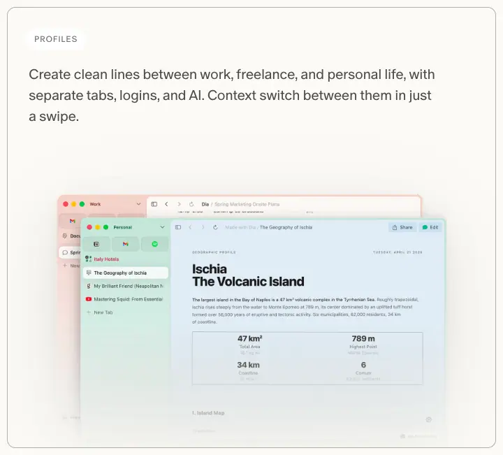
Measured card rectangles on home (x, y, w, h):
| Row |
Left |
Right |
| 1 |
PROFILES 130, 3245, 700 × 631 |
LIVE WORK 850, 3245, 460 × 631 |
| 2 |
BETTER MEETINGS 130, 3896, 460 × 631 |
SPLITS 610, 3896, 700 × 631 |
| 3 |
DECKS 130, 4547, 700 × 580 |
ORGANIZED TABS 850, 4547, 460 × 580 |
- Row gap 20 px (3245 + 631 + 20 = 3896).
- The wide card swaps sides each row (6/4, 4/6, 6/4), a checkerboard bento. The eye zig-zags instead of scanning one column.
- Card height is fixed per row so screenshots can bleed off the bottom edge.
3. Vertical rhythm
| Gap |
Value |
Where |
| Section margin (desktop) |
120 px top and bottom (800:my-120) |
home sections |
| Section margin (mobile) |
80 px (my-80) |
home sections |
| Scrollytelling section |
80 px top, 100 px bottom |
mt-60 800:mt-80 mb-80 800:mb-100 |
| Closing CTA heading |
150 px above, 100 px below (800:mt-150 800:mb-100) |
"Ready for a better day?" |
| Title → content |
40 px (mb-40) |
"Dia reads between the tabs" |
| Release-note story gap |
clamp(96px, 13.66vw, 236px) |
between stories |
| Changelog entry gap |
≈ 250–400 px (variable with content) |
/changelog |
| Footer block |
266 px tall |
home |
Why so much air: Each section is a single idea with one large picture. 120 px margins plus 48–56 px headlines give a magazine pace: one spread per scroll.
4. Spacing scale
Tailwind is configured with pixel-named utilities (px-24 = 24 px, rounded-20 = 20 px, text-28 = 28 px). Measured values in use:
4 · 5 · 6 · 10 · 12 · 14 · 16 · 20 · 22 · 24 · 28 · 30 · 35 · 40 · 48 · 50 · 56 · 60 · 80 · 100 · 120 · 150
The scale is not a strict 4/8 system. Component heights come in pairs: chips 30 / 35, buttons 40 / 42 / 48 / 50 / 56, nav 52.
5. Radii
| Radius |
Count on home |
Used for |
9999px |
55 |
CTA pills, tabs, avatars |
20px |
59 |
chips, light-grey buttons, bento labels |
16px |
6 |
nav pill, hero video window, top-right dock pill |
12px |
14 |
bento cards, app cards |
12px 12px 0 0 |
6 |
window chrome tops |
36px |
— |
/plans pricing cards |
30px |
1 |
release-note media |
8px / 6px |
— |
Students cards, small UI |
Rule: Containers 12–16 px, controls 20 px or full pill, big standalone cards 36 px.
6. Alignment patterns
- Centred stacks for every hero and closing CTA (H1, lead, one CTA).
- Left rail + right media for the scrollytelling block: a 3-item list on the left (≈ 300 px), 760 × 562 images on the right.
- Two-column text for changelog items (442 + 442).
- Single 760 px column for FAQs and legal text.
- Full-bleed only for photography: hero (1440 × 900), release-note header painting, app-page header strip, Early Birds horizon.
7. Responsive behaviour (390 wide)
| Element |
1440 |
390 |
| Home page height |
6674 px |
7424 px |
| Bento |
6/4 checkerboard |
single column, 12-col grid, 10 px gaps |
| Scrollytelling |
sticky left list + right images |
list items stacked, each with its own image |
| Nav |
floating centred pill with 3 links |
logo + menu button; full-screen menu with 72 px ABC Oracle Light links at .30 opacity, 1.0 on hover |
| Plans |
3 cards in a row |
cards stacked; page 4231 px |
| Hero CTA |
443 × 56 pill |
full-width pill (w-full max-w-[443px]) |

05 · Heroes
Dia uses nine hero patterns. They share one skeleton: floating nav pill → centred headline → one sentence → one black pill → one picture. What changes is the picture and the headline font.
1. Sunlight + wordmark + live window (home)
| Layer (back → front) |
Measured |
Photo leaf-shadows-tinted.webp |
1440 × 900, object-cover, sunlit yellow #FFCB30 with moving leaf shadows #DAA61C |
WebGL2 <canvas> |
1440 × 900 over the photo (animates the light) |
| H1 |
"More than a browser. A better workday." Exposure 38.79 / 42.67, weight 500, −1.55 px, white, top: 116px, centred |
| Wordmark "DIA" |
SVG 763 × 284 at (339, 198), fill: currentColor (white) — swash serif letters cropped by the window below |
| Product window |
autoplay muted loop <video> 1115 × 793 at (163, 398), radius 16, wrapper origin-bottom will-change-transform |
| Cream "hill" |
arched mask that cuts the bottom of the hero into the page |
| CTA |
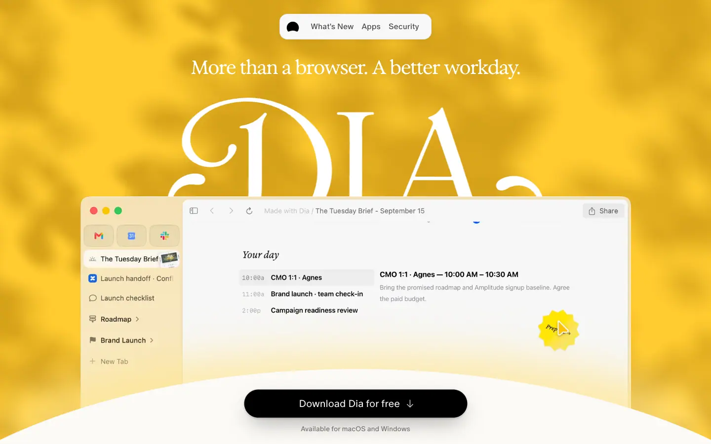
black pill 443 × 56 "Download Dia for free ↓", ABC Oracle 20 px 350, under it "Available for macOS and Windows" 14 px .50 |
Why: The yellow light says "morning, a good day" before you read a word. The giant wordmark is the logo used as architecture; the window overlaps it so the product literally sits in front of the brand. The arched hill turns the page edge into a horizon, and the CTA sits on that horizon like a sun.
Motion: the window rises 0.35 px per px of scroll until −140 px; the CTA docks at the bottom of the viewport, then a small copy appears top-right. See 11 Motion.
2. Sun glyph + pricing as hero (plans)
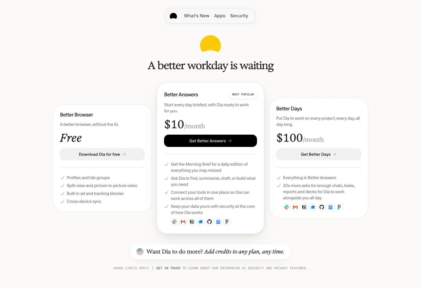
- A yellow half-sun glyph (≈ 36 × 24 px) above the H1, echoing the home hero light.
- H1 "A better workday is waiting", Exposure Variable 36 px weight 300, −1.44 px.
- The three plan cards are the hero; no separate picture.
- A floating pill below: "Want Dia to do more? Add credits to any plan, any time." (Exposure 19 px, italic second half).
Why: Someone on /plans has already decided to look at price. Removing the picture puts the decision in the first viewport.
3. Sunrise glow + product (for work)
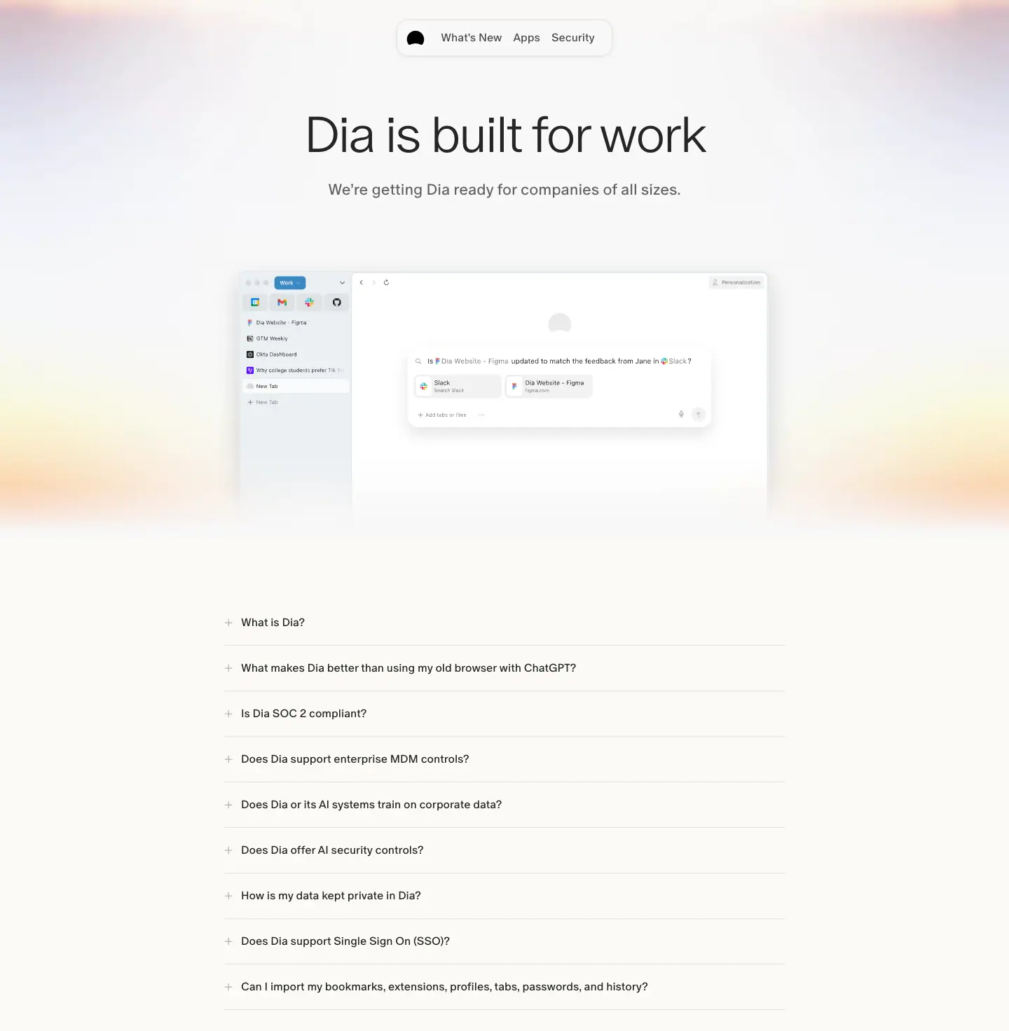
- Full-width pastel sunrise blur (orange → lilac → white) behind a centred product screenshot.
- H1 "Dia is built for work" in ABC Oracle Light 72 / 84, −2.88 px; subline "We're getting Dia ready for companies of all sizes." 18 / 27.
- No CTA in the hero; the page goes straight to an FAQ.
Why: This page is for IT buyers; the sans H1 and FAQ-first layout read as information, not persuasion.
4. Serif statement + floating app icons (apps index)
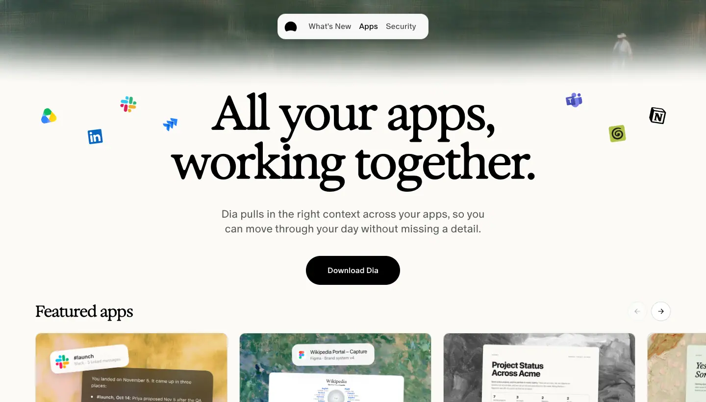
- H1 "All your apps, working together." Exposure 96 / 100, weight 550, −3.84 px,
#000.
- ≈ 12 small app logos float around the headline at different sizes and angles.
- Lead 22 / 30, Oracle 350,
.65. Black pill "Download Dia" (16 px 500, radius 9999, padding 20 × 24).
- A painterly image band (1440 × 557) behind the top.
Why: Scattered logos are the "before" (apps everywhere); the headline is the "after".
5. Photo strip + partner lockup (app pages)
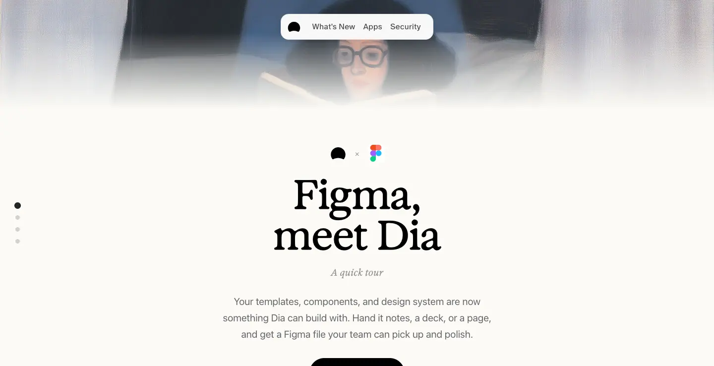
- A 1440 × 220 photographic strip at the top that fades into cream.
- Lockup: Dia mark · × · partner logo, centred.
- H1 "Figma, meet Dia" Exposure 82 / 82, 550, −1.64 px.
- Kicker "A quick tour" Exposure 19 / 31.35 italic,
.40.
- Lead in
-apple-system 20 / 33, colour rgba(60,60,67,.78) (macOS secondary label).
- Left edge: 4 vertical dots (page progress for the 4 chapters below).
Why: "X, meet Dia" is a reusable formula; the template scales to any integration with one photo and one logo swap.
6. Pixel-icon constellation (students)
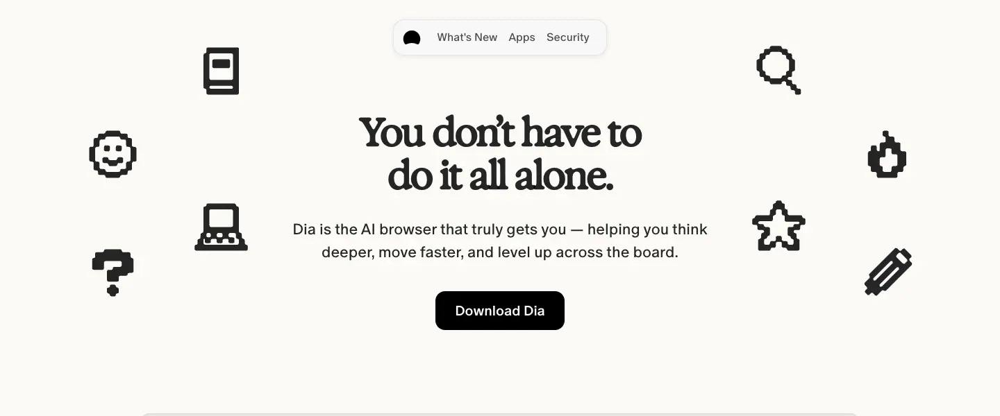
- 10 black 1-bit pixel icons (book, laptop, smiley, question mark, magnifier, flame, star, pencil…) scattered around the headline.
- H1 "You don't have to do it all alone." Exposure 56 / 62, 650, −2.8 px.
- Black pill "Download Dia". Below, a browser frame with tabs from a student's life and four slash-command cards (
/outline, /cite, /flashcards, /job-fit) with 2 px black borders and hard offset shadows.
Why: Heavier serif, pixel art and hard shadows read younger and more playful while keeping Dia's fonts.
7. Tilted postcard + issue eyebrow (release notes, "The Dia Lately")
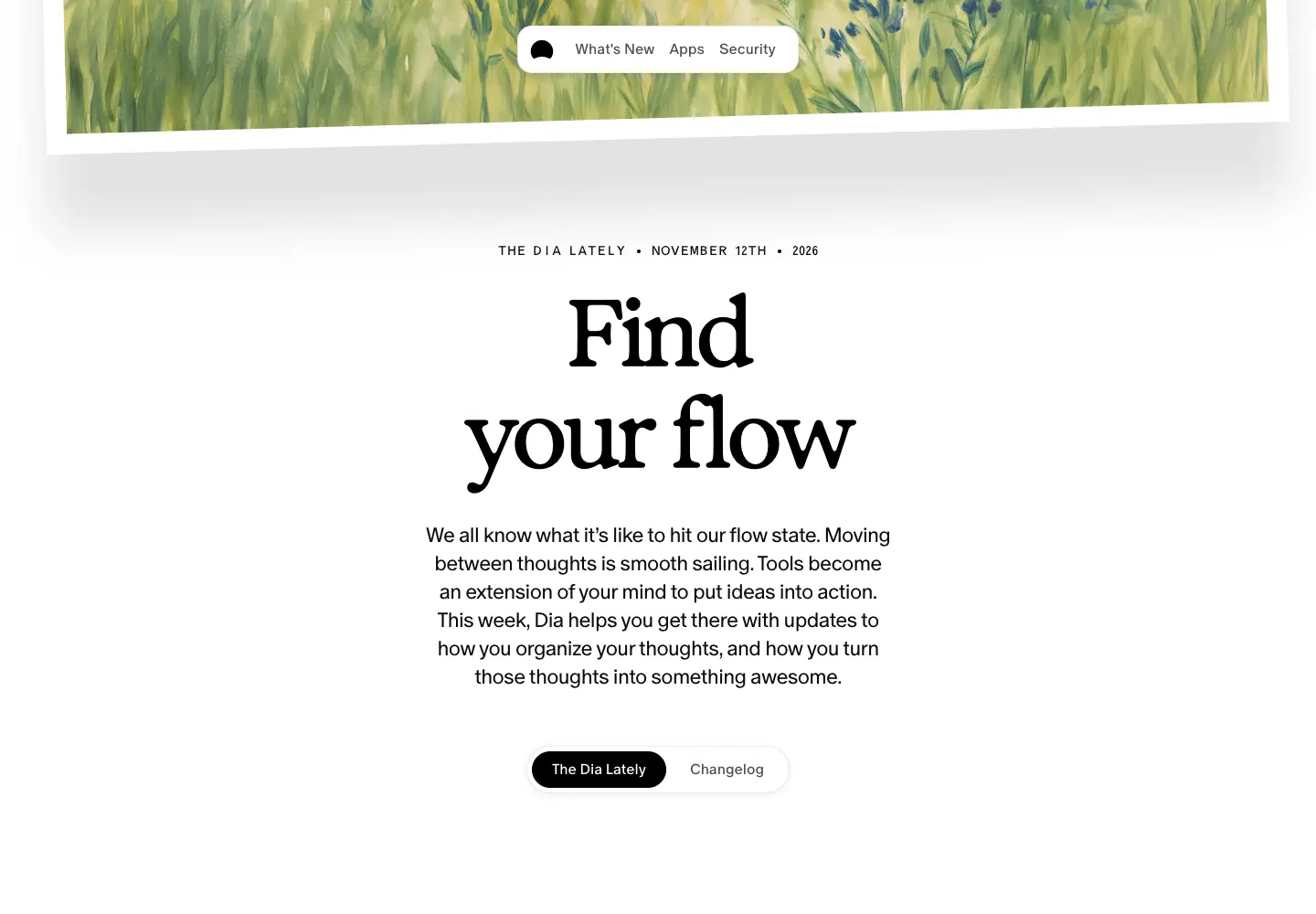
- An oil painting printed on a "postcard": 22 px white border, rotated −1.54°, shadow
0 85px 51px rgba(0,0,0,.11), bleeding off the top.
- Eyebrow "THE DIA LATELY • NOVEMBER 12TH • 2026", Oracle Triple 14 px caps, filled with grain texture.
- H1 Exposure 101.66 / 110.81 (
clamp(48px, 7.06vw, 118px)), 550, −0.05 em, two lines.
- Intro 22.5 / 30.8, Oracle 350, centred, ≈ 40 ch measure.
- Segmented control: "The Dia Lately" (black) | "Changelog" (white), 288 × 52, radius 9999.
Why: Release notes become a personal letter. Painting + postcard + date reads as "news from friends", which lowers the cost of reading a changelog.
8. Masthead + painting (roadmap notes, "Dia Weekly")
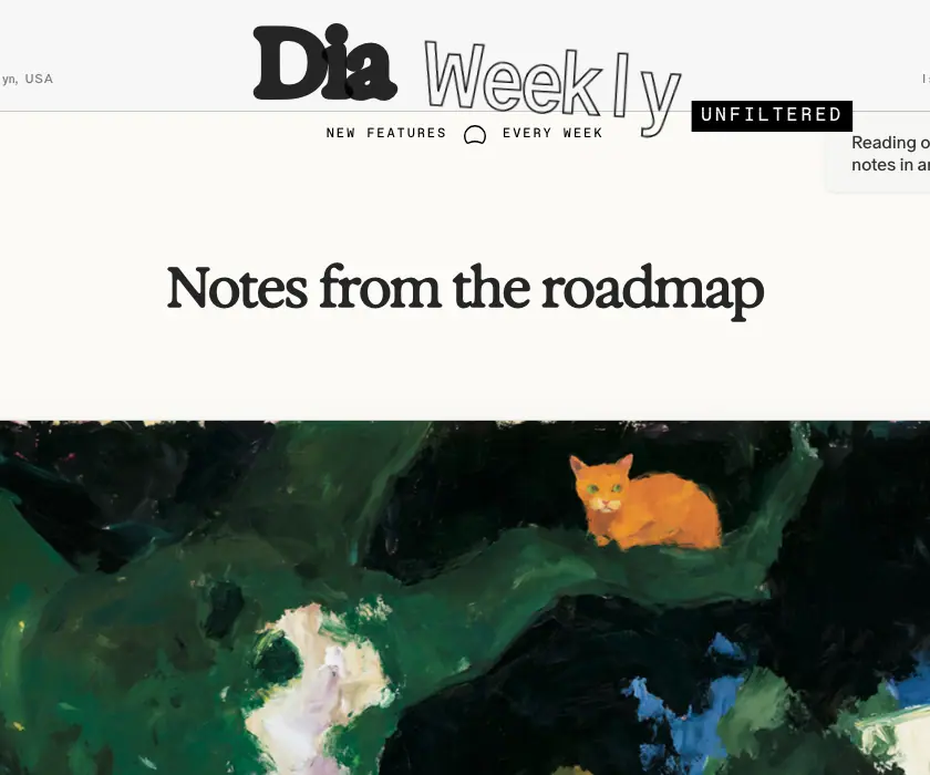
- A newspaper-style top bar: date "July 23, 2026 12:30 PM ET", "Brooklyn, USA", "Issue No." and "App Version" in boxed digits (odometer style), all 12 px Oracle Triple / Quadrant Text Mono.
- Masthead "Dia" (Exposure 81) + "Weekly" (Oracle Triple 81 outline) + "UNFILTERED" black tag (Favorit Mono 17, +2.72 px).
- Floating promo card top-right: "Reading our release notes in another browser? [Try Dia]".
- H1 "Notes from the roadmap" Exposure 50 / 60, 600. Painting with a paper-clip and a second sheet behind it.
Why: A zine costume for informal posts; it sets expectations ("unfiltered") and is funny.
9. Plain sans statement (utility and legal pages)
| Page |
H1 |
Extra |
/windows |
"Dia for Windows" Oracle 300 72/84 |
black pill + Windows product shot ("The Wednesday Brief") |
/download |
"Meet Dia, the AI Browser" Oracle 300 72/84 |
auto-download note |
/earlybirds |
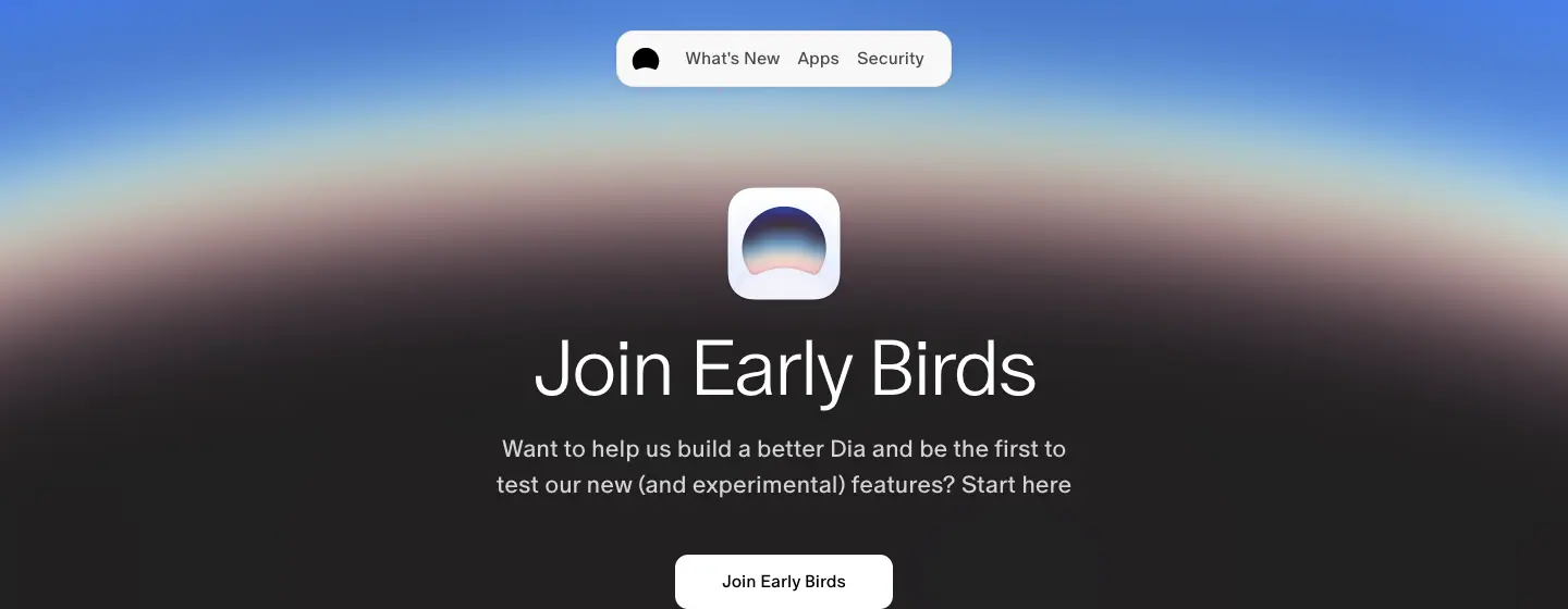
"Join Early Birds" Oracle 300 72/84 white |
dark #1B1B1B page with a blue → pink horizon at top, app-icon tile, white pill |
/privacy, /termsofuse, /security |
Oracle 300 72/72 |
left-aligned, long text |
| 404 |
"404" Oracle 300 72/84 |
"This page could not be found." 22 px |
Why: Pages that inform rather than sell drop the serif. The difference tells the reader what kind of page they are on.
Hero checklist (to copy)
- Nav pill floating 28 px from the top, never a full-width bar.
- One H1, 1–2 lines, centred.
- One supporting sentence in grey (
.60–.65), 18–22 px.
- One black pill; the secondary action is plain text below it.
- One picture that carries all the colour.
- Let the picture overlap or crop the type (wordmark behind window, postcard over the nav) so the hero feels layered, not stacked.
06 · Section types
Fifteen section patterns cover every captured page. Each entry gives where it appears, its anatomy with measured values, and why it is built that way.
1. Sticky scrollytelling list (home)
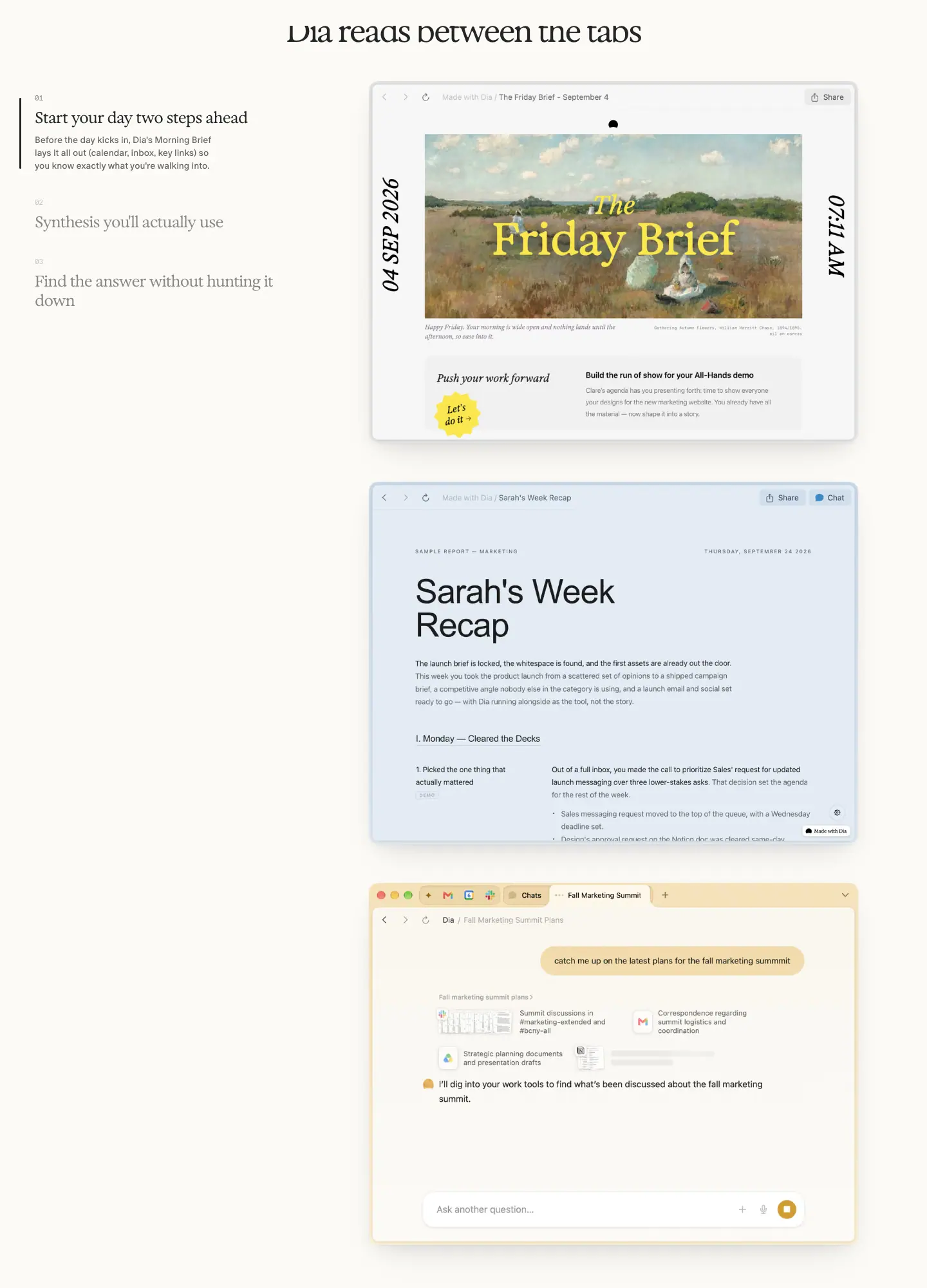
- Where: home, "Dia reads between the tabs".
- Anatomy: centred Exposure title (48/56) → a left rail of 3 numbered items → a right column of 760 × 562 screenshots. The active item has a 2 px black vertical rule on its left, its title in
.85 and a 14 px body paragraph; inactive items show only the title at .45 (Exposure 24/30).
- Step numbers: "01 / 02 / 03" in Favorit Mono 11 px at
.20.
- Behaviour: the list is sticky while the three images scroll past; the active item follows the image in view (measured: at scrollY 1800 item 02 is active and its paragraph is open).
- Why: It replaces three separate feature sections with one continuous demo. The reader never loses the list of what is coming.
2. Checkerboard bento (home)
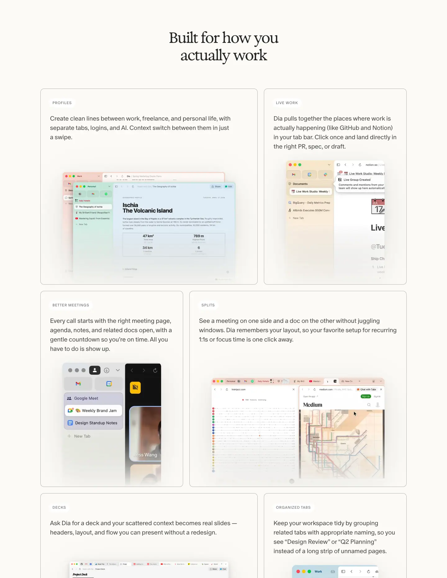
- Where: home, "Built for how you actually work".
- Anatomy: 6 cards on a 10-col grid, 6/4 → 4/6 → 6/4 (700 / 460 px). Each card: radius 12,
1px solid rgba(0,0,0,.3), transparent background. Top-left label pill (white, radius 20, 30 px tall, Oracle 12 px caps +0.72px, .55), 20/30 Oracle 350 copy at .70, then a product screenshot that bleeds off the bottom edge.
- Why: Alternating widths keep a 6-item grid from looking like a table. Labels in caps ("PROFILES", "SPLITS", "DECKS") act like tabs in the product.
3. Framed manifesto with chip marquee (home privacy)
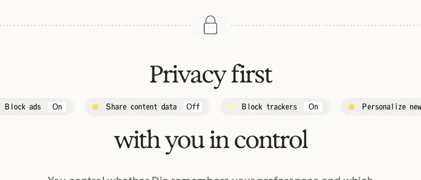
- Where: home, "Privacy first / with you in control".
- Anatomy: a 1180 × 600 dashed-border frame (SVG
dashed-border-svg) with a lock icon cut into the top edge. The title is split into two lines with a horizontal marquee of toggle chips running between them: "Memory On", "Block ads On", "Share content data Off", "Block trackers On", "Personalize new chats Off". Each chip: 35 px tall, radius 20, rgba(235,235,235,.7), Oracle Triple 16 px, a coloured dot (yellow #FFDC5C or lime #F2FCB3) and an inset white "On/Off" tag. Body 22/30 at .60. Button "Learn more about privacy in Dia →" 306 × 35, #EFEFEF, radius 20.
- Why: Privacy claims are boring; settings toggles are concrete. The marquee says "you control dozens of these" without a list.
4. Closing line (home)
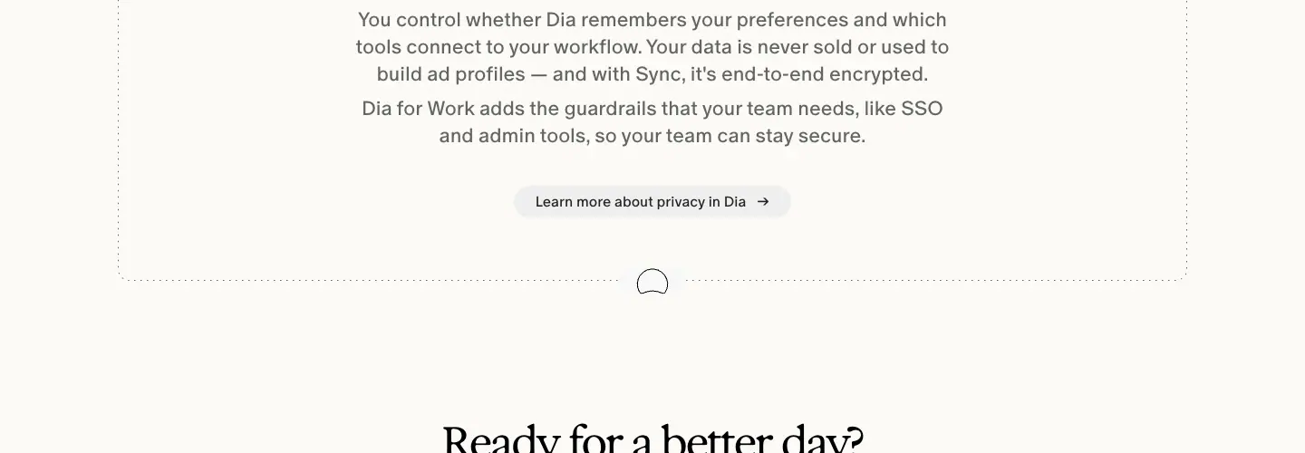
- Where: home, "Ready for a better day?".
- Anatomy: one Exposure 48/56 line, 150 px above and 100 px below; no button in the section because the docked CTA is already on screen.
- Why: The sticky CTA does the work; the section only asks the question.
5. Elevated-centre pricing (plans)
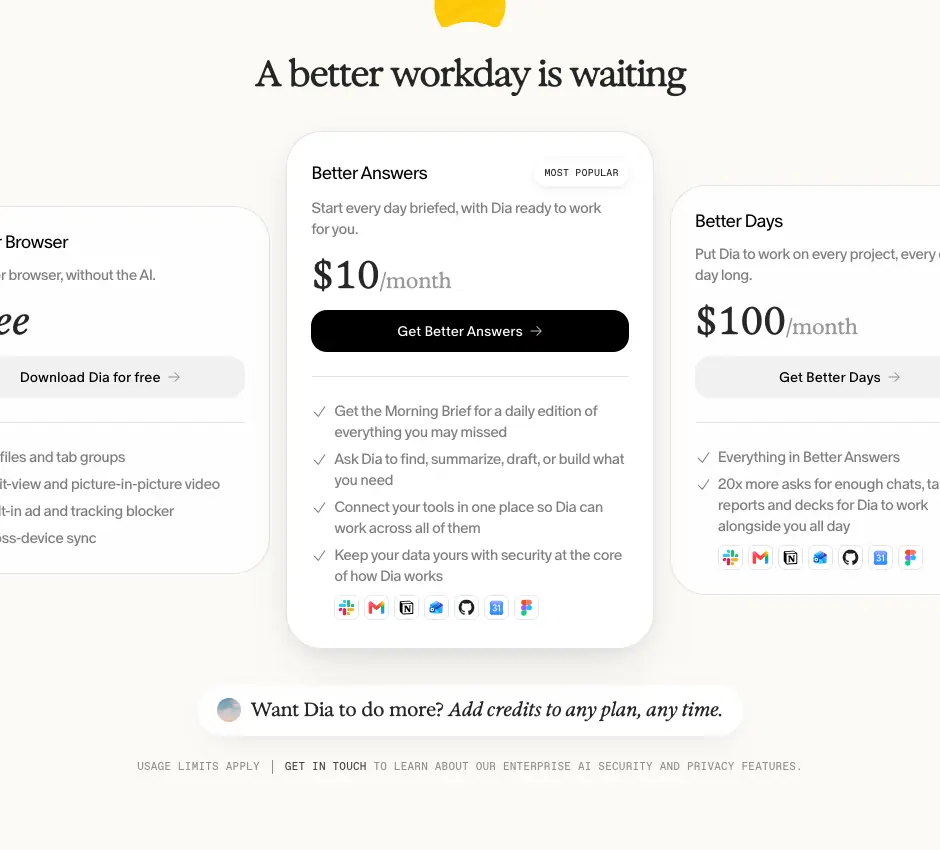
- Cards: 3 cards, radius 36,
1px rgba(0,0,0,.1). Side cards 340 × 368, rgba(255,255,255,.75), no shadow, padding 24. Centre card 367 × 518, solid white, padding 28 × 24, shadow 0 4px 12px rgba(0,0,0,.04), 0 20px 48px -16px rgba(0,0,0,.14), badge "MOST POPULAR".
- Inside: name (Oracle 18 / 350), one-line pitch (15 / 21,
.50), price (Exposure Variable 38 + "/month" 21 at .40), full-width button (42 px, radius 16, black for the popular plan, rgba(0,0,0,.05) otherwise), check list (15 / 23.25), row of app logos.
- Why: The centre card is taller, whiter and shadowed, so the eye lands on the plan they want you to buy.
6. Grouped FAQ accordion (plans, for work, security, students)
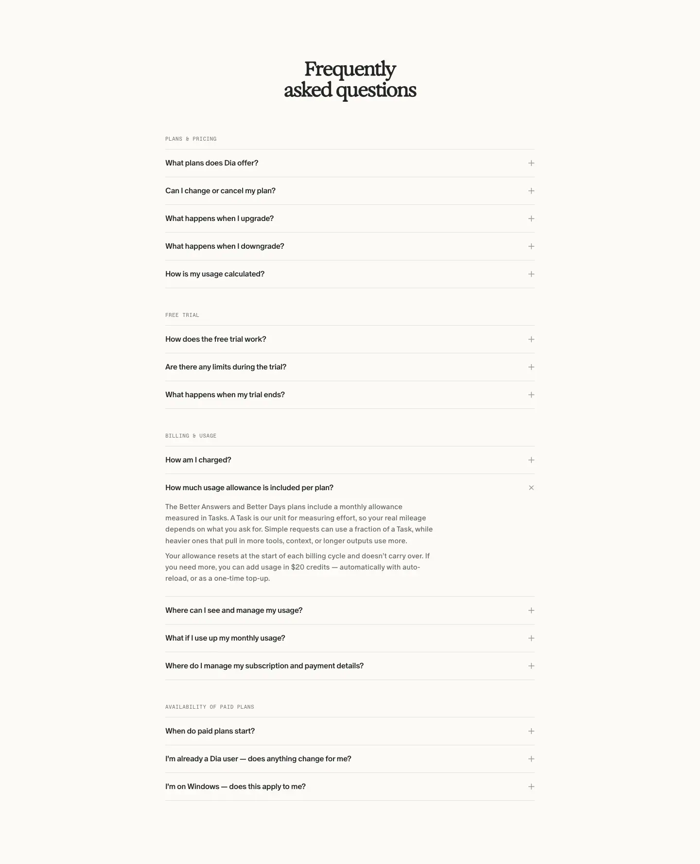
- Anatomy: 760 px column. Group labels in Favorit Mono 11 px caps
.50 ("PLANS & PRICING", "FREE TRIAL", "BILLING & USAGE"). Rows: min-height 56, padding 16 × 0, Oracle 16 / 500, + icon, bottom border 1px rgba(0,0,0,.1).
- Motion: opens by animating
grid-template-rows over 400 ms cubic-bezier(0.76,0,0.24,1) (an ease-in-out-quart), so height animates without measuring.
- Why: FAQs carry objections (SOC 2, MDM, SSO, data training) for buyers; the calm list keeps them from looking like a legal wall.
7. Featured carousel (apps)
- 6 horizontally scrolling cards (≈ 366 px tall) with an image, an app name in Oracle 14 / 350, a title in Exposure 24 / 28 / 550 ("Keep your team in sync"), and arrows top-right.
- Cards:
#FBFAF6, 1px rgba(0,0,0,.15), radius 12.
8. App directory grid (apps)
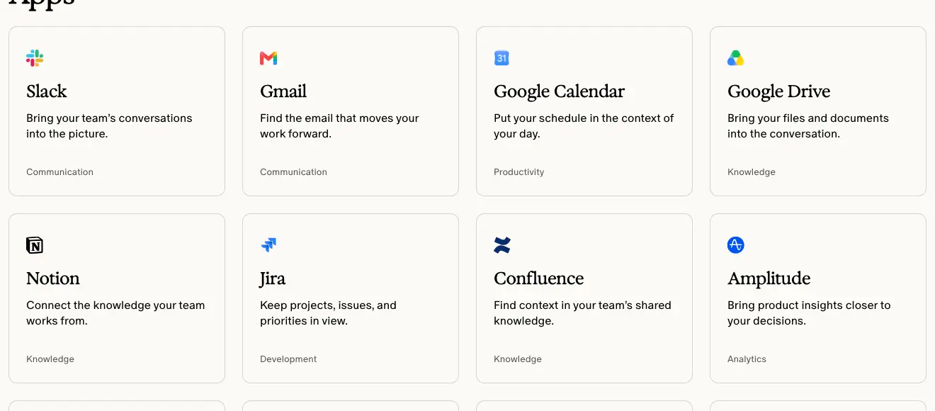
- 4 columns of cards: logo 16 px, name Exposure 24 / 30 / 550, description Oracle 16 / 22 / 350, category label Oracle 13 / 18 at
.65 ("Communication", "Knowledge").
- 18 apps: Slack, Gmail, Google Calendar, Google Drive, Notion, Jira, Confluence, Amplitude, Granola, Loom, GitHub, LinkedIn, Linear, Figma, Teams, Outlook, SharePoint, Zoom.
- Why: A directory should be scannable; equal cards and one category word per card do that.
9. App-tour chapter (app pages)
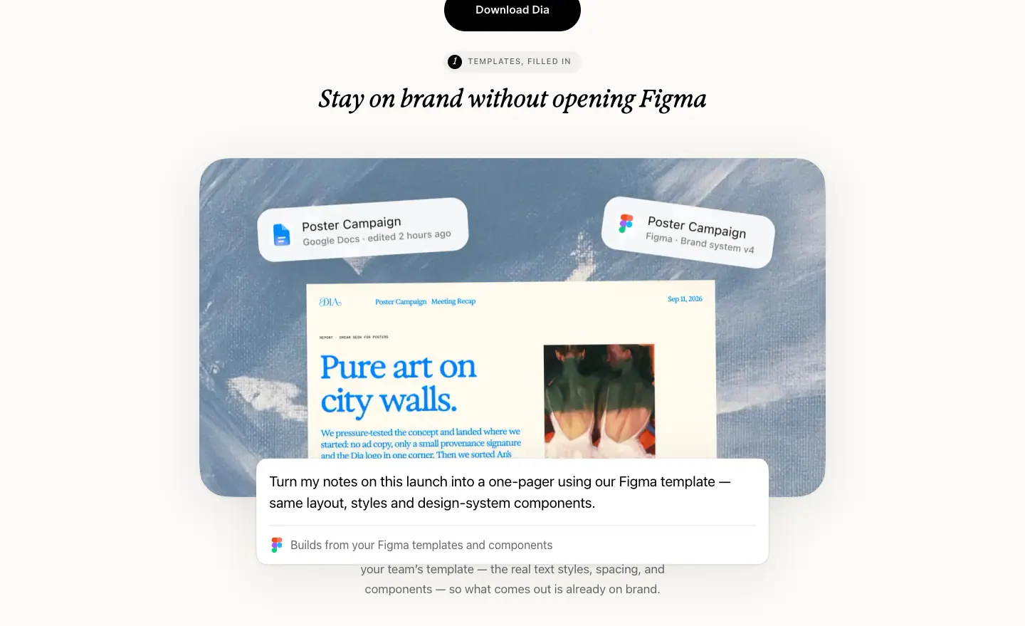
- Anatomy: small numbered tag ("1 TEMPLATES, FILLED IN", 11 px caps,
-apple-system), H2 Exposure 34 / 38, then an 880 × 476 painterly photo with floating UI cards (radius 16–40) and a prompt card showing what the user typed (-apple-system 20 / 30) with a blinking caret (app-tour-caret-blink, 1.1 s linear).
- Hover on the prompt card:
translateY(-2px) plus --filter-shadow-lift.
- The chapter repeats 4 times. A left-edge dot pager tracks the chapter.
- Close: a grey strip "That's Figma in Dia." (Exposure 23 italic) and a black pill.
- Why: Showing the exact prompt makes the AI feature concrete and copyable.
10. Thought-partner tabs + video (students)
- A black list of roles ("A tutor", "A study buddy", "A writing coach", "A coding partner"), each with a pixel icon, next to a 9:16 video of a lecture with Dia beside it.
- Why: Roles are easier to imagine than features.
11. Gradient-framed carousel (students "Skills")
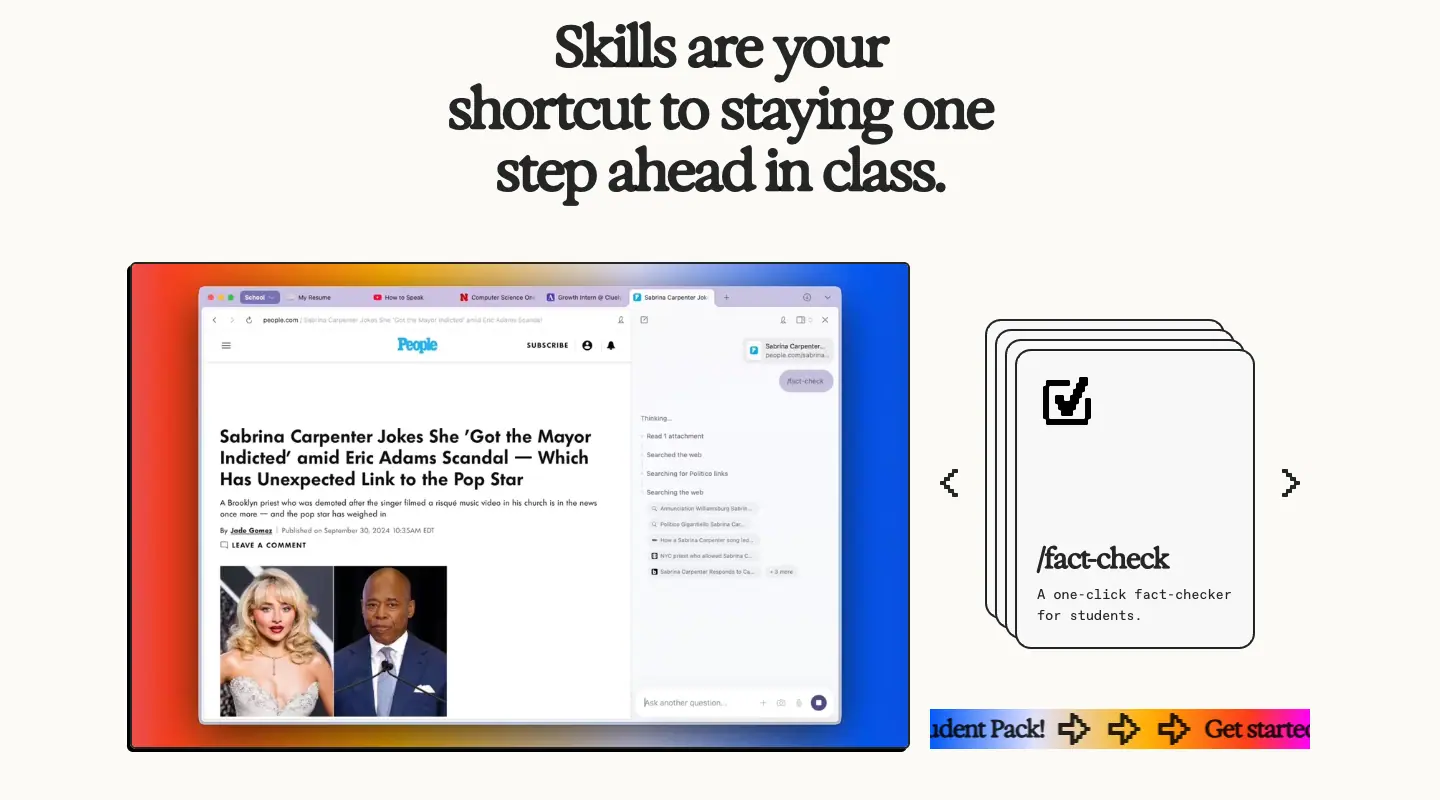
- A product screenshot framed by
--student-gradient, a stack of skill cards (/fact-check) with 2 px black borders and hard offset shadows (-3px 3px 0 #000, -6px 6px 0 #000), arrows, and a gradient marquee strip "Student Pack! → Get started".
12. Release-note story block (release notes)
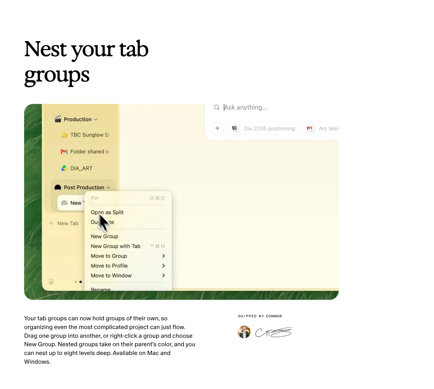
- H2 Exposure 70 / 84 left, 1044 × 650 product image (or video) on the grid, body 20 / 28.8 Oracle 350 in a 335 px side column, and a "SHIPPED BY CONNOR" credit (Oracle Triple 12 px caps, grain-filled) with an avatar.
- Secondary stories ("Fill in the blanks") drop to Exposure 41.76 / 50.11 with a 571 × 387 image.
13. "What else is new" rows + Past issues (release notes)
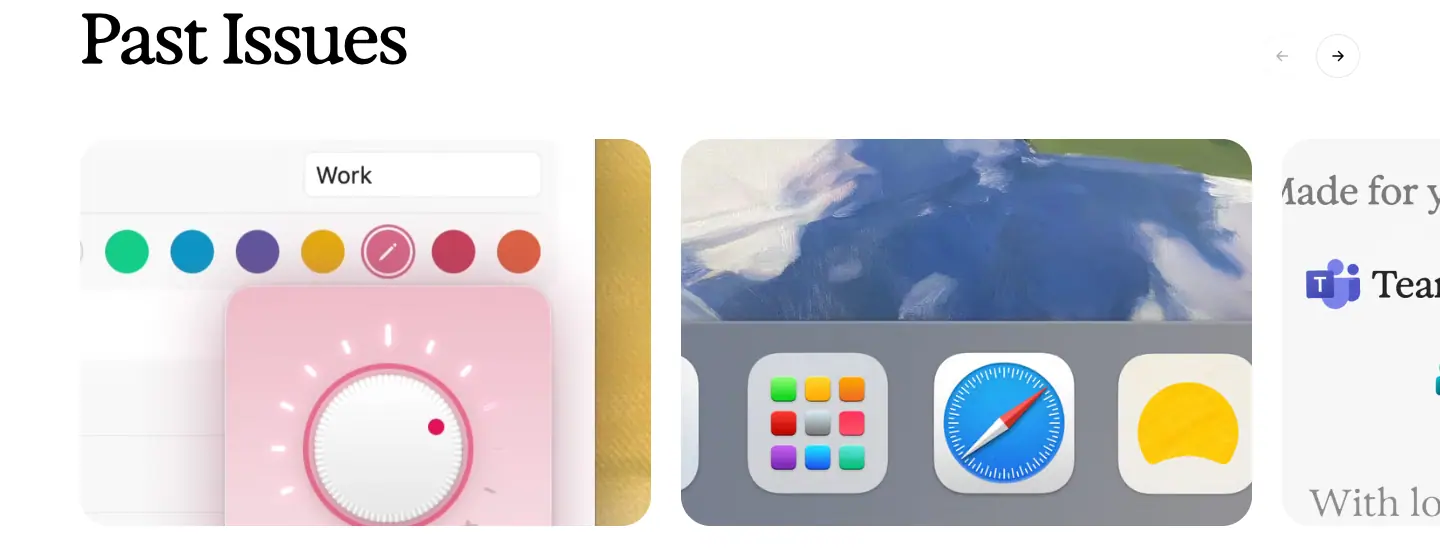
- Rows: a 25 / 34 Oracle 350 title on the left ("Toasts have been buttered."), 18 / 24.66 body on the right with a "Shipped by" credit.
- Past Issues: horizontal cards with the issue's painting, date/version in caps, and title Oracle 39 / 45.63. Arrow buttons top-right.
- Why: Rows let small fixes ship with personality; the carousel builds a back catalogue like a magazine archive.
14. Changelog entry (changelog)
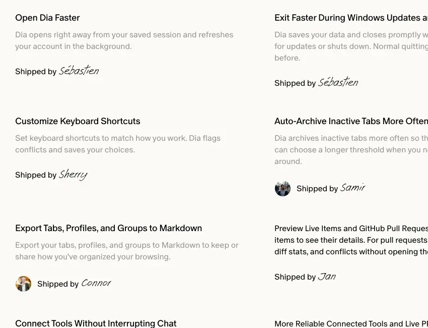
- Date (14 px
.50), H1/H2 Exposure 44 / 49.72 / 550, platform tag ("Windows" with logo) and version tag ("v1.7.0") as outlined pills in Oracle Triple, an italic summary, then items in 2 × 442 px columns: title Oracle 18 / 23 / 400, body 16 / 23 / 350 at rgba(0,0,0,.4), "Shipped by Name" with Ammer Handwriting 36 px.
- Why: A credit line per item makes a dry list feel human and shows how many people ship.
15. Three-step cards on dark (Early Birds)
- "Here's how it works:" (Oracle 34 / 37 300,
rgba(255,255,255,.8)) then 3 cards rgba(170,170,170,.1) with an icon and one sentence each.
Footer (every page)
See Header and footer.
07 · Copywriting and voice
Dia writes like a friendly colleague, not like an AI company. The copy sells days, not features: "a better workday", "better days at work", "Ready for a better day?".
1. Voice in four traits
| Trait |
Evidence |
Why it works |
| Outcome first |
"More than a browser. A better workday." · "A better workday is waiting" · Plan names "Better Browser / Better Answers / Better Days" |
Buyers of a browser compare features; Dia changes the comparison to "how does my day feel". |
| Plain, warm verbs |
"Start your day two steps ahead" · "Find the answer without hunting it down" · "All you have to do is show up." |
Short Anglo-Saxon verbs (start, find, show up) feel human next to "AI". |
| Light humour |
"Toasts have been buttered." · "Features so good, they feel illegal" · "Dial up the decor" · "UNFILTERED" |
Jokes live in release notes and the Students page, where the reader is already a fan. |
| Specific nouns |
"the right PR, spec, or doc" · "Design Review" or "Q2 Planning" · "GSuite, Teams, tabs" |
Concrete nouns prove the AI understands real work. |
2. Headline formulas
| Formula |
Examples |
| "More than X. A better Y." (reframe) |
"More than a browser. A better workday." |
| "Dia [verb]s between the tabs" (tagline) |
"Dia reads between the tabs" (also in meta titles: "the browser that reads between the tabs") |
| "X, meet Dia" (integration) |
"Figma, meet Dia" · "Notion, meet Dia" |
| "Built for how you actually work" (empathy) |
home bento title; note the conversational "actually" |
| Benefit + object |
"Stay on brand without opening Figma" · "Turn any conversation into a clean spec" · "See where every project stands" |
| "Your ___, connected" (series) |
"Your designs, connected" · "Your knowledge, connected" |
| Short contrast pair |
"Less searching. More doing." · "Privacy first / with you in control" |
| Question CTA |
"Ready for a better day?" · "Want Dia to do more?" |
| Release-note titles as moods |
"Find your flow" · "Make yourself at home" · "Crafted with care, because you spend your day here." |
| Changelog titles as pairs |
"Faster starts, tidier tabs" · "A more organized, connected Dia" · "Bring your files, organize your tabs" |
Length: Hero H1s are 4–7 words. Section titles 4–6 words. Changelog titles 3–6 words.
3. Body copy
- One idea per sentence, 15–25 words, often with a concrete example in brackets: "Dia's Morning Brief lays it all out (calendar, inbox, key links) so you know exactly what you're walking into."
- Second person throughout ("you", "your day").
- Paragraphs end on a small payoff: "…with a gentle countdown so you're on time. All you have to do is show up."
- The em dash is common: "Ask Dia for a deck and your scattered context becomes real slides — headers, layout, and flow…"
4. Labels and microcopy
| Element |
Copy |
Style |
| Primary CTA |
"Download Dia for free ↓" / "Download Dia" |
verb + product, arrow shows the action |
| Under CTA |
"Available for macOS and Windows" |
removes the main objection in 5 words |
| Plan CTAs |
"Get Better Answers →" · "Get Better Days →" |
repeats the plan name |
| Bento labels |
PROFILES · LIVE WORK · BETTER MEETINGS · SPLITS · DECKS · ORGANIZED TABS |
1–2 word caps nouns = product feature names |
| Toggle chips |
"Memory On" · "Block ads On" · "Share content data Off" |
literal settings strings |
| Badge |
MOST POPULAR |
standard |
| Kicker |
"A quick tour" |
italic, low-key |
| Footer |
FOR WORK · RELEASE NOTES · CHANGELOG · WINDOWS · HELP · STATUS · PRIVACY · TERMS OF USE · SECURITY · TRUST CENTER · ABOUT US · CAREERS · NEWSLETTER · EARLY BIRDS PROGRAM |
all caps mono |
| Credit |
"Shipped by Sébastien" |
on every changelog item |
| Sign-off |
"DESIGNED AND BUILT BY THE BROWSER COMPANY OF NEW YORK" |
footer, mono caps |
| 404 |
"This page could not be found." |
plain, no joke |
5. Meta descriptions (SEO voice)
- Home: "Dia is the browser for better days at work. Get answers without having to ask, produce beautiful ready-to-share outputs, and stay focused in the best browser for your work day."
- Apps: "Dia pulls in the right context across your apps, so you can move through your day without missing a detail."
- Figma: "Your templates, components, and design system are now something Dia can build with. Hand it notes, a deck, or a page, and get a Figma file your team can pick up and polish."
- Utility pages reuse: "Dia — the browser that reads between the tabs."
6. Audience costumes
| Audience |
Voice shift |
Work buyers (/forwork, /security) |
FAQ questions in the buyer's words: "Is Dia SOC 2 compliant?", "Does Dia support enterprise MDM controls?", "Does Dia or its AI systems train on corporate data?" |
| Students |
Louder and funnier: "You don't have to do it all alone.", "The smartest thing you can open this semester.", slash commands /fact-check, /budget-buddy |
| Fans (release notes) |
Letter tone, puns, names of the people who shipped |
7. Rules to copy
- Sell the day, not the model.
- Use one tagline everywhere ("reads between the tabs").
- Write UI labels exactly as the product shows them.
- Credit people by name where it fits.
- Keep humour for owned audiences (changelog, students), not for the hero.
08 · Components
All values measured at 1440 × 900 with getComputedStyle.
1. Floating nav pill

| Property |
Value |
| Wrapper |
position: fixed; top: 28px; left: 10px; right: 10px; z-index: 10 (mobile top: 14px) |
| Pill box |
307 × 52 at x 566 (centred) |
| Background |
#F8F8F8 + backdrop-filter: blur(12px) |
| Border |
1px solid rgba(0,0,0,.08) |
| Radius |
16 px |
| Shadow |
0 2px 8px rgba(0,0,0,.06), 0 0 2px rgba(0,0,0,.04) |
| Padding |
0 24px 0 6px (logo tile on the left sits 6 px from the edge) |
| Links |
"What's New", "Apps", "Security" — ABC Oracle 16 / 20, 400, #000, 16 px gap |
| Logo |
Dia's black dome mark, ≈ 40 × 40 tile |
Why: Three links only. A floating pill feels like a browser toolbar and leaves the hero photo uninterrupted from edge to edge.
2. Primary CTA pill (hero "sunrise" pill)


| State |
Measured |
| Rest |
443 × 56, #000, text #F8F8F8 ABC Oracle 20 px 350, radius 9999, no shadow |
| Hover |
452 × 57 (scale ≈ 1.02), shadow inset 0 1px 0 rgba(255,255,255,.18), 0 2px 4px rgba(0,0,0,.16), 0 18px 40px -10px rgba(0,0,0,.34) |
| Transition |
transform 220ms cubic-bezier(.22,1,.36,1), box-shadow 420ms cubic-bezier(.22,1,.36,1) |
| Loading |
renders grey (disabled) for ≈ 1 s before the OS is detected (frame home-load-t0) |
| Docked |
377 × 48 at the bottom of the viewport after scrollY ≈ 300 |
| Focus |
focus-visible:ring-2 ring-black ring-offset-2 |
3. Standard buttons
| Variant |
Size |
Fill |
Text |
Radius |
Hover |
| Black pill (apps, app pages) |
h 59 incl. padding 20 × 24 |
#000 |
#F8F8F8 Oracle 16 / 500 |
9999 |
rgb(66,66,66) or opacity .80 |
| Plan primary |
h 42, padding 0 24 |
#000 |
#FFF 14 px |
16 |
.button--primary: inset glow 0 0 7.8px 2px rgba(255,255,255,.5) |
| Plan secondary |
h 42 |
rgba(0,0,0,.05) |
#000 14 px |
16 |
rgba(0,0,0,.12) (--fill-secondary-hover) |
| Grey link button |
h 35, padding 0 24 |
#EFEFEF |
.85 16 px |
20 |
colour shift 300 ms |
| Segmented tabs |
wrap 288 × 52, padding 5; tab h 40, padding 0 22 |
wrap #FFF + 1px rgba(0,0,0,.08); active #000 |
active #FFF |
9999 |
— |
| Top-right dock |
176 × 48 |
#F8F8F8 |
black, Apple logo + "Download Dia" |
16 |
— |
| Students outline |
h 40 |
transparent, 2px solid .85 + hard shadow |
Exposure 24 / 650 |
8–16 |
shadow grows |
4. Cards
| Card |
Size |
Surface |
Border |
Radius |
Shadow |
| Home bento |
700 / 460 × 631 |
transparent |
1px rgba(0,0,0,.3) |
12 |
none |
| Bento label pill |
auto × 30 |
#FFF |
none |
20 |
none |
| Apps featured |
≈ 366 tall |
#FBFAF6 |
1px rgba(0,0,0,.15) |
12 |
none |
| Apps directory |
≈ 280 × 200 |
#FBFAF6 |
1px rgba(0,0,0,.15) |
12 |
none |
| Plans popular |
367 × 518 |
#FFF |
1px rgba(0,0,0,.1) |
36 |
0 4px 12px .04, 0 20px 48px -16px .14 |
| Plans side |
340 × 368 |
rgba(255,255,255,.75) |
1px rgba(0,0,0,.1) |
36 |
none |
| Release postcard |
1382 × 890 |
#FFF |
22px solid #FFF |
0 |
0 85px 51px rgba(0,0,0,.11), rotate(-1.54deg) |
| Students skill card |
— |
#F8F8F8 |
2px solid rgba(0,0,0,.85) |
8 / 16 |
-3px 3px 0 #000 or -6px 6px 0 #000 |
| Early Birds step |
— |
rgba(170,170,170,.1) |
none |
≈ 12 |
none |
5. Chips and tags
| Chip |
Spec |
| Toggle chip (privacy) |
35 px, radius 20, padding 0 16, gap 14, rgba(235,235,235,.7), Oracle Triple 16, dot + white "On/Off" tag |
| Badge MOST POPULAR |
94 × 26, rgba(255,255,255,.95), padding 6 × 10, Favorit Mono 10 caps, shadow 0 2px 8px rgba(0,0,0,.08) |
| Changelog tags |
outlined pills: platform (logo + "Windows") and version ("v1.7.0"), Oracle Triple 12–14 px, 1px border, radius 9999 |
| Credits pill (plans) |
white pill with avatar dot: "Want Dia to do more? Add credits…" |
6. Accordion (FAQ)
- Row: min-height 56, padding 16 × 0, gap 24, question Oracle 16 / 500 at
.85, + icon on the left (for-work) or right (plans).
- Divider:
border-bottom: 1px solid rgba(0,0,0,.1).
- Open/close:
grid-template-rows 400 ms cubic-bezier(.76,0,.24,1); icon transform, opacity 300 ms cubic-bezier(0,0,.2,1).
7. Product window frame
- macOS traffic lights, sidebar with tab list, URL bar ("Made with Dia / The Friday Brief - September 4"), "Share" button.
- Radius 16 (hero video) or 12 (stills), soft shadows from the screenshot itself (baked in), not CSS.
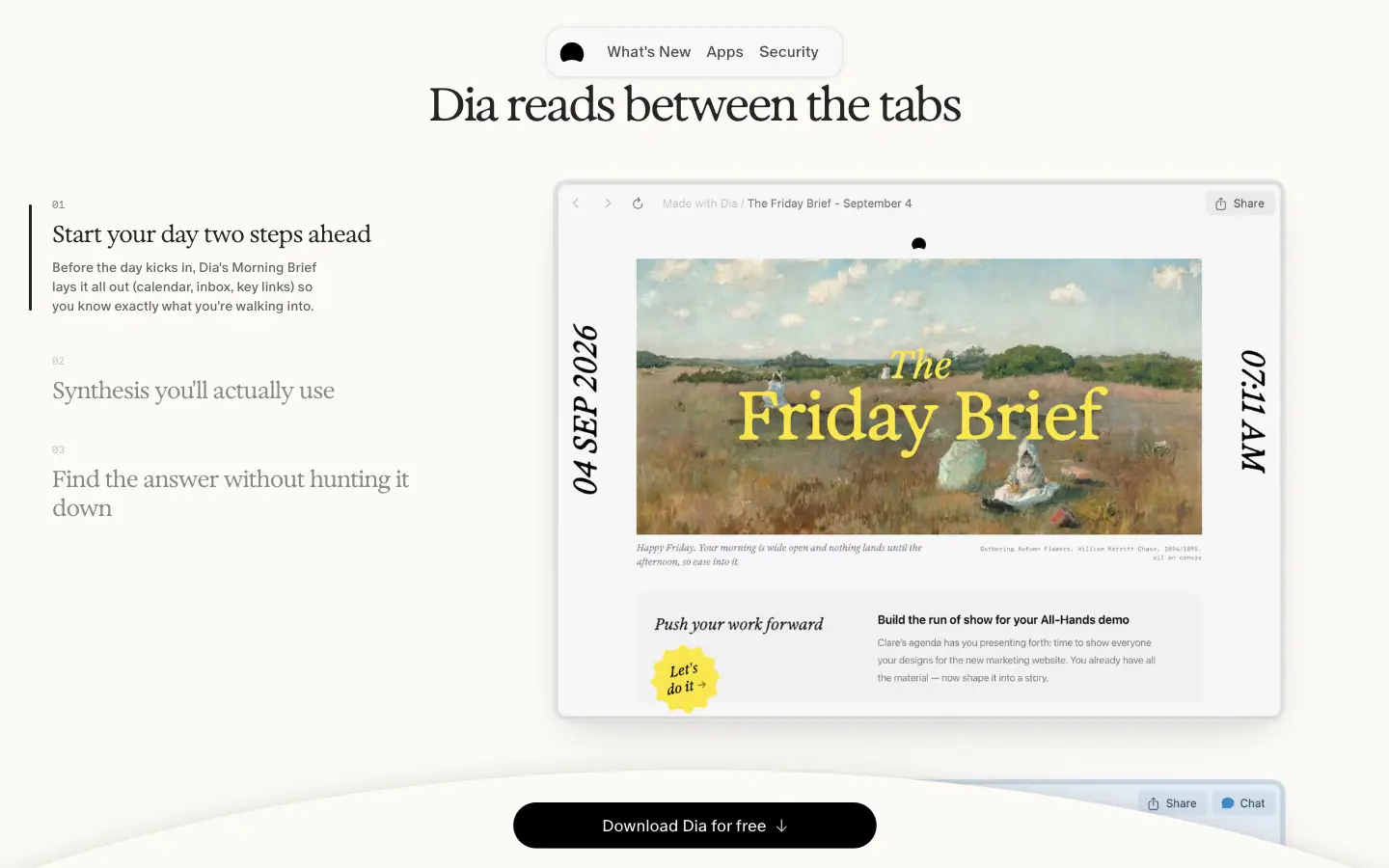
- Content is designed: the "Friday Brief" uses a painting, a serif masthead, vertical date "04 SEP 2026" and time "07:11 AM".
8. Carousel controls
- Small circular arrow buttons (≈ 28 px) top-right of the carousel ("Featured apps", "Past Issues"),
1px border, white.
- Release-note "Past Issues" cards are full links whose text includes "NOVEMBER 5TH V1.56.0 NO. 44" plus the title.
9. Footer
See Header and footer: 4 Favorit Mono columns, round company seal, sign-off line.
10. Mobile menu
- Full-screen overlay. Links in ABC Oracle 72 px Light at
opacity .30, hover/active 1.0, transition-opacity 200ms.
- Items enter with
opacity 0 → 1 and filter: blur(5px) → 0 (inline styles set by JS).
09 · Art direction
Dia's art direction can be summed up as "sunlight, paint and paper": warm natural light, painterly imagery, and printed-object metaphors (postcards, newspapers, seals), with crisp product UI placed on top. The UI chrome stays monochrome so the art can be loud.
1. Mood words
Morning · sunlit · domestic · editorial · hand-made · calm · optimistic · New York studio.
2. Photography: dappled light
- Subject: no people, no objects. Only light through leaves on a warm yellow surface (
leaf-shadows-tinted.webp). Sampled colours: #FFCB30 in the light, #DAA61C in the shadow.
- Treatment: tinted toward yellow, soft focus, high key. A WebGL canvas sits over it and animates the light (frames at t = 0 s, 1 s, 3 s show the shadows shifting).
- Why: Dappled sunlight is a universal "good morning" signal. It gives the brand a colour (yellow) without a logo colour, and it moves, so the page feels alive with zero UI animation.
- Rule: photography carries atmosphere, never product claims.
3. Painting: plein-air and expressive oils
- Where: release-note headers (grass and meadow), roadmap notes (dark garden, children, an orange cat), the "Friday Brief" mock (landscape with a figure), app-page backdrops.
- Style: loose brushwork, visible texture, natural palettes (greens, ochres, sky blue), mostly figurative.
- Treatment: printed on a white-bordered postcard (22 px border, −1.54° tilt, long soft shadow), or clipped with a paper clip on a sheet.
- Why: Paintings say "craft" and "taste". They separate Dia from the gradient-blob look of most AI products and suit a company that calls its notes "The Dia Lately".
4. Painterly photo backdrops for UI
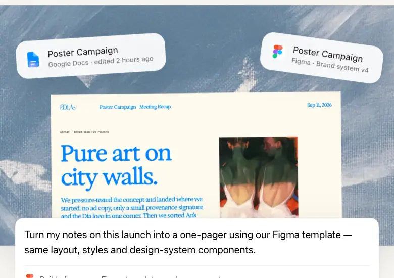
- Where:
/apps/figma, /apps/notion, /apps featured cards.
- Style: a photo or painting (blue poster wall, orange dusk, field, sunset), slightly blurred, with UI cards floating on it: file chips ("Poster Campaign — Google Docs · edited 2 hours ago"), a document, a prompt card.
- Why: The backdrop gives each chapter its own colour so four similar chapters do not blur together. The UI floats, so the product reads as light and layered.
5. Product screenshots
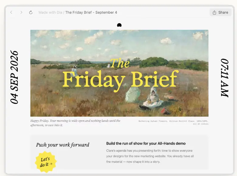
- Always believable content: "The Tuesday Brief", "Prep for my CMO 1:1", "Launch handoff", "Sarah's Week Recap", "Fall Marketing Summit".
- Designed outputs inside the product: the Morning Brief uses a painting, a serif masthead and vertical date/time ("04 SEP 2026", "07:11 AM") — the product's own outputs follow the brand's editorial look.
- Frame: real macOS window chrome, 12–16 px radius, soft baked shadow, light content (cream sidebars, white pages).
- Why: The screenshots prove the promise ("beautiful ready-to-share outputs" from the meta description).
6. Iconography
| Set |
Style |
Where |
| Dia mark |
solid black dome/arch, rounded |
nav pill, lockups, favicon |
| App logos |
full-colour vendor marks at 16–24 px |
apps grid, plan cards, apps hero |
| UI line icons |
thin, 1–1.5 px stroke, rounded (lock, arrows, plus) |
privacy frame, accordions |
| Pixel icons |
1-bit black pixel art (book, laptop, smiley, question, magnifier, flame, star, pencil) |
/students |
| Emoji |
used in content only ("Dia 🤝 Notion") |
release-note issue titles |
7. Logo and wordmark usage (as seen)
- Hero wordmark: "DIA" in a swash display serif, white, 763 × 284 px SVG paths (
fill: currentColor). It is cropped by the product window, which overlaps its lower third. It is drawn, not typeset: no font for it is loaded.
- Masthead wordmark: "Dia" in a heavy serif next to "Weekly" (outline mono) on roadmap notes.
- Mark: the black dome on a light tile in the nav pill; paired with partner logos as "Dia × Figma".
- Company seal: round "THE BROWSER COMPANY OF NY" seal with a globe in the footer (black line art).

8. Texture
- Grain: an inline SVG
feTurbulence noise tile (120 × 120) used as background-image with transparent text colour, so eyebrow text is "printed" with grain ("THE DIA LATELY • …").
- Paper: cream page, white postcards, paper clips, dashed frame on the privacy section.
9. Colour in art
- Home: yellow.
- Plans: cream + one yellow sun glyph.
- For work: sunrise peach → lilac.
- Apps / app pages: a different painted colour per chapter.
- Students: the
--student-gradient (magenta → red → orange → lavender → blue) and black.
- Early Birds: night sky horizon (blue → pink → black).
- Release notes: painting greens and earth tones on pure white.
Rule: one dominant art colour per page; UI stays black and cream.
10. How to brief an illustrator or photographer
- "Morning light on a warm surface, no subject, leaves casting soft shadows, yellow-gold, high key, 3:2, shot for a 1440 × 900 crop."
- "Loose plein-air oil painting, natural palette, visible brushwork, figurative but calm; deliver flat scans for postcard treatment."
- "1-bit pixel icons, 16 × 16 grid scaled ×4, black only, school objects."
- Product shots: "Real-looking content for a named person's day; outputs styled as editorial documents."
10 · Brand assets and graphics inventory
Every distinct graphic type found on the captured pages. All crops are PNGs cut from the 1440-wide screenshots in images/full/; nothing was downloaded from the site's asset folders and no SVG was fetched.
1. Core identity
| Asset |
Crop |
Made with |
How to recreate |
| Hero "DIA" wordmark |
|
inline SVG, 763 × 284, fill: currentColor |
Draw custom swash letters in a high-contrast serif (start from Exposure or Fraunces 900, add swash terminals by hand), export as one path; colour with currentColor so it can flip white/black |
| Nav pill with mark |
|
HTML/CSS + mark |
see 08 Components §1 |
| Company seal |
|
raster/vector line art in the footer |
circular type on a path around a globe, single black line weight |
2. Atmosphere
| Asset |
Crop |
Made with |
How to recreate |
| Sunlit hero |
|
leaf-shadows-tinted.webp (1440 × 900) + WebGL2 canvas + <video> |
Photograph or render leaf shadows (gobo light) on a yellow board; tint to #FFCB30; add a slow displacement shader or a 10 s looping video of moving shadows |
| Cream "hill" with docked CTA |
 |
an elliptical mask at the bottom of the hero |
clip-path: ellipse(75% 100% at 50% 100%) on a cream block, or an SVG arc; place the sticky CTA on it |
| Sunrise glow (for work) |
|
blurred image band |
radial gradients (#FFC9A0, #E9D2FF, white) with filter: blur(60px) |
| Early Birds horizon |
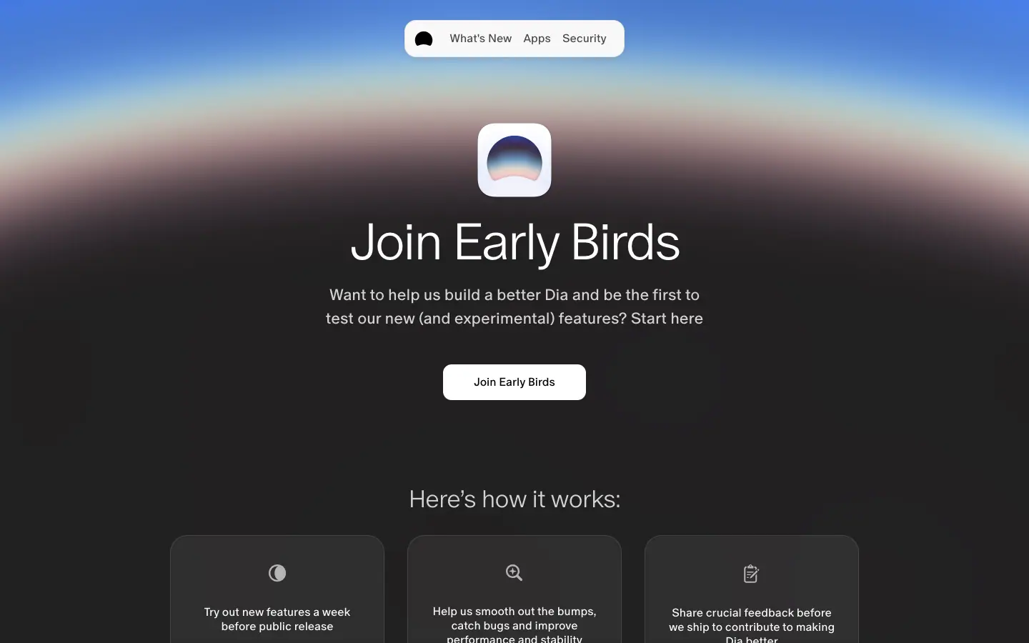 |
image band on #1B1B1B |
radial-gradient(ellipse at 50% 120%, transparent 60%, #F5B2C8 64%, #4F86D9 70%, #1B1B1B 80%) approximates it |
3. Editorial objects
| Asset |
Crop |
Made with |
How to recreate |
| Postcard (tilted painting) |
|
border: 22px solid #fff; transform: rotate(-1.54deg); box-shadow: 0 85px 51px rgba(0,0,0,.11) |
exact CSS above; image object-fit: cover, top: -8.83%; height: 117.67% for a slow parallax inside the card |
| "Dia Weekly" masthead |
|
HTML type: Exposure + outlined Oracle Triple + black "UNFILTERED" tag + boxed digits |
boxed digits = one <span> per digit with 1px border; outline type via -webkit-text-stroke: 1px #000; color: transparent |
| Grain-filled eyebrow |
(on release notes) |
color: transparent; background: url(feTurbulence SVG); background-clip: text |
inline SVG <filter><feTurbulence type="fractalNoise" baseFrequency=".8"/></filter> as a data URI |
| Past-issue cards |
|
image + caps metadata + Oracle 39 title |
as listed in 06 §13 |
| Handwritten signatures |
|
Ammer Handwriting font, 36 px |
any handwriting font at 2× body size, baseline-shifted down 4–6 px |
4. Product imagery
| Asset |
Crop |
Made with |
Notes |
| Friday Brief window |
|
next/image PNG 760 × 562 |
product output styled like a magazine cover |
| Bento card shot |
|
PNG inside a 12-radius card, bleeding off the bottom |
crop screenshots so the bottom 20–30 % is cut by the card edge |
| App-tour prompt scene |
|
Sanity image 880 × 476 + HTML cards |
photo backdrop + floating chips + typed prompt with blinking caret |
| Pricing cards |
|
HTML |
see 06 §5 |
5. Interface graphics
| Asset |
Crop |
Notes |
| Toggle-chip marquee |
 |
CSS marquee keyframes diaMarqueeL (translate3d(-100%,0,0)), pauses on hover |
| Dashed privacy frame |
|
SVG dashed-border-svg 1180 × 600 with a lock icon breaking the top line |
| App directory |
|
vendor logos at 16 px |
| Floating app icons |
|
≈ 12 logos at random positions and sizes around the H1 |
6. Audience-specific graphics (Students)
| Asset |
Crop |
How to recreate |
| Pixel-art icon set |
|
16 × 16 1-bit icons scaled with image-rendering: pixelated |
| Gradient frame and marquee |
|
--student-gradient + --student-marquee (see 02 §6); hard shadows -6px 6px 0 #000 |
7. Colour and gradient sheets (generated from measured values)
8. Asset production rules
- One art piece per section; the UI around it stays black and cream.
- Product screenshots are designed artefacts with real-looking content, never lorem ipsum.
- Put art inside physical metaphors (postcard, clipped sheet, window, seal).
- Keep line icons thin and black; use colour only in vendor logos and imagery.
- Serve images as WebP/AVIF through an image CDN (Dia uses
next/image with q=78–80 and Sanity's fm=jpg&q=80 for OG).
11 · Motion and interaction
Measured from computed transition / animation on every element, the @keyframes and :hover rules in the stylesheets, document.getAnimations(), and screenshots at fixed times and scroll positions.
1. Summary
| Type |
Duration |
Easing |
Where |
| Colour hover (default) |
200 ms |
cubic-bezier(.4,0,.2,1) |
118 elements on home: links, footer, chips |
| Opacity hover |
200 ms |
cubic-bezier(.4,0,.2,1) |
logo, mobile menu links |
| Card / button "all" |
300 ms |
cubic-bezier(.4,0,.2,1) |
9 elements on home |
| Hero CTA scale |
220 ms transform, 420 ms shadow |
cubic-bezier(.22,1,.36,1) (ease-out-quint-like) |
sunrise pill |
| FAQ open |
400 ms grid-template-rows |
cubic-bezier(.76,0,.24,1) (ease-in-out-quart) |
plans, students |
| FAQ icon |
300 ms transform, opacity, color |
cubic-bezier(0,0,.2,1) |
plans |
| Text underline |
250 ms text-decoration-color |
cubic-bezier(.77,0,.175,1) |
release-note links |
| App-tour cards |
500 ms opacity, transform (+90 ms stagger) |
cubic-bezier(.22,1,.36,1) |
/apps/figma |
| Release-note drawer |
450 ms transform, 300 ms opacity |
cubic-bezier(.22,1,.36,1) |
/release-notes/* |
| Release-note card fade |
200 ms opacity |
cubic-bezier(.87,0,.13,1) |
past issues |
| Hero fade-in |
1 s opacity |
cubic-bezier(0,0,.2,1) |
home hero layer |
| Scroll reveal |
opacity 0 → 1, translateY(5px) → 0 |
JS-driven (inline styles); duration not exposed in CSS |
section titles |
| Hero window parallax |
scroll-linked |
0.35 px per px, clamped at −140 px |
home video |
| Marquee |
infinite |
linear (keyframes) |
privacy chips, students gradient strip |
| Caret blink |
1100 ms loop |
linear, step at 50 % |
app-tour prompts |
Pattern: hovers are 200 ms with Material's standard ease; anything that moves uses a strong ease-out (.22,1,.36,1) at 220–500 ms; anything that opens uses a symmetric in-out (.76,0,.24,1) at 400 ms.
2. Home hero sequence
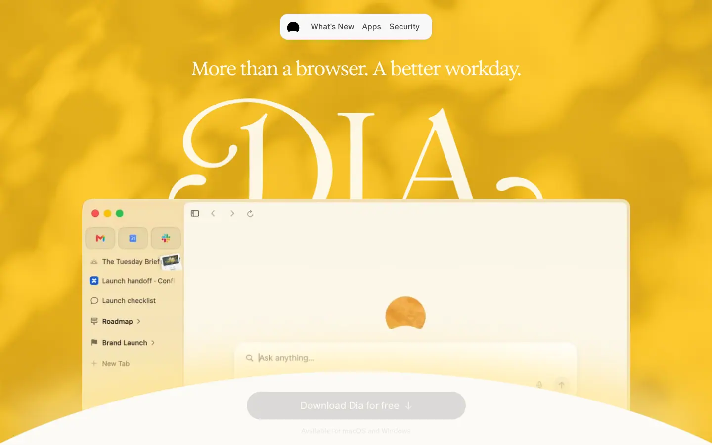
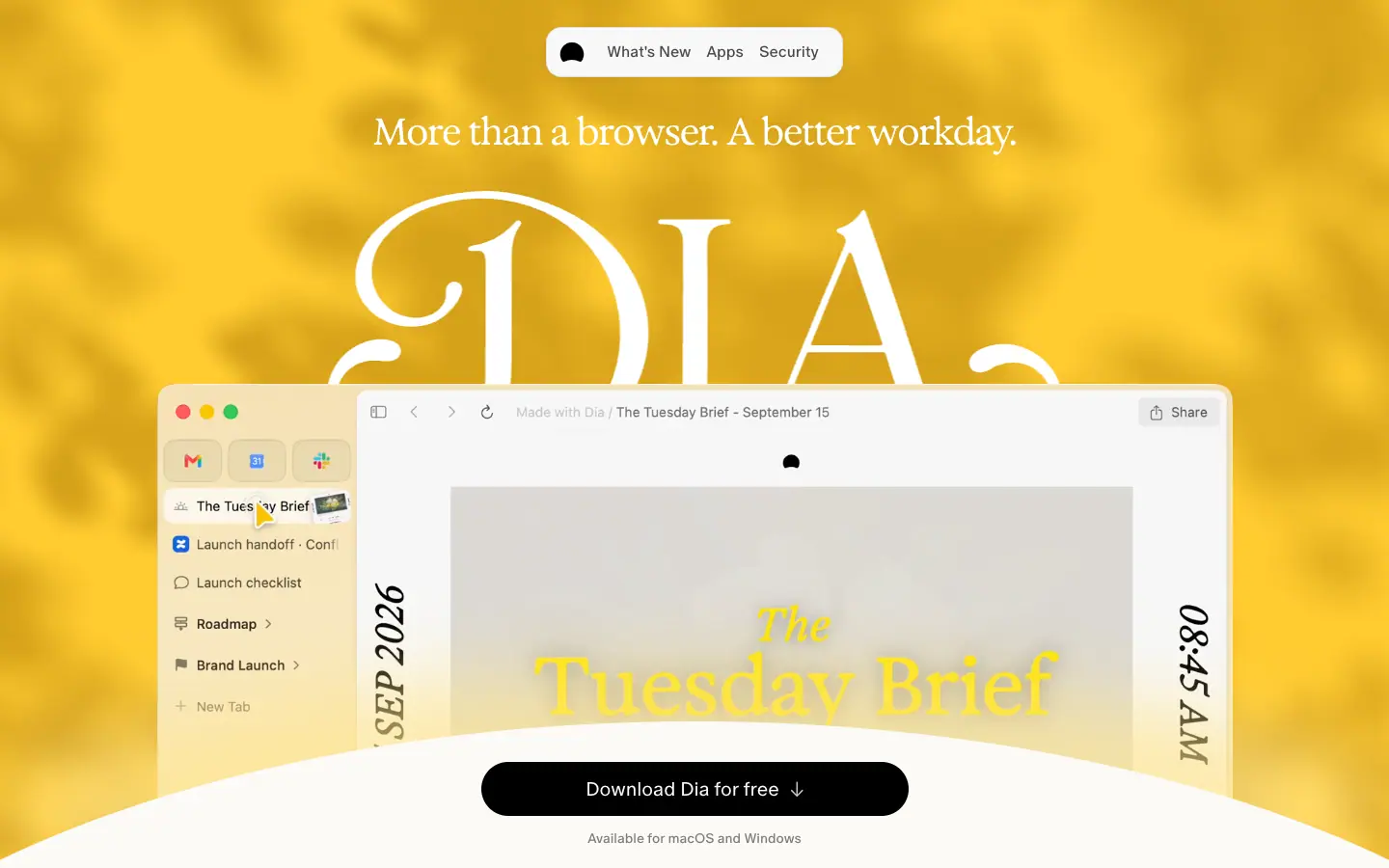
- t = 0: hero photo and wordmark visible; product window shows an empty "Ask anything…" composer; CTA is a disabled grey pill.
- t ≈ 1 s: CTA turns black (OS detected); the window video starts its scripted demo: a cursor clicks "The Tuesday Brief", the brief page renders with a painting and vertical date "SEP 2026" / "08:45 AM".
- t ≈ 3 s: the demo moves to "Your day" calendar with a yellow sticker "Prep".
- WebGL light: the leaf shadows drift continuously (WebGL2 canvas 1440 × 900).
Why: The first three seconds show the product doing a morning routine, which is the whole pitch.
3. Scroll choreography (home)
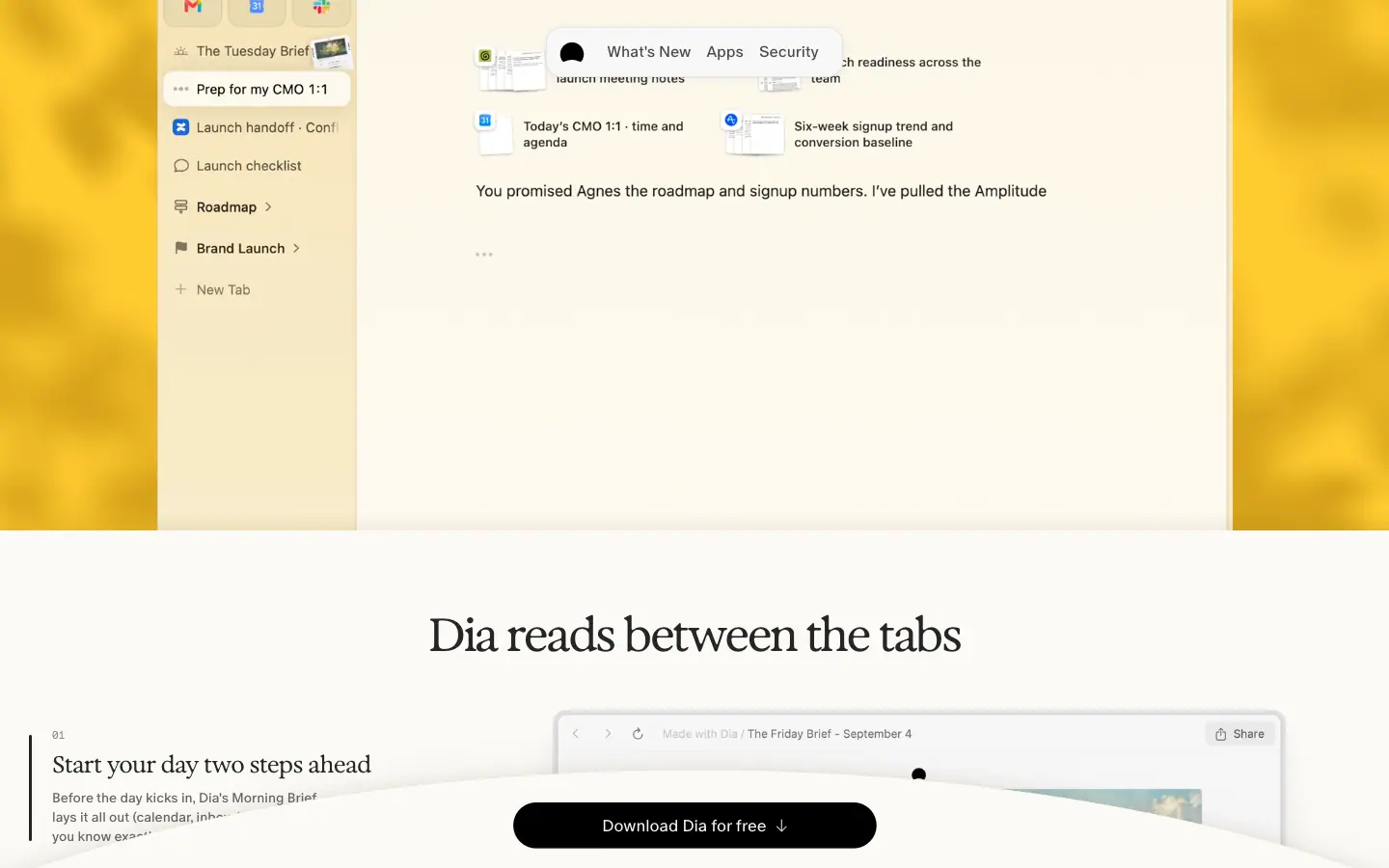
| scrollY |
Hero window translateY |
CTA pill |
Top-right dock |
| 0 |
0 |
443 × 56 at y 790 |
hidden |
| 150 |
−52.5 px |
— |
hidden |
| 300 |
— |
377 × 48 at y 832, --dock-t: 1 |
hidden |
| 350 |
−122.5 px |
377 × 48 |
hidden |
| 600+ |
−140 px (clamped) |
377 × 48 |
hidden |
| 1100+ |
−140 px |
377 × 48 sits on its cream hill |
176 × 48 "Download Dia" at (1254, 28) |
- The window wrapper has
transform-origin: bottom; will-change: transform.
- The "Available for macOS and Windows" line fades with
opacity: calc(1 - var(--dock-t)).
- The CTA never leaves the viewport; it shrinks once (≈ 15 %) when the reader starts scrolling, then a second, smaller copy joins the nav.
Why: The page always offers the download, but the offer gets quieter as the reader shows interest, instead of louder.
4. Scrollytelling list
- Section titles start at
opacity: 0; transform: translateY(5px) (inline styles) and fade up when they enter the viewport.
- The three-step list highlights the item whose image is centred; the active item gains a 2 px black left rule and its paragraph expands.
- Measured: at scrollY 1800 item "02 Synthesis you'll actually use" is active.
5. Marquees
@keyframes diaMarqueeL { 0% { transform: translateZ(0) } 100% { transform: translate3d(-100%,0,0) } }
@keyframes diaMarqueeR { 0% { transform: translateZ(0) } 100% { transform: translate3d(100%,0,0) } }
[data-dia-marquee][data-pause-on-hover]:hover [data-dia-marquee-content] { animation-play-state: paused; }
Also marqueeU / marqueeD (vertical). The privacy chip row runs left; hovering pauses it so a chip can be read.
6. Other keyframes defined
| Name |
Effect |
Likely use |
pulse |
opacity 0 → 1, scale .5 → 1, blur(2px) → 0 |
dot or badge appear |
pulse-scale |
scale 1 → .75 |
recording / live dot |
chroma-sweep |
background-position 100% → 0, blur(1px) → 0 |
gradient text sweep (students) |
chroma-expand-bidirectional |
two gradients sweep |
gradient text |
fade-to-black-sweep |
background-position 100% → 0 |
text reveal |
app-tour-caret-blink |
opacity 1 until 50 %, then 0 |
typed prompt caret, 1.1 s |
page-enter |
opacity 0 → 1 |
route transition |
spin |
rotate(1turn) |
loader |
7. Hover inventory
| Element |
Hover |
| Hero CTA |
scale ≈ 1.02 (443 → 452 px), shadow 0 18px 40px -10px rgba(0,0,0,.34) + inset highlight |
.button--primary |
inset glow 0 0 7.8px 2px rgba(255,255,255,.5), stays black |
| Grey secondary |
rgba(0,0,0,.08) → .12 |
| Footer links |
.424 → .85 colour, 200 ms |
| Mobile menu links |
opacity .30 → 1, 200 ms |
| App-tour prompt |
children translateY(-2px), filter: var(--filter-shadow-lift) |
Arrow links (group-hover:translate-x-2) |
arrow shifts 2 px right |
| Some cards |
hover:scale-[1.02] |
| Text links |
text-decoration-color fades between transparent and currentColor (250 ms) |
| Marquees |
pause |
All hover rules are wrapped in supports-hover: (@media (hover: hover)), so touch devices never get sticky hover states.
8. Smooth scroll
The mobile nav carries data-lenis-prevent, which means the site ships Lenis smooth scrolling (the attribute stops Lenis from hijacking scroll inside the menu). The <html> element had no lenis class at capture time, so it may only be active on some routes or devices.
9. What could not be measured
- Durations of JS-driven reveals (Framer-Motion-style inline styles) and of the mobile menu stagger (
opacity + blur(5px)).
- The hero WebGL shader parameters.
- The hero video's internal timing beyond the three captured frames.
10. Rules to copy
- Hover = 200 ms colour/opacity, standard ease. Nothing bounces.
- Movement = 220–500 ms with
cubic-bezier(.22,1,.36,1).
- Open/close = 400 ms
cubic-bezier(.76,0,.24,1) on grid-template-rows.
- Reveal distance 5 px, not 20–40 px.
- Link one or two things to scroll (hero window, CTA dock), not every section.
- Gate hover styles behind
@media (hover: hover).
12 · Glossary
Terms you need to brief, design or build a page in Dia's style. Each term says where Dia uses it.
Layout and structure
| Term |
Meaning |
On diabrowser.com |
| Floating nav pill |
A small rounded navigation bar that hovers over the page instead of spanning the full width |
307 × 52 pill, 28 px from the top |
| Hero |
The first screen of a page |
sunlit photo + wordmark + window |
| Full-bleed |
An element that runs edge to edge, ignoring the content grid |
hero photo, painting headers |
| Content grid |
The column system content aligns to |
10 × 100 px columns, 20 px gaps, 1180 px |
| Gutter |
Space between columns |
20 px |
| Bento grid |
A grid of differently sized cards, like a bento box |
home 6/4 cards |
| Checkerboard bento |
A bento where the wide card swaps sides each row |
6/4 → 4/6 → 6/4 |
| Scrollytelling |
A section where scrolling advances a story, often with sticky elements |
"Dia reads between the tabs" |
| Sticky |
An element that stays fixed while its section scrolls |
step list, CTA dock |
| Docked CTA |
A call-to-action that pins to the viewport edge after you scroll |
bottom pill + top-right pill |
| Marquee |
A row that scrolls horizontally on a loop |
privacy toggle chips |
| Carousel |
Horizontally scrollable cards with arrows |
Featured apps, Past Issues |
| Accordion |
Rows that expand to show an answer |
FAQs |
| Segmented control |
A pill with two or more options, one active |
"The Dia Lately / Changelog" |
| Measure |
Line length of body text |
≈ 40–60 characters in intros |
| Vertical rhythm |
Consistent spacing between sections |
120 px section margins |
Type
| Term |
Meaning |
On diabrowser.com |
| Display type |
Large headline type |
Exposure 48–101 px |
| Serif / sans / mono |
Letters with feet / without / fixed-width |
Exposure / Oracle / Favorit Mono |
| Variable font |
One font file with adjustable axes |
Exposure Variable, weight 1–999, "EXPO" axis |
| Axis |
An adjustable property of a variable font |
font-variation-settings: "EXPO" -25 |
| Tracking (letter-spacing) |
Space added or removed between all letters |
−0.05 em on display, +0.1 em on mono caps |
| Leading (line-height) |
Distance between lines |
1.0–1.17 for headlines, 1.4–1.5 for body |
| Kicker / eyebrow |
A small label above a headline |
"THE DIA LATELY • NOVEMBER 12TH • 2026", "A quick tour" |
| Lead / dek |
The intro paragraph under a headline |
20–22 px grey paragraph |
| Caps label |
Small uppercase text, usually tracked out |
PROFILES, FOR WORK |
| Tabular numbers |
Digits of equal width so prices align |
$10, $100 |
| Swash |
A decorative flourish on a letter |
the hero "DIA" wordmark |
| Wordmark / logomark |
Logo made of letters / a symbol |
"DIA" / black dome |
Colour and surface
| Term |
Meaning |
On diabrowser.com |
| Off-white / cream |
A warm, not-pure white |
#FBFAF6 |
| Alpha ink |
Text colour as black at an opacity |
rgba(0,0,0,.85/.60/.45) |
| Hairline |
A 1 px low-contrast border |
rgba(0,0,0,.08–.30) |
| Contrast ratio |
WCAG luminance ratio; 4.5 : 1 for body, 3 : 1 for large text |
.85 ink = 14.5 : 1 |
| Backdrop blur |
Blurs what is behind a translucent element |
nav blur(12px) |
| Hard (offset) shadow |
A sharp, unblurred shadow offset diagonally |
Students -6px 6px 0 #000 |
| Soft elevation |
Large, low-opacity blurred shadow |
popular plan card |
| Grain / noise |
Fine random texture |
feTurbulence on eyebrows |
| Duotone / tint |
An image recoloured toward one hue |
yellow-tinted leaf photo |
Art direction
| Term |
Meaning |
On diabrowser.com |
| Dappled light |
Sunlight broken by leaves |
home hero |
| Plein-air painting |
Painted outdoors, loose and light-filled |
release-note headers |
| Postcard treatment |
Image with a white border, tilt and drop shadow |
release-note header |
| Masthead |
The title block of a newspaper/magazine |
"Dia Weekly — UNFILTERED" |
| Lockup |
A fixed arrangement of logos |
"Dia × Figma" |
| Product shot / mock |
Screenshot of the product, often staged |
browser windows |
| Pixel art |
Icons drawn on a coarse pixel grid |
Students icons |
| Seal |
A round badge logo |
Browser Company seal |
Motion
| Term |
Meaning |
On diabrowser.com |
| Easing |
The speed curve of an animation |
cubic-bezier(.22,1,.36,1) |
| Ease-out |
Fast start, slow end; feels responsive |
CTA scale, card reveals |
| Ease-in-out |
Slow start and end; feels deliberate |
FAQ open |
| Parallax |
Elements moving at different speeds on scroll |
hero window rises 0.35× |
| Scroll-linked |
Animation driven by scroll position, not time |
CTA dock, --dock-t |
| Reveal |
Fade/slide-in when entering the viewport |
5 px fade-up |
| Stagger |
Small delay between items animating in sequence |
app-tour cards +90 ms |
| Smooth scroll (Lenis) |
A JS library that eases wheel scrolling |
data-lenis-prevent present |
| Hover lift |
Scale or shadow increase on hover |
CTA ×1.02 |
Copy
| Term |
Meaning |
On diabrowser.com |
| Tagline |
The repeatable brand line |
"reads between the tabs" |
| Value proposition |
What the user gets |
"A better workday" |
| Microcopy |
Small UI text |
"Available for macOS and Windows" |
| Social proof |
Evidence others use it |
not used on home (no logos wall) |
| Objection handling |
Copy that removes reasons not to buy |
FAQs on SOC 2, MDM, training data |
A brief you can paste
Build a calm, editorial landing page on a cream #FBFAF6 page. Floating white nav pill (radius 16, blur 12) at the top centre. Full-bleed sunlit hero photo with a white serif tagline and a giant swash wordmark behind a product window that rises on scroll. One black pill CTA that docks to the bottom of the viewport. Display type: high-contrast serif at weight 500–550, −0.05 em tracking. Text: neutral grotesk at weight 350–400, alpha-black ink (.85/.60/.45). Mono caps for footer and labels. Sections 120 px apart: sticky 3-step scrollytelling, 6/4 checkerboard bento of bordered cards (radius 12) with bleeding screenshots, a dashed privacy frame with a marquee of settings chips, a one-line closing question. Motion: 200 ms colour hovers, 220–420 ms ease-out on the CTA, 5 px fade-up reveals.
13 · Build recipe
CSS tokens and component CSS that reproduce Dia's look. Values are the measured ones; font names fall back to free substitutes (see 03 Typography).
1. Fonts
/* Licensed originals (self-host WOFF2): 205TF Exposure, Dinamo ABC Oracle, ABC Favorit Mono.
   Free stand-ins below via Google Fonts. */
@import url("https://fonts.googleapis.com/css2?family=Fraunces:opsz,wght@9..144,300..700&family=Geist:wght@300;400;500&family=Geist+Mono:wght@400;500&display=swap");

:root {
  --font-display: "Exposure VAR", "Fraunces", Georgia, serif;
  --font-sans: "ABC Oracle", "Geist", "Inter", system-ui, sans-serif;
  --font-mono: "ABC Favorit Mono", "Geist Mono", ui-monospace, monospace;
  --font-semimono: "ABC Oracle Triple", "Geist Mono", ui-monospace, monospace;
  --font-hand: "Ammer Handwriting", "Caveat", cursive;
}
2. Colour tokens
:root {
  /* paper */
  --page: #FBFAF6;
  --white: #F8F8F8;
  --true-white: #FFFFFF;
  --chip: rgba(235,235,235,.7);
  --light-grey: #EFEFEF;

  /* ink */
  --black: #000000;
  --primary: rgba(0,0,0,.85);
  --secondary: rgba(0,0,0,.60);
  --tertiary: rgba(0,0,0,.45);
  --quaternary: rgba(0,0,0,.20);
  --fill-primary: rgba(0,0,0,.9);
  --fill-secondary: rgba(0,0,0,.08);
  --fill-secondary-hover: rgba(0,0,0,.12);
  --fill-tertiary: rgba(0,0,0,.04);
  --stroke-light: rgba(0,0,0,.06);
  --stroke-medium: rgba(0,0,0,.12);
  --black-8: rgba(0,0,0,.08);
  --card-line: rgba(0,0,0,.30);
  --link: #5863EA;

  /* brand hues */
  --yellow: #FFB005; --red: #FA3D1D; --pink: #FD02F5; --blue: #0358F7; --brown: #340B05;
  --sun: #FFCB30; /* sampled hero light */

  --student-gradient: linear-gradient(180deg,#FD02F5 -10.07%,#FA3D1D 6.81%,#FFB005 35.18%,#E1E1FE 66.63%,#0358F7 95.78%);
  --creamsicle-gradient: linear-gradient(180deg,#FFF1AC 60%,#FF6F3C);
}
body { background: var(--page); color: var(--primary); font: 400 16px/1.25 var(--font-sans); -webkit-font-smoothing: antialiased; }
3. Type styles
.h-hero    { font: 550 clamp(48px, 7.06vw, 101px)/1.09 var(--font-display); letter-spacing: -.05em; }
.h-section { font: 500 48px/56px var(--font-display); letter-spacing: -.05em; font-variation-settings: "EXPO" -25; color: var(--primary); }
.h-card    { font: 550 24px/30px var(--font-display); letter-spacing: -.02em; }
.h-legal   { font: 300 72px/84px var(--font-sans); letter-spacing: -.04em; }
.lead      { font: 350 22px/30px var(--font-sans); color: var(--secondary); }
.body-lg   { font: 350 20px/30px var(--font-sans); letter-spacing: -.02em; color: rgba(0,0,0,.70); }
.body      { font: 400 16px/24px var(--font-sans); color: var(--secondary); }
.label     { font: 400 12px/30px var(--font-sans); letter-spacing: .06em; text-transform: uppercase; color: rgba(0,0,0,.55); }
.mono-caps { font: 400 13px/16px var(--font-mono); letter-spacing: .1em; text-transform: uppercase; }
.price     { font: 400 38px/1 var(--font-display); font-variant-numeric: tabular-nums; }

@media (max-width: 799px) {
  .h-section { font-size: 32px; line-height: 38px; letter-spacing: -1.6px; }
  .h-legal   { font-size: 48px; line-height: 52px; }
  .body-lg   { font-size: 16px; line-height: 24px; }
}
4. Grid and spacing
.container { max-width: 1440px; margin: 0 auto; padding: 0 10px; }
.grid10 { display: grid; grid-template-columns: repeat(12, 1fr); gap: 10px; }
@media (min-width: 800px) {
  .grid10 { grid-template-columns: repeat(10, 100px); gap: 20px; justify-content: center; } /* 1180px */
}
.section { margin-block: 80px; }
@media (min-width: 800px) { .section { margin-block: 120px; } }
.span-6 { grid-column: span 6; } .span-4 { grid-column: span 4; }
5. Components
/* Nav pill */
.nav-wrap { position: fixed; top: 28px; left: 10px; right: 10px; z-index: 10; display: flex; justify-content: center; }
.nav-pill { display: flex; align-items: center; gap: 16px; height: 52px; padding: 0 24px 0 6px;
  background: var(--white); backdrop-filter: blur(12px); border: 1px solid var(--black-8); border-radius: 16px;
  box-shadow: 0 2px 8px rgba(0,0,0,.06), 0 0 2px rgba(0,0,0,.04); font: 400 16px/20px var(--font-sans); }

/* Hero CTA */
.cta { display: flex; align-items: center; justify-content: center; gap: 10px; height: 56px; width: min(443px, 100%);
  border-radius: 9999px; background: #000; color: var(--white); font: 350 20px/1 var(--font-sans);
  transition: transform .22s cubic-bezier(.22,1,.36,1), box-shadow .42s cubic-bezier(.22,1,.36,1); }
@media (hover: hover) { .cta:hover { transform: scale(1.02);
  box-shadow: inset 0 1px 0 rgba(255,255,255,.18), 0 2px 4px rgba(0,0,0,.16), 0 18px 40px -10px rgba(0,0,0,.34); } }

/* Secondary pill */
.btn-2 { height: 42px; padding: 0 24px; border-radius: 16px; background: rgba(0,0,0,.05); font: 400 14px var(--font-sans);
  transition: background-color .2s cubic-bezier(.4,0,.2,1); }
.btn-2:hover { background: var(--fill-secondary-hover); }

/* Bento card */
.bento { border: 1px solid var(--card-line); border-radius: 12px; overflow: hidden; display: flex; flex-direction: column; min-height: 631px; padding: 30px 30px 0; }
.bento .tag { width: fit-content; height: 30px; padding: 0 12px; border-radius: 20px; background: #fff; }
.bento img { margin-top: auto; translate: 0 10%; }

/* Pricing card */
.plan { border-radius: 36px; border: 1px solid rgba(0,0,0,.1); padding: 24px; background: rgba(255,255,255,.75); }
.plan--popular { background: #fff; padding: 28px 24px;
  box-shadow: 0 4px 12px rgba(0,0,0,.04), 0 20px 48px -16px rgba(0,0,0,.14); }

/* Toggle chip */
.chip { display: inline-flex; align-items: center; gap: 14px; height: 35px; padding: 0 16px; border-radius: 20px;
  background: var(--chip); font: 400 16px/35px var(--font-semimono); }
.chip b { background: #fff; padding: 0 6px; font-weight: 400; }

/* FAQ */
.faq-row { border-bottom: 1px solid rgba(0,0,0,.1); }
.faq-q { min-height: 56px; padding: 16px 0; font: 500 16px/21.6px var(--font-sans); display: flex; justify-content: space-between; }
.faq-a { display: grid; grid-template-rows: 0fr; transition: grid-template-rows .4s cubic-bezier(.76,0,.24,1); }
.faq-row[open] .faq-a { grid-template-rows: 1fr; }
.faq-a > div { overflow: hidden; }

/* Postcard */
.postcard { border: 22px solid #fff; background: #fff; transform: rotate(-1.54deg);
  box-shadow: 0 85px 51px rgba(0,0,0,.11); }

/* Hard-shadow card (Students) */
.brut { border: 2px solid rgba(0,0,0,.85); border-radius: 16px; box-shadow: -6px 6px 0 #000; background: #F8F8F8; }

/* Marquee */
@keyframes marqueeL { to { transform: translate3d(-100%,0,0); } }
.marquee { display: flex; overflow: hidden; }
.marquee > div { display: flex; gap: 20px; animation: marqueeL 40s linear infinite; }
.marquee:hover > div { animation-play-state: paused; }

/* Reveal */
.reveal { opacity: 0; transform: translateY(5px); transition: opacity .6s cubic-bezier(.22,1,.36,1), transform .6s cubic-bezier(.22,1,.36,1); }
.reveal.in { opacity: 1; transform: none; }
@media (prefers-reduced-motion: reduce) { .reveal { opacity: 1; transform: none; transition: none; } }
Note: the marquee speed (40 s) and reveal duration (600 ms) are not measurable on the live site (see 11 §9); pick them to taste.
6. Hero parallax and CTA dock (JS)
const win = document.querySelector('.hero-window');
const cta = document.querySelector('.cta');
addEventListener('scroll', () => {
  const y = scrollY;
  win.style.transform = `translateY(${Math.max(-140, -0.35 * y)}px)`; // measured 0.35, clamp -140
  document.documentElement.style.setProperty('--dock-t', y > 120 ? 1 : 0);
}, { passive: true });
.cta { position: fixed; bottom: 20px; left: 50%; translate: -50% 0; }
:root[style*="--dock-t: 1"] .cta { width: 377px; height: 48px; }
.cta-note { opacity: calc(1 - var(--dock-t, 0)); transition: opacity .2s; }
7. Page skeleton
nav-wrap (fixed pill).- Hero: full-bleed photo, white tagline, wordmark SVG, product video, cream arc, CTA.
- Scrollytelling: centred section title, sticky 3-item list + 3 images.
- Bento: centred title, 6 cards on the 10-col grid (6/4, 4/6, 6/4).
- Privacy: dashed frame, split title with a chip marquee, lead, grey pill.
- Closing question.
- Footer: 4 mono columns, seal, sign-off.
8. Checklist before shipping
- [ ] Page background is cream, cards are white or
#F8F8F8.
- [ ] Only black for actions; all colour comes from images.
- [ ] Display serif tracked −0.04 to −0.05 em.
- [ ] Body copy weight 350–400 in alpha-black.
- [ ] Hover styles inside
@media (hover: hover).
- [ ] White text on the hero photo reaches at least 3 : 1 (add an overlay; Dia's does not).
- [ ] Footer link contrast ≥ 4.5 : 1 (Dia's is 3.05 : 1).
Home · /
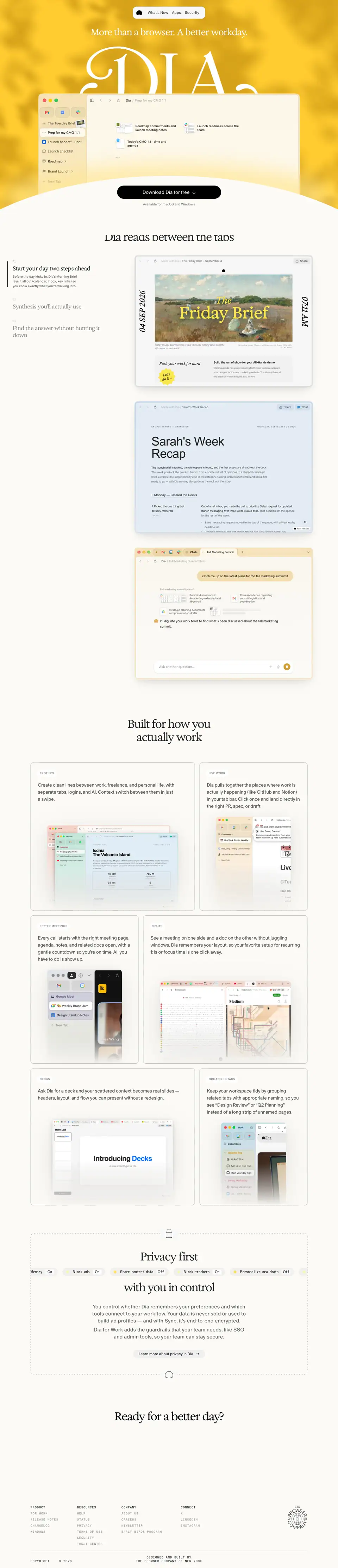
- URL: https://www.diabrowser.com/
- Title: "Dia | The browser for better days at work."
- Height: 6674 px at 1440 (7424 px at 390).
- Body:
#FBFAF6.
- Job of the page: make a work buyer feel "my day would be better" and click Download.
The page has 6 sections. It never shows a logo wall, testimonials or stats; the product demo carries all proof.
1. Hero (0 → 960 px)
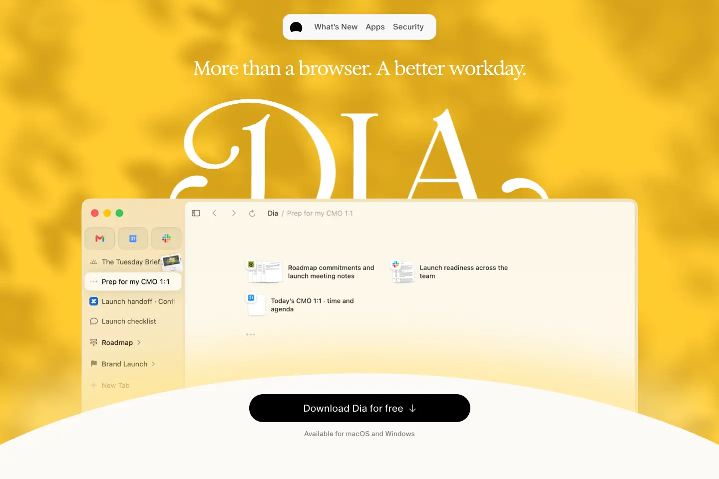
| Element |
Measured |
| Nav pill |
307 × 52, #F8F8F8, blur 12, radius 16, fixed at top 28 |
| Background |
leaf-shadows-tinted.webp 1440 × 900 + WebGL2 canvas; sampled #FFCB30 / #DAA61C |
| H1 |
"More than a browser. A better workday." Exposure 38.79 / 42.67, 500, −1.55 px, white, top 116 |
| Wordmark |
SVG "DIA" 763 × 284 at (339, 198), white |
| Window |
<video> autoplay loop muted, 1115 × 793 at (163, 398), radius 16 |
| CTA |
443 × 56 black pill "Download Dia for free ↓", Oracle 20 / 350 |
| Note |
"Available for macOS and Windows" 14 px .50 |
Why: Light, logo, product, action — in that order, front to back. The window overlaps the wordmark so the product is literally in front of the brand. The arched cream hill turns the CTA into a sunrise.
Motion: window rises to −140 px by scrollY 400; CTA docks at 377 × 48; see 11 Motion.
2. "Dia reads between the tabs" (960 → 2960 px)
| Element |
Measured |
| Title |
Exposure 48 / 56, 500, −2.4 px, .85 |
| Container |
max-w-1400, mt-80 mb-100 |
| Steps |
01 "Start your day two steps ahead" · 02 "Synthesis you'll actually use" · 03 "Find the answer without hunting it down" |
| Step title |
Exposure 24 / 30, 500; inactive at .45 |
| Step body |
Oracle 14 / 20 .60, only on the active step |
| Step number |
Favorit Mono 11 .20 |
| Active marker |
2 px black vertical rule left of the item |
| Images |
3 × 760 × 562 (dia-reads-01/02/03.png): Friday Brief, Sarah's Week Recap, Chat about a marketing summit |
Why: Three AI features (brief, synthesis, answers) in one sticky story keeps the reader in one place while the evidence scrolls. Each image is a finished-looking artefact, not a chat bubble.
3. "Built for how you actually work" (2960 → 4820 px)
| Card |
Size |
Copy (Oracle 20 / 30, 350, .70) |
| PROFILES |
700 × 631 |
"Create clean lines between work, freelance, and personal life…" |
| LIVE WORK |
460 × 631 |
"Dia pulls together the places where work is actually happening (like GitHub and Notion)…" |
| BETTER MEETINGS |
460 × 631 |
"Every call starts with the right meeting page… All you have to do is show up." |
| SPLITS |
700 × 631 |
"See a meeting on one side and a doc on the other…" |
| DECKS |
700 × 580 |
"Ask Dia for a deck and your scattered context becomes real slides…" |
| ORGANIZED TABS |
460 × 580 |
"Keep your workspace tidy by grouping related tabs…" |
- Cards: radius 12,
1px solid rgba(0,0,0,.3), no fill. Label pill: white, radius 20, 30 px, Oracle 12 caps +0.72px .55.
- Grid: 10 × 100 px, gap 20, x 130 → 1310.
- Title:
sr-only <h2>; visible title in Exposure.
Why: These are the non-AI browser features (profiles, splits, tab groups). The checkerboard keeps six similar cards lively; screenshots bleed off the bottom so each card looks like a window into the app.
4. "Privacy first / with you in control" (4820 → 5540 px)
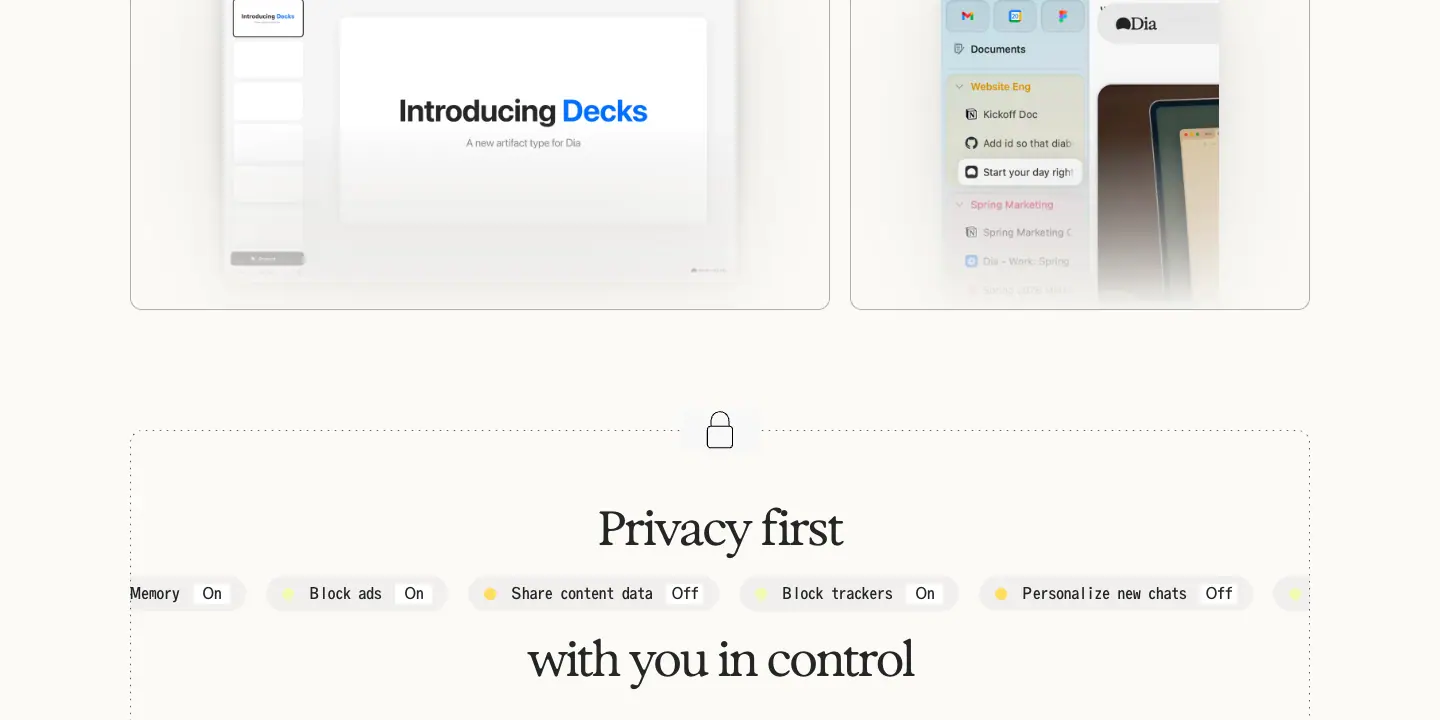
| Element |
Measured |
| Frame |
dashed SVG border 1180 × 600, lock icon centred in the top edge |
| Title |
two <p> lines, Exposure 48 / 56, 500, EXPO -25; the <h2> is sr-only |
| Chip marquee |
runs between the two title lines; chips 35 px, radius 20, rgba(235,235,235,.7), Oracle Triple 16 |
| Body |
22 / 30 Oracle 400 .60: "You control whether Dia remembers your preferences and which tools connect… Your data is never sold or used to build ad profiles…" |
| Button |
"Learn more about privacy in Dia →" 306 × 35, #EFEFEF, radius 20 |
Why: Privacy is the top objection for an AI browser. Showing real toggle names ("Share content data Off") makes control tangible; the dashed frame reads as a "safe zone".
5. "Ready for a better day?" (5540 → 6040 px)
- Exposure 48 / 56, 500,
#000, max-w-760, mt-150 mb-100.
- No button: the docked CTA (bottom) and the top-right "Download Dia" are both on screen here.
Why: Ending on the brand promise as a question, with the action already in reach.
6. Footer (6040 → 6674 px)
See Header and footer.
Mobile (390)
- H1 28 / 30.8; section titles 32 / 38; "Built for…" 36 / 41 in Oracle 300; bento copy 16 / 24.
- Bento becomes one column; scrollytelling steps stack with their own images.
- Nav becomes logo + menu; menu links are 72 px Oracle Light.
For work · /forwork
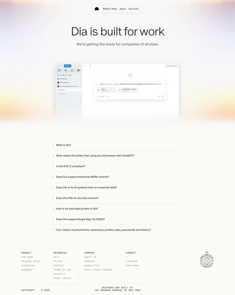
- Title: "Dia Browser | Work". Height 1808 px (1908 at 390).
- Job: answer an IT or security buyer's checklist.
1. Hero
| Element |
Measured |
| H1 |
"Dia is built for work" ABC Oracle 300 72 / 84, −2.88 px, .85 |
| Subline |
"We're getting Dia ready for companies of all sizes." Oracle 18 / 27 |
| Picture |
Dia window with a "Work" profile, centred over a pastel sunrise glow (peach → lilac → white) |
| CTA |
none |
Why: The sans H1 and no CTA signal "information page". The sunrise glow keeps the brand's morning light without the bold yellow.
2. FAQ (the whole page)
Questions (Oracle 16 / 24, .85, + icon left, dividers):
- What is Dia?
- What makes Dia better than using my old browser with ChatGPT?
- Is Dia SOC 2 compliant?
- Does Dia support enterprise MDM controls?
- Does Dia or its AI systems train on corporate data?
- Does Dia offer AI security controls?
- How is my data kept private in Dia?
- Does Dia support Single Sign On (SSO)?
- Can I import my bookmarks, extensions, profiles, tabs, passwords, and history?
Answers (Oracle 16 / 24 .60) link out to "MDM policies", "trust.diabrowser.com", "public.diabrowser.com" and "disable content sharing".
Why: Procurement reads questions, not marketing. Writing each heading as the buyer's own question shortens the security review.
3. Footer
See Header and footer.
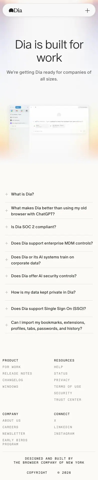
Plans · /plans
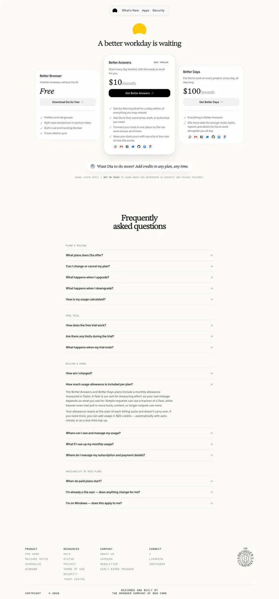
- Title: "Dia Browser | Plans". Meta: "Compare Dia plans."
- Height: 3095 px (4231 px at 390).
- Job: let someone who has decided to look at price pick a plan in one screen.
1. Hero = pricing (0 → ≈ 1100 px)
| Element |
Measured |
| Sun glyph |
yellow half-disc above the H1 (≈ 36 × 24), echoes the home hero light |
| H1 |
"A better workday is waiting" Exposure Variable 36 px, 300, −1.44 px, .85 |
| Background |
day.552aea45.webp 1440 × 1044 behind the top (soft daylight) |
| Side cards |
340 × 368, rgba(255,255,255,.75), radius 36, 1px rgba(0,0,0,.1), padding 24 |
| Centre card |
367 × 518, #FFF, radius 36, padding 28 × 24, shadow 0 4px 12px .04, 0 20px 48px -16px .14 |
| Badge |
"MOST POPULAR" 94 × 26, Favorit Mono 10 caps, white pill, 0 2px 8px .08 |
| Plan name |
Oracle 18, 350, −0.72 px: "Better Browser", "Better Answers", "Better Days" |
| Pitch |
15 / 21, −0.6 px, .50: "A better browser, without the AI." / "Start every day briefed, with Dia ready to work for you." / "Put Dia to work on every project, every day, all day long." |
| Price |
"Free" (Exposure 38 italic 550) · "$10/month" · "$100/month" (Exposure Variable 38, tabular-nums; "/month" 21 px .40) |
| Buttons |
42 px, radius 16: "Download Dia for free →" (rgba(0,0,0,.05)), "Get Better Answers →" (black), "Get Better Days →" (.05) |
| Features |
15 / 23.25 .60 with check icons; row of 7 app logos in paid plans |
| Credits pill |
"Want Dia to do more? Add credits to any plan, any time." Exposure 19 |
| Fine print |
"USAGE LIMITS APPLY | GET IN TOUCH TO LEARN ABOUT OUR ENTERPRISE AI SECURITY AND PRIVACY FEATURES." Favorit Mono 11 caps |
Why:
- Plan names are the brand promise in three steps (Browser → Answers → Days), so pricing reinforces positioning.
- The free tier is "without the AI", which removes risk for AI-sceptical users.
- The centre card is taller, opaque, shadowed and badged; the side cards are translucent. Every visual cue points to $10.
- Radius 36 makes the cards feel like soft objects rather than table columns.
2. FAQ (≈ 1150 → 2700 px)
- Title "Frequently asked questions" Exposure 40 / 43.2, 600, −2 px.
- Groups: PLANS & PRICING · FREE TRIAL · BILLING & USAGE · AVAILABILITY OF PAID PLANS (Favorit Mono 11 / 300 caps
.50).
- Rows 760 wide, min-height 56, Oracle 16 / 500; divider
rgba(0,0,0,.1); open animates grid-template-rows 400 ms cubic-bezier(.76,0,.24,1).
Why: Groups mirror the order of buyer questions: what is it, can I try it, how am I billed, can I get it.
3. Footer
See Header and footer.
Mobile

Cards stack (popular first is not enforced; order stays Free → $10 → $100). H1 30 px; FAQ title 34 / 36.72.
Apps index · /apps
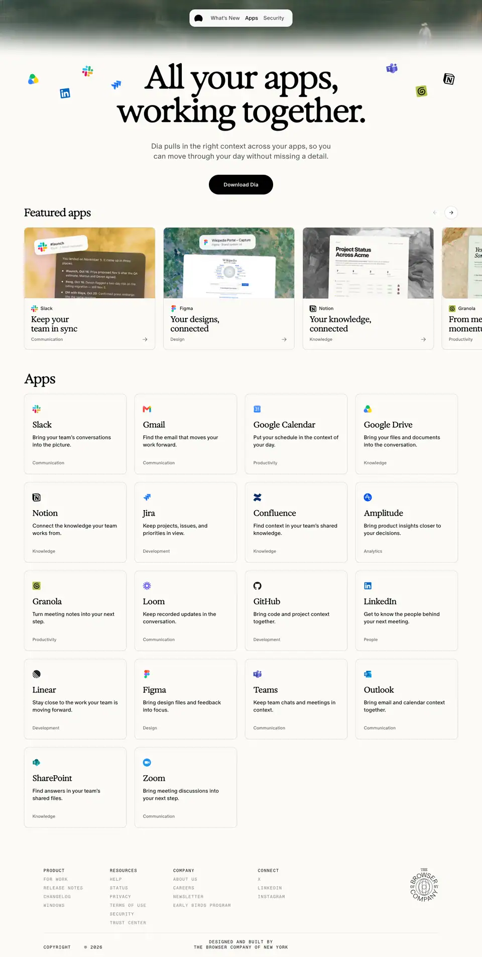
- Title: "Apps | Dia Browser". Height 2859 px.
- Meta: "Dia pulls in the right context across your apps, so you can move through your day without missing a detail."
- Job: show breadth of integrations and route to per-app pages.
1. Hero
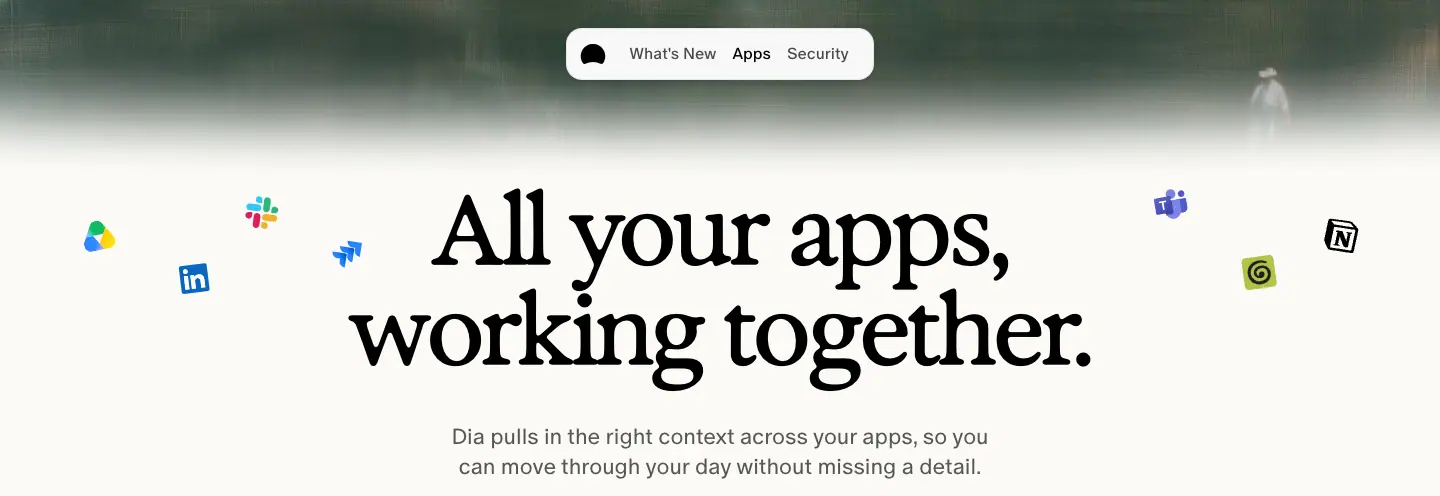
| Element |
Measured |
| Header art |
painterly image band 1440 × 557 behind the top |
| H1 |
"All your apps, working together." Exposure 96 / 100, 550, −3.84 px, #000 |
| Floating logos |
≈ 12 app logos scattered around the H1 at different sizes |
| Lead |
Oracle 22 / 30, 350, .65 |
| CTA |
"Download Dia" black pill, Oracle 16 / 500, padding 20 × 24, radius 9999 |
Why: The scattered logos visualise "apps everywhere"; the headline promises they work together.
2. Featured apps carousel
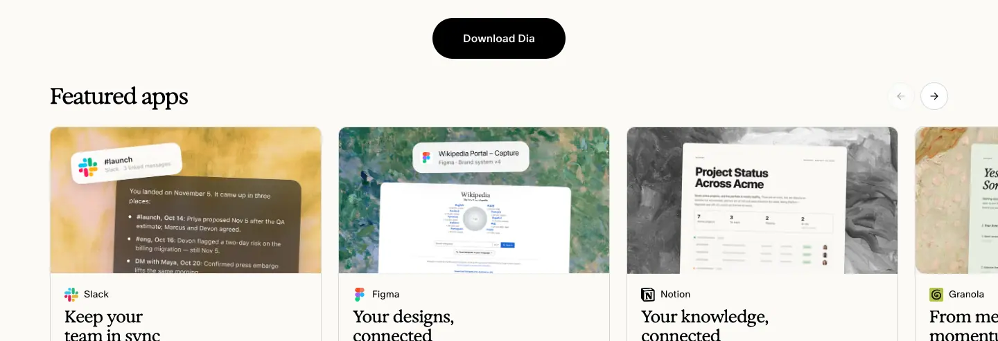
- Title "Featured apps" Exposure 32 / 38, 550.
- 6 cards (≈ 366 px tall): Slack "Keep your team in sync", Figma "Your designs, connected", Notion "Your knowledge, connected", Granola "From meeting to momentum", Google "Less searching. More doing.", plus "Start one step ahead".
- Card: image top, app name (Oracle 14 / 350), title (Exposure 24 / 28 / 550), category;
#FBFAF6, 1px rgba(0,0,0,.15), radius 12.
- Arrow buttons top-right.
Why: Each featured card is a mini value proposition, so the carousel reads as a list of benefits.
3. App directory
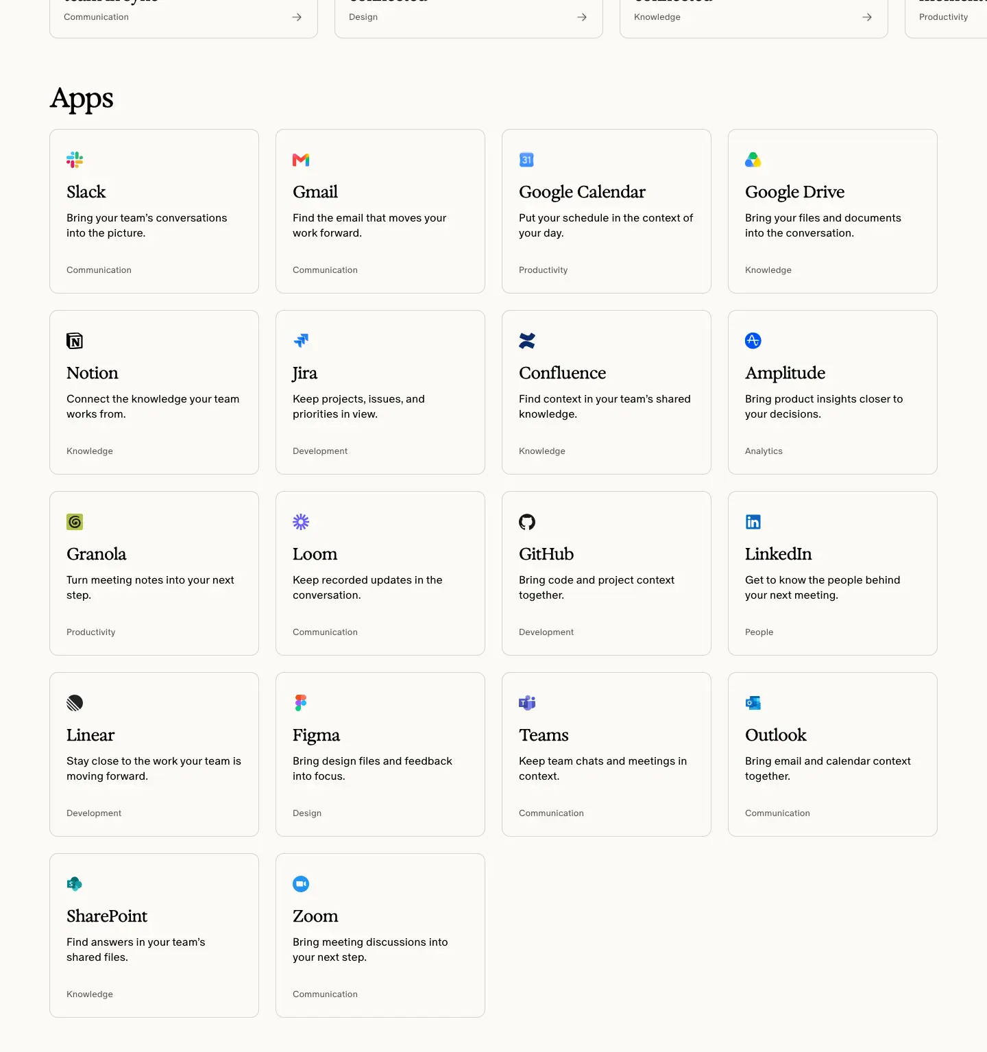
- Title "Apps" Exposure 40 / 44, 550, −1.6 px.
- 18 cards, 4 per row: logo, name (Exposure 24 / 30 / 550), one-line benefit (Oracle 16 / 22 / 350
#000), category (Oracle 13 / 18 .65).
- Examples: "Gmail — Find the email that moves your work forward." · "Google Calendar — Put your schedule in the context of your day." · "Jira — Keep projects, issues, and priorities in view."
Why: Each benefit line starts with a verb and mentions work, so the grid repeats the brand promise 18 times.
4. Footer
See Header and footer.
App page template · /apps/figma, /apps/notion (and 5 more)
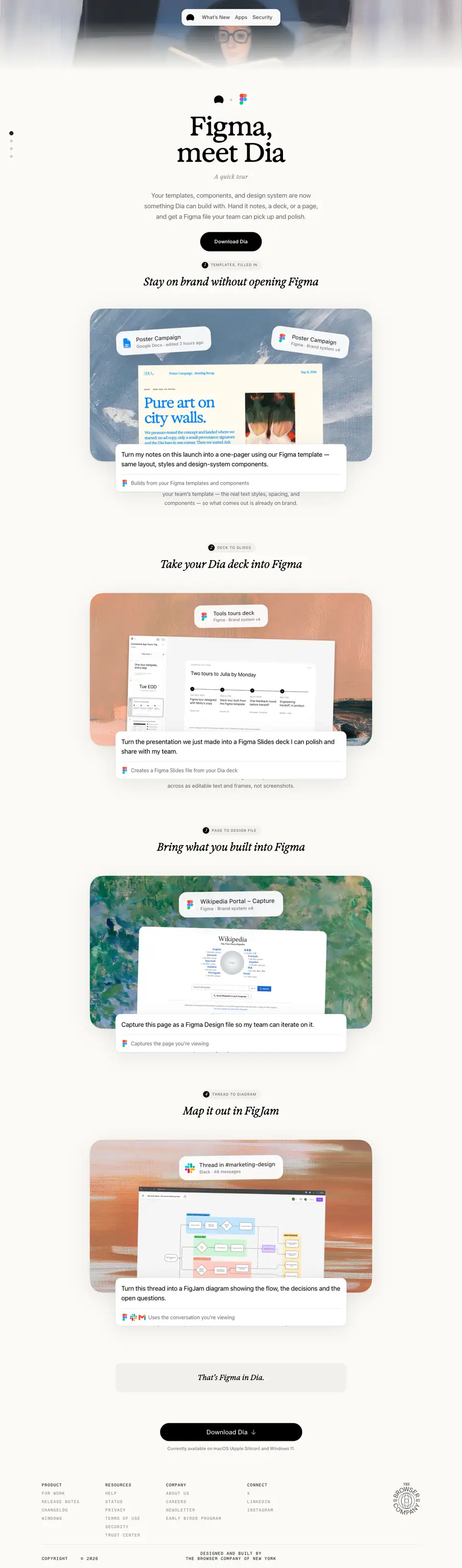
The 7 app pages (/apps/figma, /apps/notion, /apps/linkedin, /apps/granola, /apps/google, /apps/slack) share one template. Captured: Figma (4879 px) and Notion (4885 px). Only the photo, logo, copy and four chapter scenes change.
1. Hero
| Element |
Measured |
| Photo strip |
1440 × 220 (Sanity image), fades into the cream page |
| Lockup |
Dia mark · × · partner logo |
| H1 |
"Figma, meet Dia" / "Notion, meet Dia" — Exposure 82 / 82, 550, −1.64 px |
| Kicker |
"A quick tour" Exposure 19 / 31.35, 550 italic, +0.19 px, .40 |
| Lead |
-apple-system 20 / 33, rgba(60,60,67,.78): "Your templates, components, and design system are now something Dia can build with…" |
| CTA |
black pill "Download Dia" |
| Pager |
4 dots at the left edge, one per chapter |
Why: The "X, meet Dia" formula is an introduction between friends; it also scales to any partner.
2. Four tour chapters
| # |
Figma tag / title |
Notion tag / title |
| 1 |
TEMPLATES, FILLED IN — "Stay on brand without opening Figma" |
INSTANT RECALL — "Find the answer buried in your workspace" |
| 2 |
DECK TO SLIDES — "Take your Dia deck into Figma" |
KEEP THE PLAN CURRENT — "Turn meeting decisions into project updates" |
| 3 |
PAGE TO DESIGN FILE — "Bring what you built into Figma" |
FROM DISCUSSION TO SPEC — "Turn any conversation into a clean spec" |
| 4 |
THREAD TO DIAGRAM — "Map it out in FigJam" |
STATUS AT A GLANCE — "See where every project stands" |
Anatomy of each chapter:
- Tag: -apple-system 11 / 18.15, 500, +1.1 px caps, rgba(60,60,67,.78), with the chapter number.
- H2: Exposure 34 / 38.08, 550, −0.51 px.
- Scene: 880 × 476 painterly photo with floating file chips ("Poster Campaign — Figma · Brand system v4"), a document, and a prompt card: the user's request in -apple-system 20 / 30 ("Turn my notes on this launch into a one-pager using our Figma template — same layout, styles and design-system components.") with a 1.1 s blinking caret.
- Caption: -apple-system 16 / 26.4 rgba(60,60,67,.78) ("Builds from your Figma templates and components").
- Body: 17 / 28.05 ("Dia takes the notes you're viewing and lays them into…").
- Motion: cards enter with opacity, transform 500ms cubic-bezier(.22,1,.36,1), second wave delayed 90 ms; prompt hover lifts 2 px.
Why: Each chapter is "input → prompt → output". Showing the exact sentence a user types makes the AI capability concrete and teachable. Using Apple's system font and colours inside the scenes makes them look like native macOS UI rather than marketing art.
3. Close
- Grey strip "That's Figma in Dia." (Exposure 23 / 29.9 italic, 550).
- Black pill "Download Dia" + availability note.
4. Footer
See Header and footer.
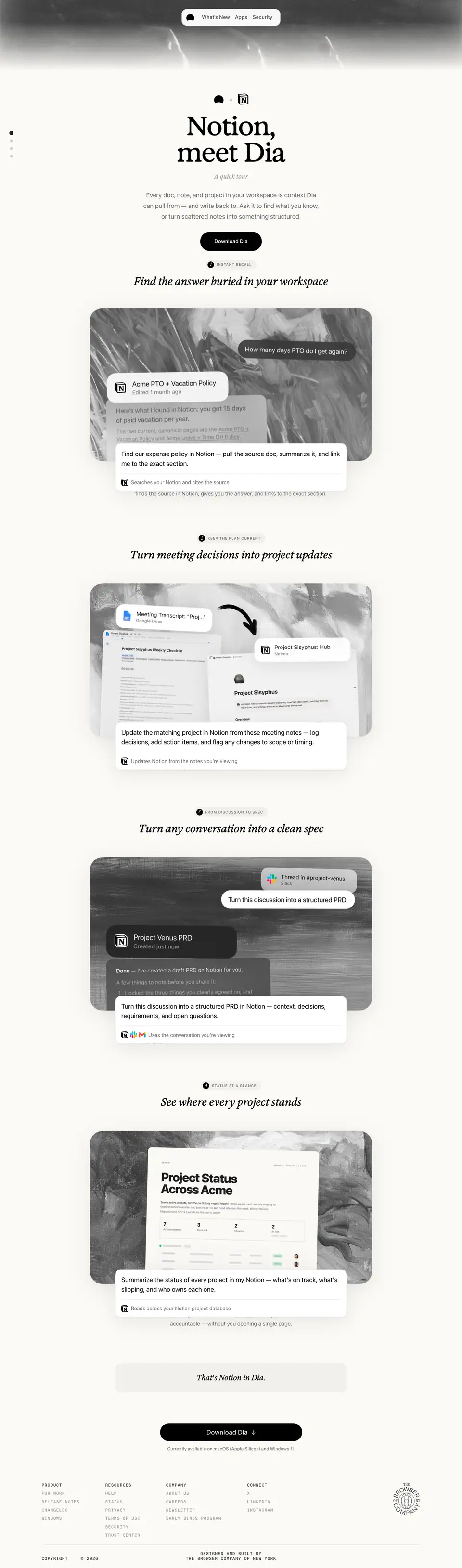
Students · /students
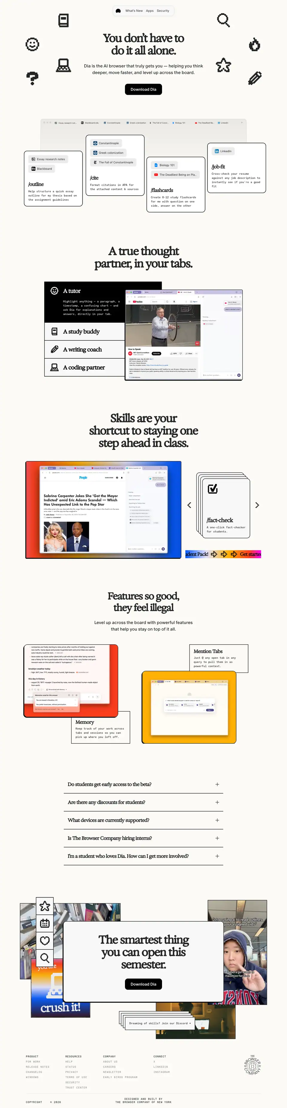
- Title: "Dia for Students". Height 5556 px.
- Meta: "Dia is the AI browser that truly gets you — helping you think deeper, move faster, and level up across the board."
- Job: win students with a louder costume while keeping Dia's fonts and pills.
Costume changes vs the rest of the site: Exposure at weight 650; 2 px black borders (rgba(0,0,0,.85), 27 elements) and hard offset shadows (-3px 3px 0 #000, -6px 6px 0 #000); 1-bit pixel icons; the loud --student-gradient; Favorit Mono for card copy (14 / 21).
1. Hero (0 → 1150)
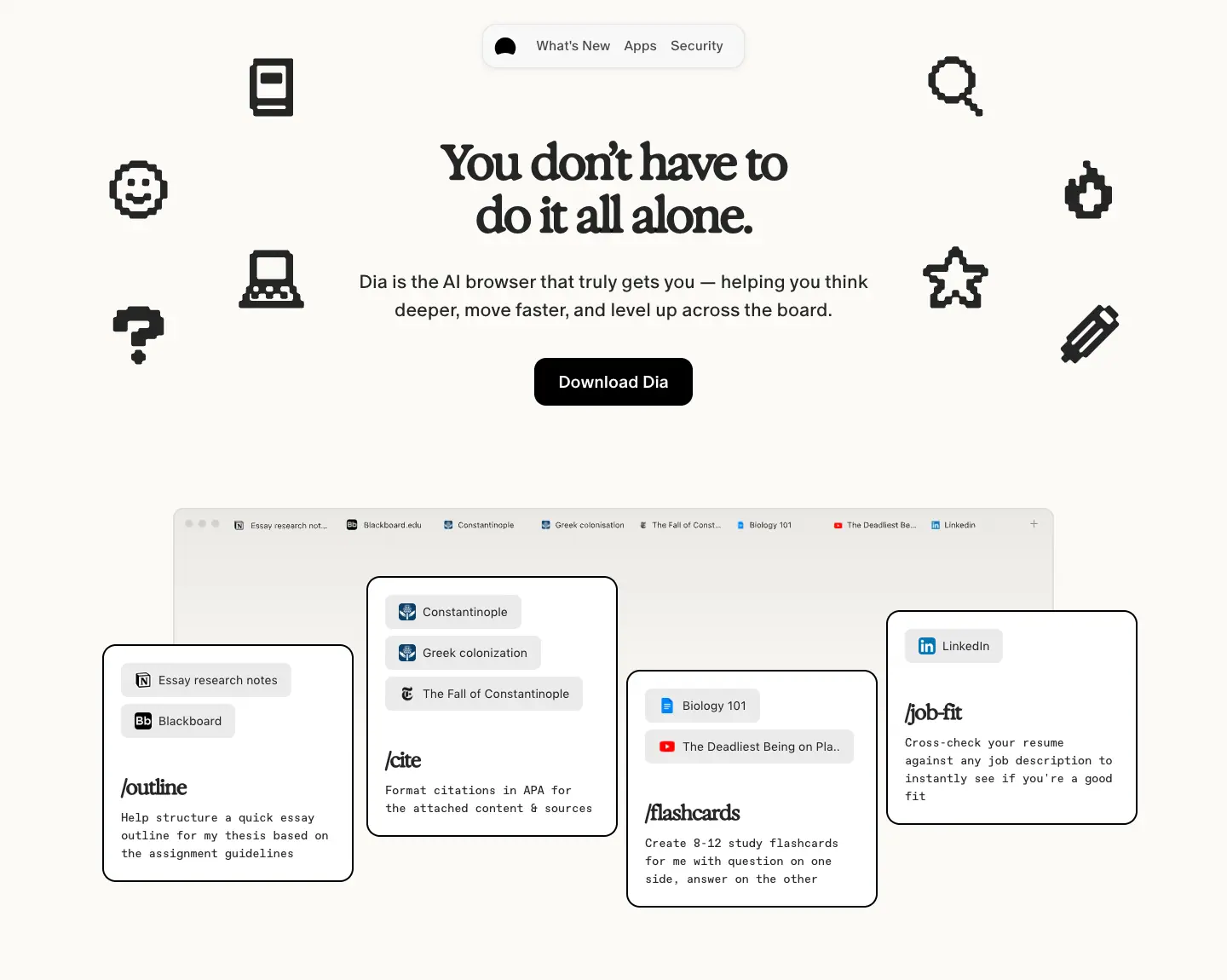
- 10 pixel icons around the H1.
- H1 "You don't have to do it all alone." Exposure 56 / 62, 650, −2.8 px.
- Lead Oracle 16–18 px; black pill "Download Dia".
- Browser frame with a student's tabs ("Essay research notes", "Blackboard", "Constantinople", "Biology 101", "LinkedIn") in SF Pro 14 / 21, and 4 skill cards:
/outline, /cite, /flashcards, /job-fit (Exposure 24–28 / 650 title, Favorit Mono 14 / 21 body, 2 px border, hard shadow).
Why: Slash commands are how students will actually use skills; pixel art and hard shadows speak an internet-native visual language.
2. "A true thought partner, in your tabs." (1150 → 2010)
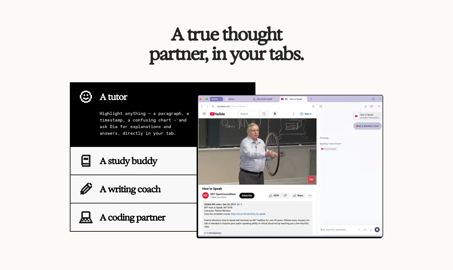
- Black role list: "A tutor", "A study buddy", "A writing coach", "A coding partner" (Exposure 28 / 30 / 650), each with a pixel icon; active role shows a description in Favorit Mono.
- Right: lecture video with Dia's sidebar.
3. "Skills are your shortcut to staying one step ahead in class." (2010 → 2860)
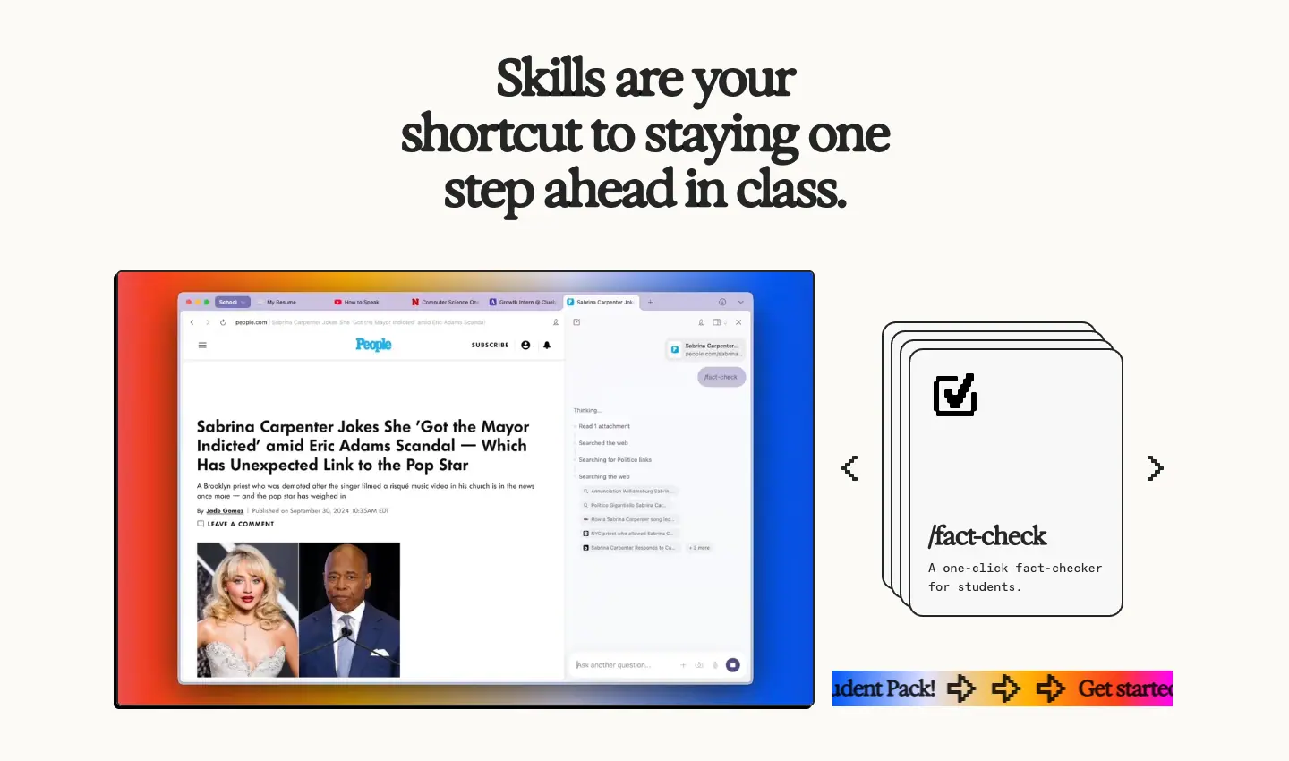
- Screenshot framed by
--student-gradient; stacked skill cards (/fact-check, /budget-buddy) with arrows; a gradient marquee strip "Get started with our Student Pack! →".
4. "Features so good, they feel illegal" (2860 → 3760)
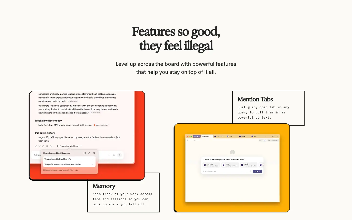
- Exposure 48 / 58 / 650. A collage of feature cards on red and yellow panels: Memory, Mention Tabs, Split View, Command Bar, Ad Block (Exposure 24 / 26 / 650 labels, Favorit Mono descriptions).
5. FAQ (3760 → 4330)
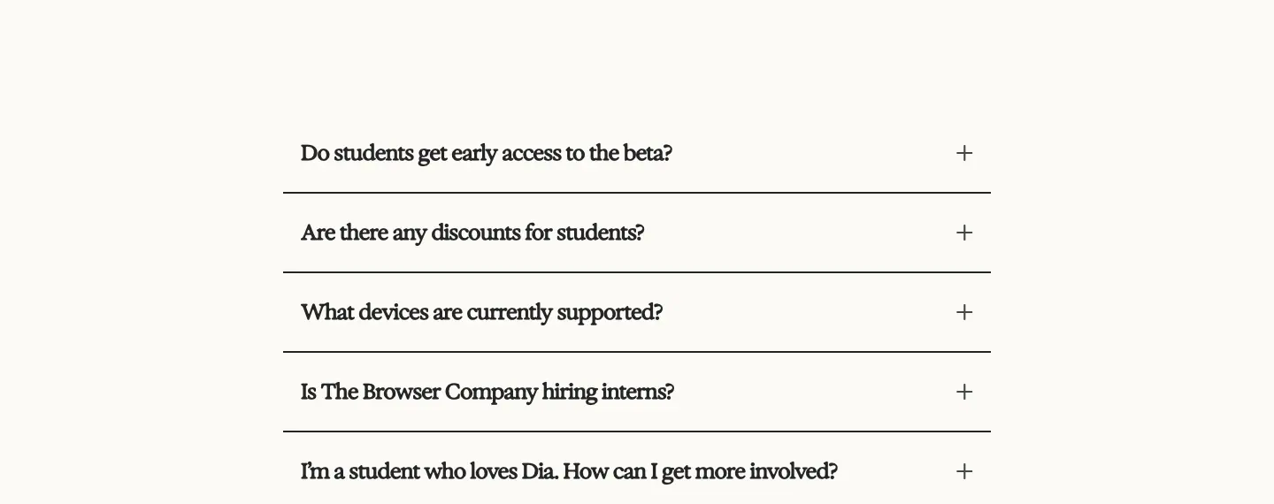
Questions (Exposure 24 / 28 / 650): "Do students get early access to the beta?", "Are there any discounts for students?", "What devices are currently supported?", "Is The Browser Company hiring interns?", "I'm a student who loves Dia. How can I get more involved?". Same grid-template-rows 400 ms animation as plans.
6. Closing collage (4330 → 5180)
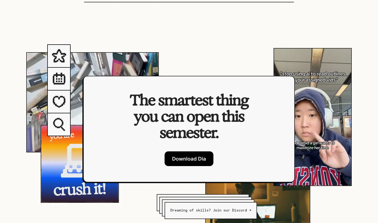
- A white card "The smartest thing you can open this semester." (Exposure 56 / 62 / 650) with a black pill, floating over a collage of student photos, a pixel-icon toolbar and a "crush it!" gradient sticker. Below: "Dreaming of skills? Join our Discord →" in Favorit Mono.
Why: The collage looks like a student's camera roll, which sells identity rather than features.
7. Footer
See Header and footer.
Security · /security
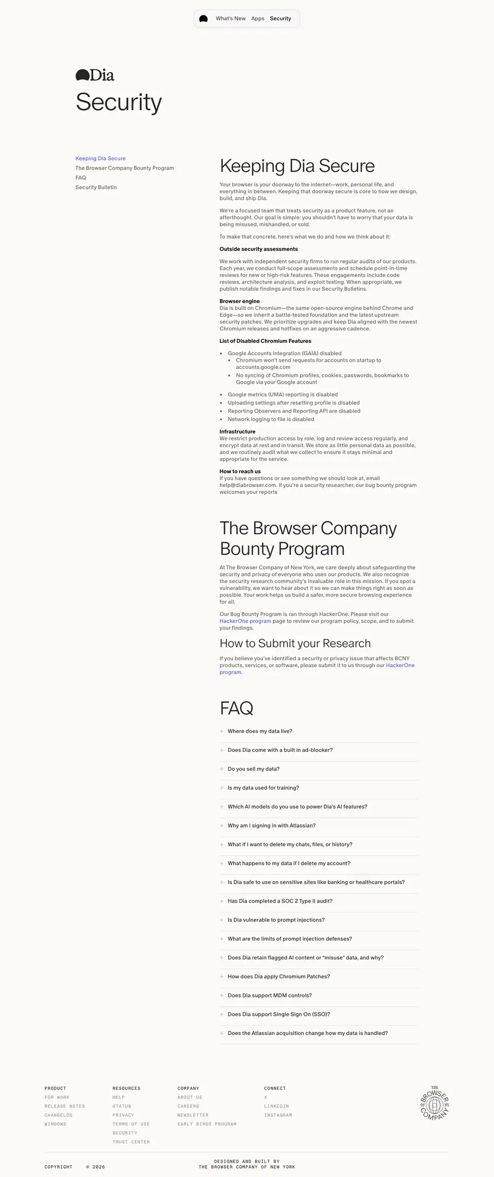
- Title: "Dia Browser | Security". Height 3430 px.
- Job: document the security programme and answer AI-safety questions.
Layout
- Left rail (≈ 200 px): Dia mark + H1 "Security" (ABC Oracle 300, 72 / 72, −2.88 px), then a table of contents: "Keeping Dia Secure", "The Browser Company Bounty Program", "FAQ", "Security Bulletin" (Oracle 16 / 20
.60, link blue #5863EA for the current item).
- Right column (≈ 760 px): long-form text.
Why: A document layout (TOC + text) signals seriousness. No art, no serif: this is the sans "information" voice.
Sections
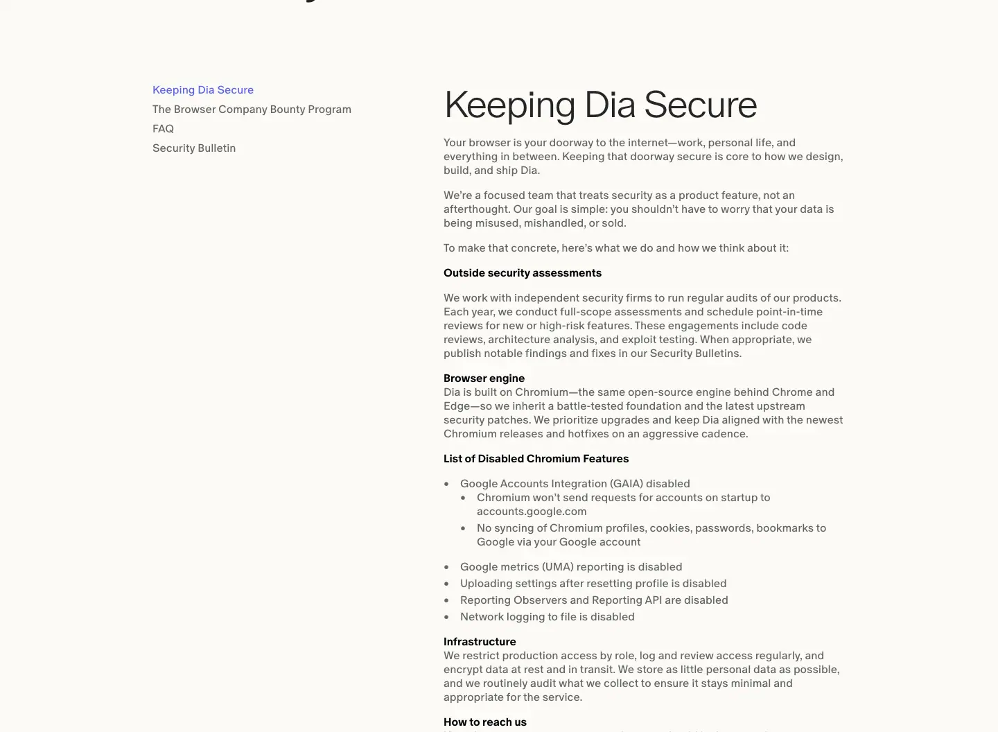
- Keeping Dia Secure — H2 Oracle 54 / 60, 300. Opening: "Your browser is your doorway to the internet—work, personal life, and everything in between." Bold run-in heads (Oracle 16 / 500
#000): "Outside security assessments", "Browser engine", "Infrastructure", "How to reach us". Bulleted lists 16 / 24 .60.
- The Browser Company Bounty Program — HackerOne link, scope and rules.
- How to Submit your Research — H3 Oracle 34 / 37, 300.
- FAQ — 17 questions, including: "Where does my data live?", "Do you sell my data?", "Is my data used for training?", "Which AI models do you use to power Dia's AI features?", "Why am I signing in with Atlassian?", "Is Dia vulnerable to prompt injections?", "What are the limits of prompt injection defenses?", "How does Dia apply Chromium Patches?", "Does the Atlassian acquisition change how my data is handled?".
Why: The FAQ names hard topics (prompt injection, model providers, the acquisition) directly. Naming risks openly builds more trust than a badge wall.
Footer
See Header and footer.
Utility pages · /windows, /download, /earlybirds, /help
Four short pages share one pattern: ABC Oracle Light 72 / 84 H1, one sentence, one action, footer. They are 1166–1431 px tall.
/windows — "Dia for Windows" (1296 px)
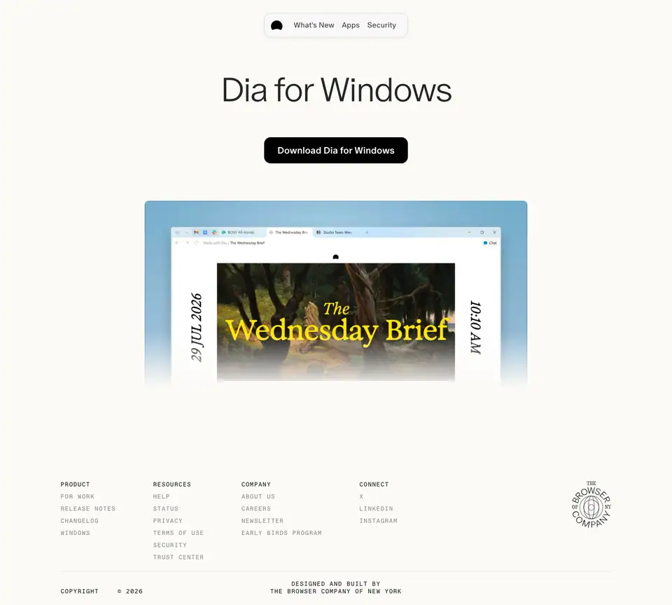
- H1 Oracle 300 72 / 84, −2.88 px. Black pill "Download Dia for Windows".
- Product shot of Dia on Windows showing "The Wednesday Brief" (same painting-and-serif brief style as the Mac shots), with a vertical date.
- Why: Windows users need proof that it is the same product, so the screenshot repeats the Mac brief design.
/download — "Meet Dia, the AI Browser" (1166 px)
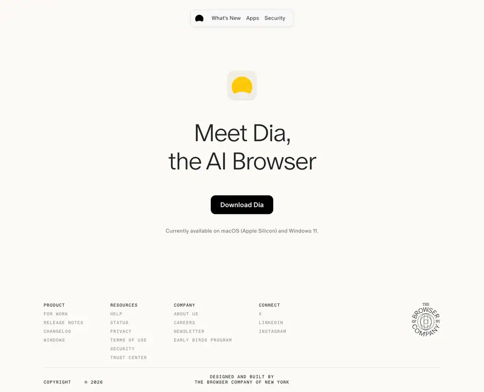
- H1 Oracle 300 72 / 84. Black pill "Download Dia". Note "Currently available on macOS (Apple Silicon) and Windows 11." (14 / 16.8).
- Why: A landing target for ads and links; nothing competes with the button.
/earlybirds — "Join Early Birds" (1431 px)
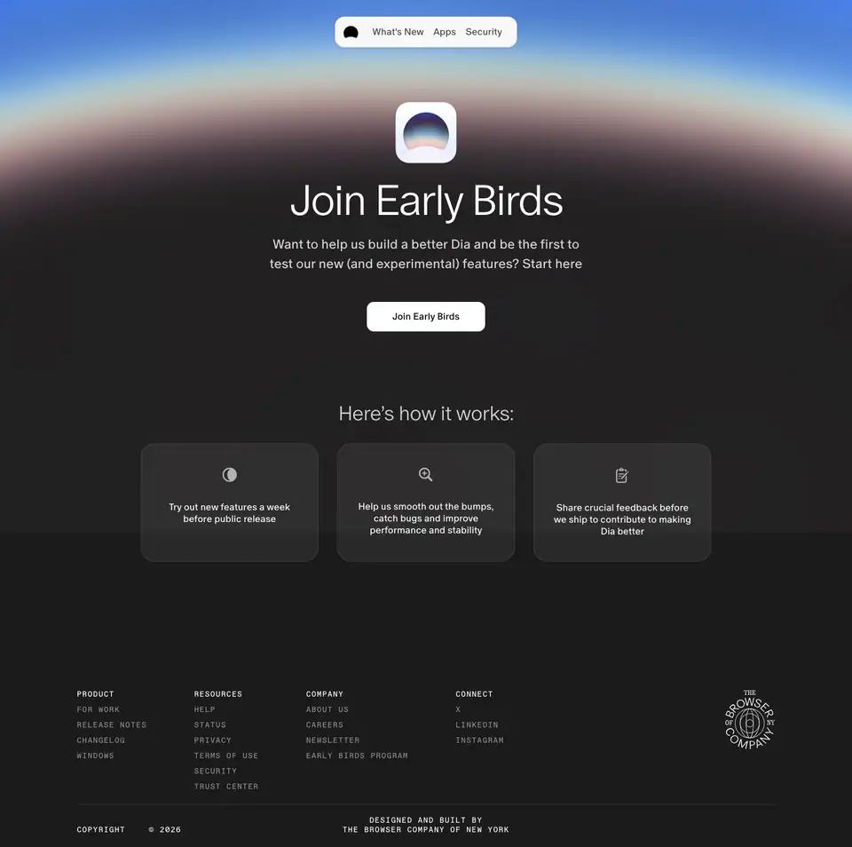
- The only dark page: body
#1B1B1B, night-sky horizon band (blue → pink → black) at the top.
- App-icon tile (rounded square with the Dia dome over a gradient).
- H1 white Oracle 300 72 / 84; lead 22 / 33
#F8F8F8: "Want to help us build a better Dia and be the first to test our new (and experimental) features? Start here".
- White pill "Join Early Birds".
- "Here's how it works:" (Oracle 34 / 37, 300,
rgba(255,255,255,.8)) + 3 cards (rgba(170,170,170,.1)): "Try out new features a week before public release" · "Help us smooth out the bumps, catch bugs and improve performance and stability" · "Share crucial feedback before we ship to contribute to making Dia better".
- Footer flips to white text (
.5 for links).
- Why: "Early birds" = before sunrise. The dark sky with a dawn horizon extends the home page's sunlight story.
/help — Help Center shell (1166 px)
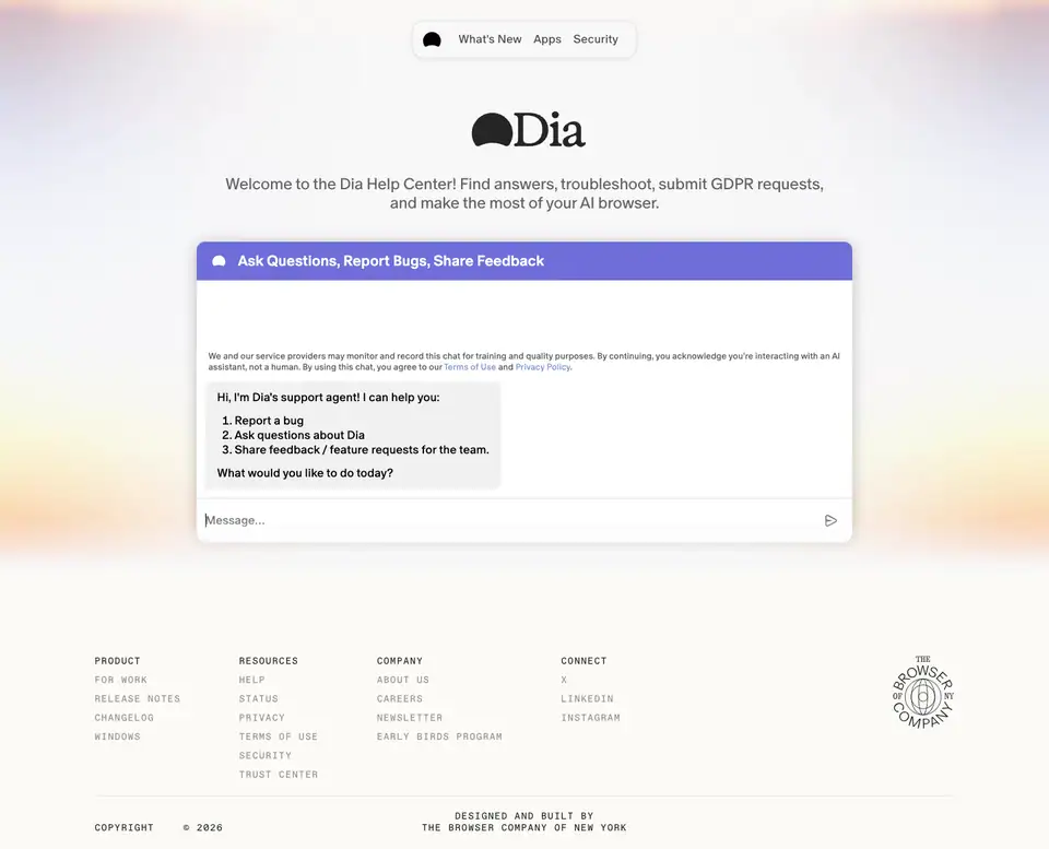
- A centred card with the Dia mark and "Welcome to the Dia Help Center! Find answers, troubleshoot, submit GDPR requests, and make the most of your AI browser." (Oracle 22 / 26
.60) over a pastel sunrise; the help content itself loads in an embedded widget (a blue "Ask Questions, Report Bugs, Share Feedback" panel).
- Why: Help is outsourced to a support tool; the page only frames it in brand light.
Footer
See Header and footer.
Release notes template · "The Dia Lately" · /release-notes/<version-slug>

- Captured:
/release-notes/1-57-find-your-flow (7233 px) and /release-notes/1-56-make-yourself-at-home (5517 px).
- Count: 37 versioned stories in the sitemap;
/release-notes and /release-notes/latest redirect (307) to the newest.
- Body: pure
#FFFFFF (not cream), so paintings look printed on white stock.
- Job: turn a weekly release into a letter fans want to read.
1. Postcard header
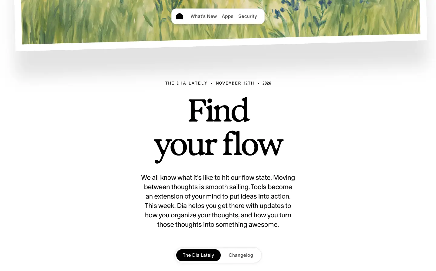
| Element |
Measured |
| Postcard |
oil painting (/images/lately/header-painting.webp) in a 22 px white border, rotate(-1.54deg), shadow 0 85px 51px rgba(0,0,0,.11), 1382 × 890, bleeding off the top; the image sits at top:-8.83%; height:117.67% for an inner parallax |
| Eyebrow |
"THE DIA LATELY • NOVEMBER 12TH • 2026" Oracle Triple 14 / 18, +0.42 px caps; color: transparent with an SVG feTurbulence grain fill |
| H1 |
"Find your flow" Exposure 101.66 / 110.81 (clamp(48px,7.06vw,118px)), 550, −5.08 px |
| Intro |
Oracle 22.5 / 30.8, 350, #0B0B0B, ≈ 40 ch: "We all know what it's like to hit our flow state…" |
| Tabs |
segmented pill 288 × 52: "The Dia Lately" (black, active) / "Changelog" |
Why: A postcard is a personal message; the date eyebrow makes it an issue of a publication. The giant serif title names a feeling ("Find your flow", "Make yourself at home"), not a feature.
2. Feature stories
- H2 Exposure 70 / 84, 550, −2.8 px (e.g. "Nest your tab groups", "Dia can now design in Figma", "Every link goes where it belongs", "Dial up the decor").
- Media 1044 × 650 on a 1280 px
.lately-grid (x 80, gap 20), product UI on a painted backdrop.
- Text column 335 px at col 7: Oracle 20 / 28.8, 350, −0.2 px; inline code-like paths ("Settings → Apps" in 700); quoted prompts ("make a Figma Slides with our end of year plans.").
- Credit: "SHIPPED BY CONNOR" (Oracle Triple 12 / 15 caps, +0.36 px, grain fill) with a small avatar. Ammer Handwriting is not loaded on this template; any signature here is an image.
- Stories are spaced
clamp(96px, 13.66vw, 236px) apart.
Secondary stories ("Fill in the blanks", "Read between the layers"): Exposure 41.76 / 50.11, media 571 × 387, side-by-side.
Why: Each story is a magazine spread: one big picture, short copy, the person who made it.
3. "What else is new"
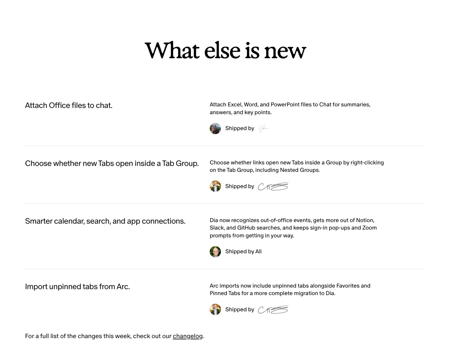
- H2 Exposure 70. Rows: title Oracle 25 / 34, 350, −0.75 px left ("Attach Office files to chat.", "Toasts have been buttered.", "The gray theme on Mac feels more native."); body 18 / 24.66 right; a "Shipped by" credit with an avatar under each.
- Ends with "For a full list of the changes this week, check out our changelog" (link with
text-decoration-color fade, 250 ms cubic-bezier(.77,0,.175,1)).
4. Past Issues
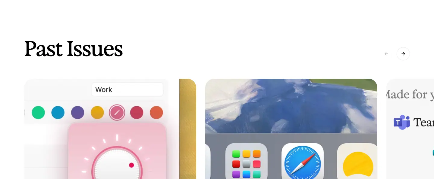
- H2 Exposure 70 "Past Issues", arrows top-right.
- Cards: painting/product image, metadata "NOVEMBER 5TH · V1.56.0 · NO. 44" (caps), title Oracle 39 / 45.63, 400, −1.17 px ("Make yourself at home", "Crafted with care, because you spend your day here.", "Your tool kit, in Dia.", "Dia 🤝 Microsoft").
- Card fade 200 ms
cubic-bezier(.87,0,.13,1).
Why: Issue numbers ("NO. 45") and a back catalogue make updates feel collectable.
5. Footer
See Header and footer.
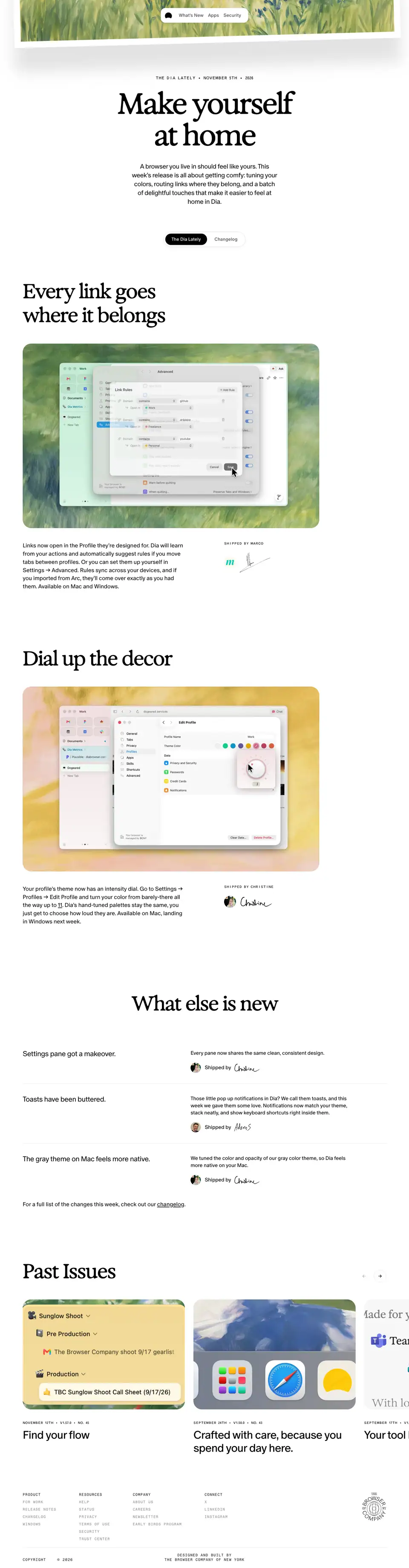
Notes from the roadmap · "Dia Weekly" · /release-notes/<topic>
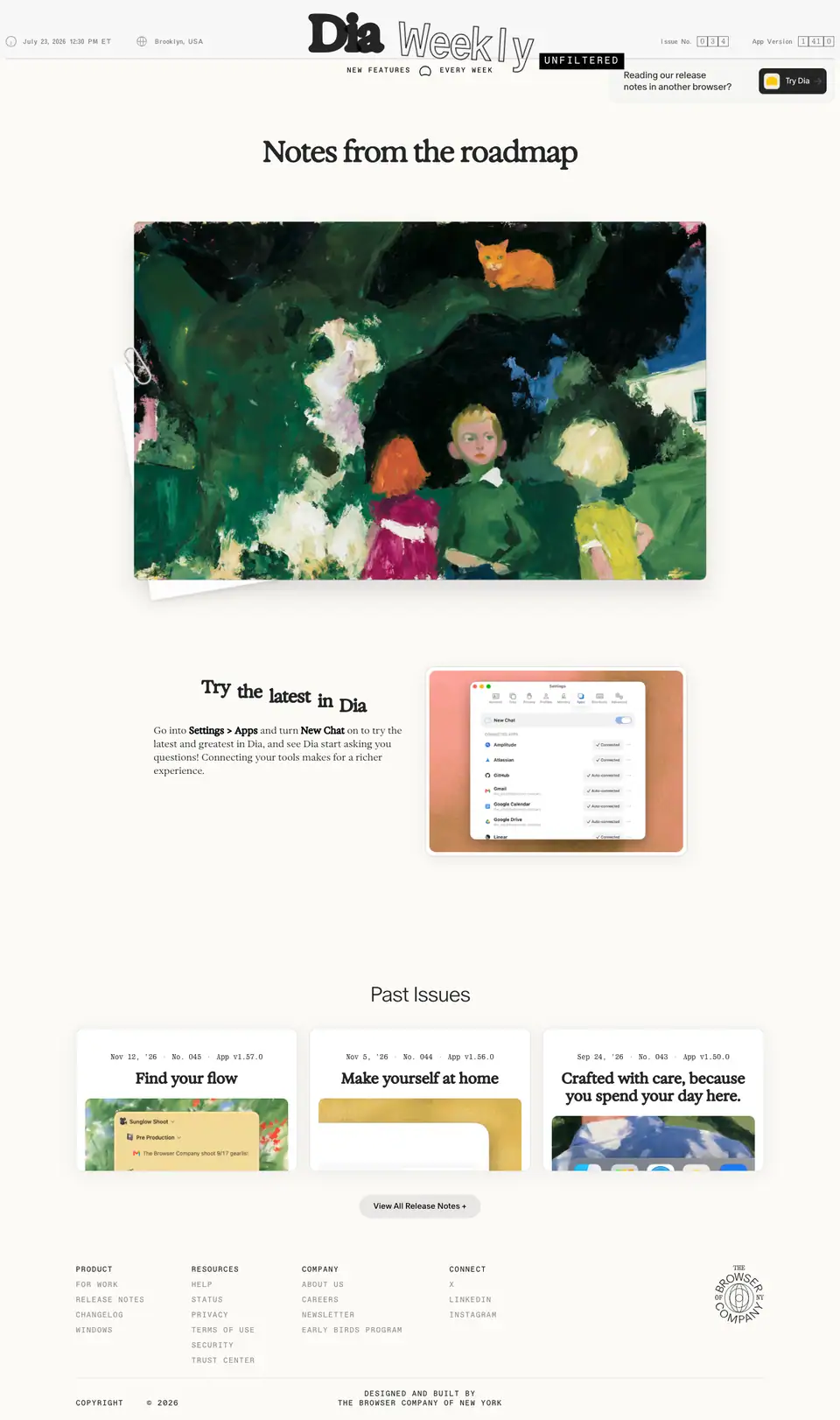
- Captured:
/release-notes/questions (2433 px).
- Count: 9 topic slugs in the sitemap (
context-switching, Linear, Tools, security-team-question, questions, linkedin-integration, granola, Notion, windows-wednesdays), all titled "Notes from the roadmap".
- Body:
#FBFAF6.
- Job: informal, pre-release notes on what the team is exploring.
1. Masthead
| Element |
Measured |
| Top bar |
"July 23, 2026 12:30 PM ET" (Oracle Triple 12 / 17 .50) · "Brooklyn, USA" · "Issue No." and "App Version" in boxed single digits |
| Title |
"Dia" (Exposure Variable 81 / 113) + "Weekly" (Oracle Triple 81 / 113, −3.24 px, outlined) + "UNFILTERED" (Favorit Mono 17 / 18.7, +2.72 px, white on black) |
| Strap |
"NEW FEATURES ◠ EVERY WEEK" Favorit Mono 12 / 23, +1.92 px caps |
| Promo |
card "Reading our release notes in another browser? [Try Dia]" with a yellow app icon, top-right |
Why: A newspaper parody sets the tone (candid, weekly, local to Brooklyn) and the boxed digits are an odometer, a physical-object joke.
2. Letter
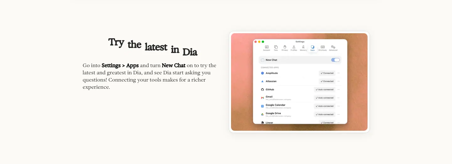
- H1 "Notes from the roadmap" Exposure 50 / 60, 600, −2 px.
- Painting (dark garden, three children, an orange cat in the tree) with a paper clip and a second sheet behind it.
- Body in Exposure 20 / 29.6: "Greetings from Brooklyn!", then the letter; a quoted prompt ("Help me write a project update for my manager") and a sign-off "— Jonathan" (Exposure 20, 550).
- Callout "Try the latest in Dia" (Exposure 30 / 27, 700, word-split for an animated reveal) with "Settings > Apps" in bold.
Why: Written by a named person as a letter, so roadmap uncertainty reads as candour, not as missing features.
3. Past Issues
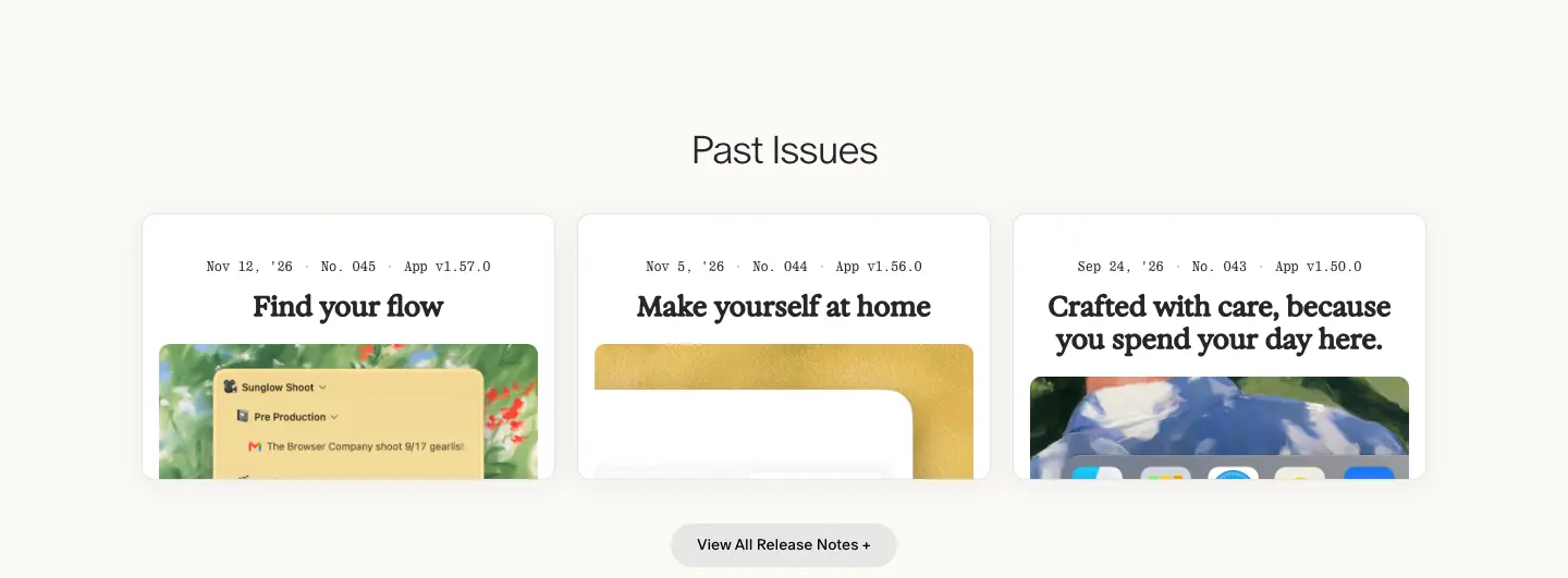
- "Past Issues" in ABC Oracle 36 / 36, 300; cards with Quadrant Text Mono dates ("Nov 12, '26 · No. 045 · App v1.57.0"); button "View All Release Notes +".
4. Footer
See Header and footer.
Changelog · /changelog, /changelog/mac, /changelog/windows, entry pages
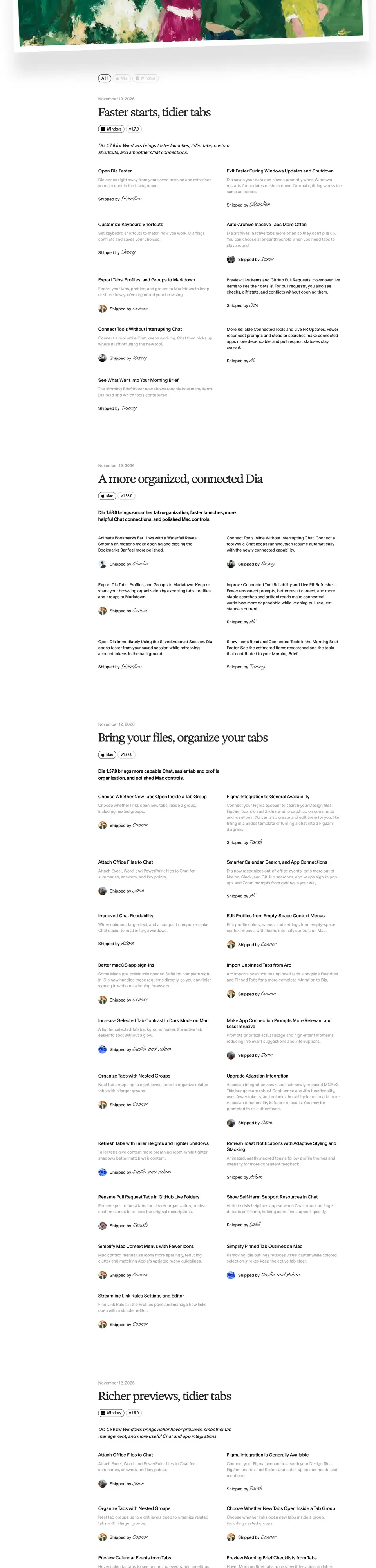
- Indexes:
/changelog (All) is 78,636 px tall at capture (99 <h2> elements: month headings + entries); /changelog/mac ≈ 74,000 px. Every entry renders on one page; there is no pagination. Screenshots are cut to the first 6000 px.
- Entry pages: 64 macOS (
/changelog/mac/1-58-0 … 0-43-0) and 8 Windows (/changelog/windows/1-7-0 … 1-0). Captured: mac 1.58.0 (1235 px) and windows 1.7.0 (1666 px).
- Title: "Dia Browser | Product Updates" (index), "Dia Browser | Update 1.7.0 for Windows" (entry).
- Job: the complete, factual list — the counterpart to the story-led release notes.
1. Index header
| Element |
Measured |
| H1 |
"Changelog" ABC Oracle 72 / 84, 300 (visually hidden at x −1; the page starts with the filter) |
| Filter |
pills "All" (50 px), "Mac" (69 px), "Windows" (100 px), Oracle Triple 16 / 18, −0.32 px, radius 100, at y 285 |
| Month heading |
"November 2026" Oracle 54 / 60, 300 (left column, sticky) |
2. Entry block
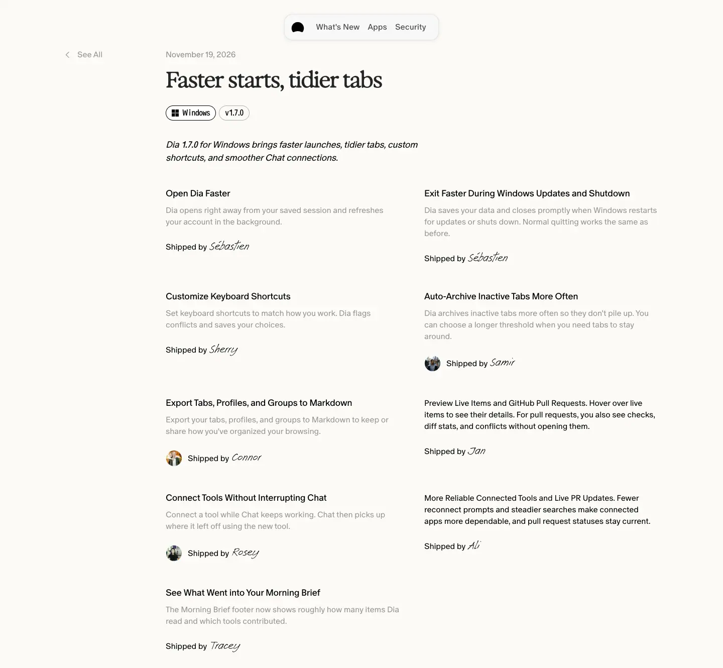
| Element |
Measured |
| Column |
x 376, width 934 |
| Back link |
"‹ See All" Oracle 16 / 18, 350 (entry pages) |
| Date |
"November 19, 2026" 14 px .50 |
| Title |
Exposure 44 / 49.72, 550, −2.2 px ("Faster starts, tidier tabs", "A more organized, connected Dia", "Bring your files, organize your tabs") |
| Tags |
outlined pills: platform logo + "Windows"/"Mac", and "v1.7.0" (Oracle Triple 18 / 26; version in 350 or 700) |
| Summary |
italic Oracle: "Dia 1.7.0 for Windows brings faster launches, tidier tabs, custom shortcuts, and smoother Chat connections." |
| Items |
2 columns × 442 px, 50 px gap. Title Oracle 18 / 23, 400, −0.36 px; body 16 / 23, 350, rgba(0,0,0,.4) |
| Credit |
"Shipped by" 16 / 23 + name in Ammer Handwriting 36 / 24, optional 20 px avatar |
Why:
- One endless page makes Cmd-F work across every version, which is what people use a changelog for.
- Grey item bodies (.40) let the eye scan titles only.
- A handwritten name on every item shows the team's size and care; it costs one line per item.
3. Footer
See Header and footer.
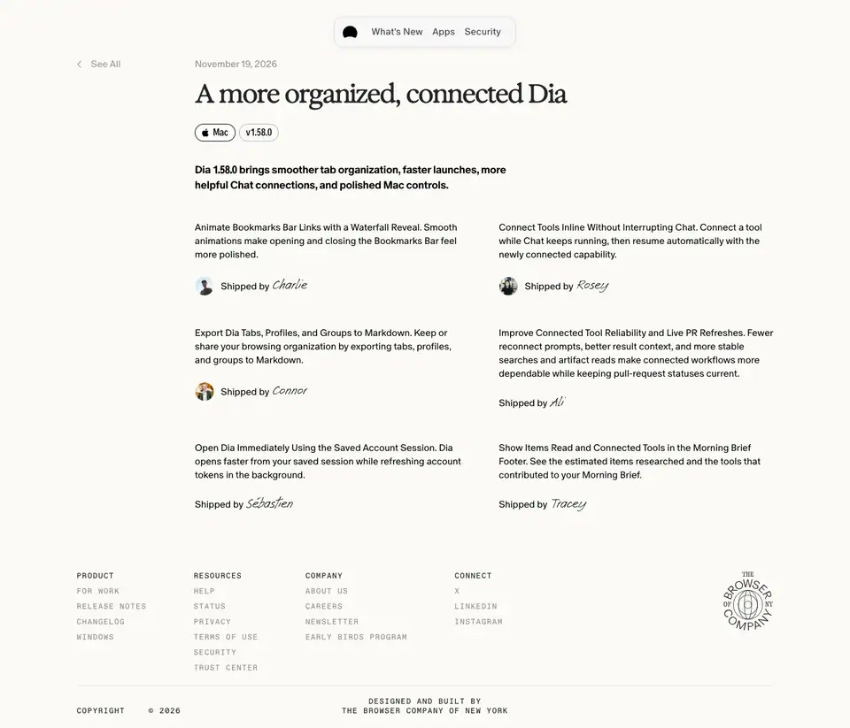
Legal and 404 · /privacy, /termsofuse, 404
/privacy — "Dia Browser Privacy Policy" (11,736 px)

- H1 "Privacy" ABC Oracle 300, 72 / 72, −2.88 px.
- Left sticky table of contents in link blue
#5863EA (16 / 20, 32 entries) — the only page where a hue is used for navigation.
- Section heads Oracle 300, 34 / 37, −0.68 px ("Privacy Policy Intro", "What does this Privacy Policy cover?", "What is personal data?", "Cookies", "Data security", "Data retention").
- Body 16 / 20,
.60; bold run-ins 16 / 700 #000 ("A heads up that by using or accessing Dia…").
- Why: Long documents need a visible map; blue marks links clearly inside dense grey text.
/termsofuse — "Terms of Use" (10,748 px)

- Same template: Oracle 300 72 / 72 H1, 16 / 20
.60 body, bold caps clauses ("THE BROWSER COMPANY OF NEW YORK…"), help@diabrowser.com in #5863EA, "Effective August 17, 2026" in 15 / 20.
404 — "Page Not Found"
- H1 "404" Oracle 300, 72 / 84; "This page could not be found." Oracle 22 / 26, −0.44 px.
- Served at
/privacy-policy, which is still listed in /sitemap.xml (the live policy is /privacy).
- Why: No joke, no illustration; it uses the information voice like the legal pages. A sitemap clean-up is due.
Footer
See Header and footer.